Woodhouse Fish Co. (CA)

San Francisco. Exhibition and narrative are ubiquitous, including where we eat, and drink. Random objects and images displayed in restaurants and bars may be campy, and overly designed interiors may be vaguely artificial. But sometimes the story of the place and it's clientele is an authentic narrative, organically evolved and expressed from the inside out. And sometimes artifacts are smartly integrated in the space, teaching us a thing or two about exhibition design. This is true of a little seafood restaurant in my neighborhood. 

IMG_8415.JPG

The space is small, oddly shaped and split, but the many columns and corners are well incorporated as vertical display space.

IMG_8350.JPG
IMG_8398.JPG

There's a humble pleasure in ordinary spaces that are nicely arranged, whether it's someone's living room or a little restaurant. The negative spaces are not jarring. Flat and dimensional elements are integrated from floor to ceiling. Evidence of real TLC without too much or too little. Pulleys and ropes tie it all together.

IMG_8386.JPG

Dignified "Most Oysters Eaten" awards, and 2 small "found pearl" vitrines add relevance through diner's participation, like signed photos of celebrities.

IMG_8354.JPG

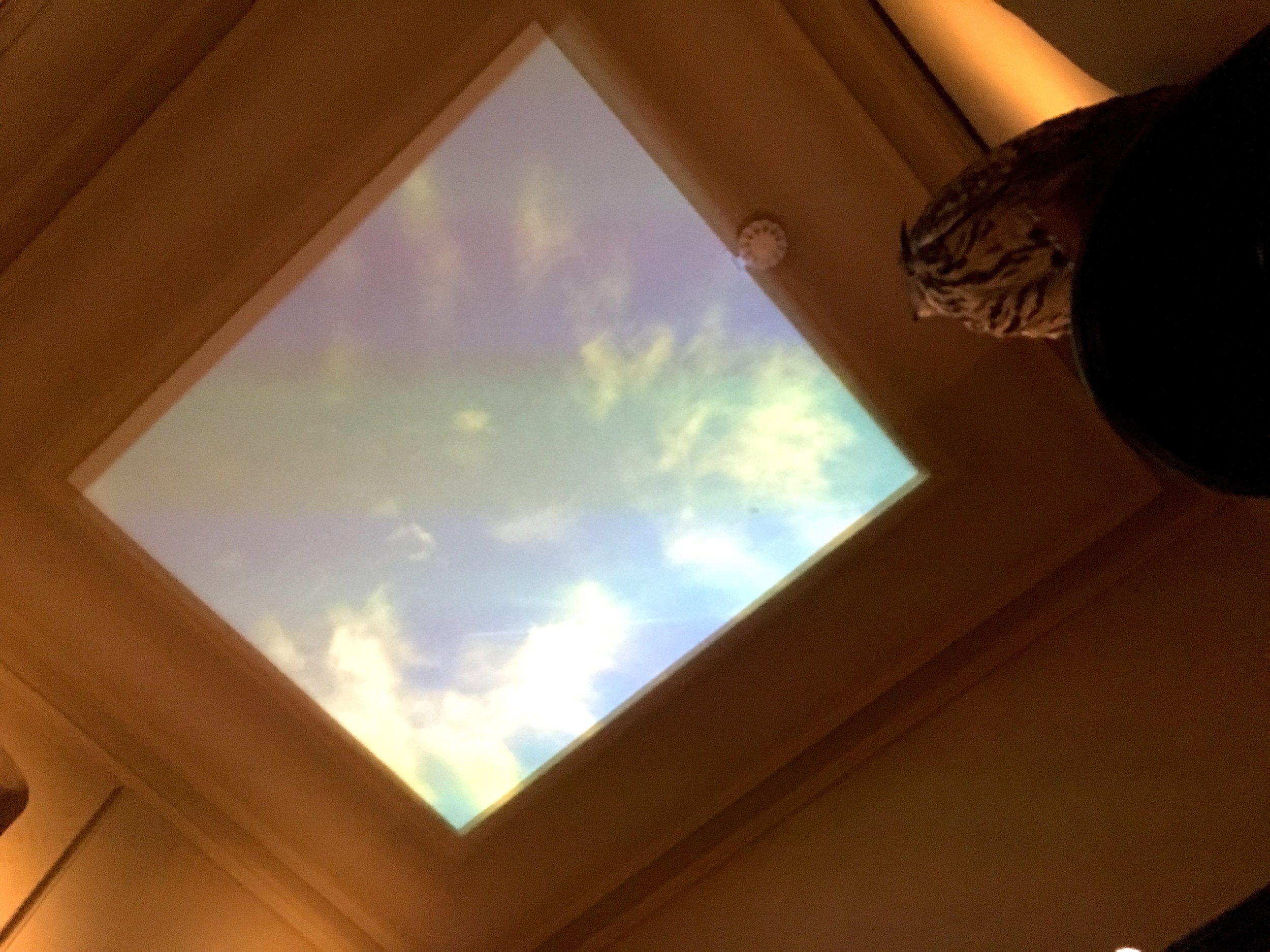
The window-framed monitor runs continous clips from black and white seafaring movies, such as the classic "Moby Dick".

IMG_8107.JPG

The movie clips give the illusion of an expanse "outside", extending the little space with a sense of motion and sound. Rolling waves and seagull's cries convey the mythical drama of the sea. 

IMG_8381.JPG

Objects include historically dated hooks, reels, traps, measuring gauges, scrimshaw. All are simply labeled, and respectful of the fishermen's craft. 

IMG_8394.JPG

Little treasures include a yellowed article on kitchen hypnotism to calm a lobster.

IMG_8388.JPG
IMG_8355.JPG
IMG_8364.JPG

Perhaps the narrative details in these environments are delightful because we encounter them in our "down time" in non-museum spaces, where it isn't expected and narratives are free to find meaning without official analysis. In our living rooms, we're not required to display personal objects, but we do out of our innate human need to find meaning and beauty in our story.

Floating Hotel Museum (CA)

Long Beach, CA. I had 2 hours to wait at the docks, to pick up someone from a cruise ship. So it seemed appropriate to kill that time on another cruise ship. The Queen Mary is a museum, and a hotel with dining and shops. It's a venue for nightlife, team building scavenger hunts and multicultural weddings. It even has a Russian submarine on a leash. It's on the water of course, not on a sea of grass.

IMG_6165.JPG

Outdoor photo murals often have a surreal quality, especially when the image is mounted on the the real thing it represents. Here the image goes back in time, and distance, like a parent, or a baby in the belly of the ship.

IMG_6123.JPG

A photo of an excited traveler boarding the maiden voyage is so welcoming, I wish I could move it to the actual ticket entry, which is far away. These 2 great photos are splintered by a third one with bad corner cropping.

IMG_6125.JPG

The space between the boat and the land is a "behind the scenes" that can't be hidden, a work area full of umbilical chords and other bridges that turn a ship into a building.

IMG_6141.JPG
IMG_6140.JPG

Actual views of the ship are hard to see. An elevator tower obscures the view at the entry, which is (sort of) part of the hotel reception, but around the corner.

IMG_6136.JPG
IMG_6178.JPG

It's confusing to buy a ticket, called a "passport", because there are so many packages to decipher, called "voyages". Most of them involve special tours or shows, on various themes, including an evening paranormal tour. Because the idea of "boarding" the museum as an actual passenger is so enticing, why not do it in a realistic way?

IMG_6179.JPG

The cheapest ticket visitors (like lower class passengers) are sent directly down a long ramp to the engine room at the stern. The walkway is melancholy, strewn with residual event decorations and furniture.  

IMG_6181.JPG
IMG_6182.JPG

Double signage is like fighting fire with fire. 

IMG_6185.JPG

The Queen Mary is a historic Art Deco jewel. 

IMG_6188.JPG

But the logotype is traditional serif. Next to it is some deco wayfinding (MB Picturehouse or Nova Deco?)

IMG_6286.JPG

This painful deco treatment is probably older, no longer in use.

IMG_6291.JPG

Other aspects of the wayfinding are based on the simpler cruiseline font

IMG_6280.JPG

The overwhelming array of options reappear at the real museum entry.

IMG_6273.JPG
IMG_6213.JPG

Beautiful deco wall.

IMG_6196.JPG

The original typography on the ship's controls, hand-shaped and spaced to fit the wedge. 

IMG_6222.JPG

Heavy wooden frames on the engine labels.

IMG_6218.JPG

This dark alcove walkway for viewing the actual propeller under water was really moody. It had whatever quality it is (hope, fear) that compels people to throw coins.

IMG_6241.JPG

The museum has the dense claustrophobic quality of a ship, and the personal stories have the fleeting, temporal quality of a passenger.

IMG_6252.JPG
IMG_6260.JPG

At the upper level, the ship becomes a common ground for tours, hotel, shopping, dining, conference, photo studio, with other exhibits somewhere in the mix.

IMG_6307.JPG

Photos and anecdotes of non celebrity passengers help make it accessible.

IMG_6304.JPG
IMG_6288.JPG

A Lego ship model and lego building stations

IMG_6293.JPG

A Lego mosaic

IMG_6294.JPG

So the photo mural texture is probably Lego inspired.

IMG_6298.JPG

Starbucks on the promenade deck just doesn't seem right.

IMG_6331.JPG

Lifeboats will not be needed.

IMG_6284.JPG

The ship's natural landscape is the sea, but as a visitor on a docked ship, we can't experience that. I wanted some of the windows to reveal a (photo) view of the vast expanse of the sea, the horizon.

IMG_6323.JPG

The ship is bordered by a mini circus arena with a few amusement rides.

IMG_6170.JPG

Next to this is the "Queen Mary's Dark Harbor, Fear Lives Here" exhibition. It could be under construction. It's hard to say because the aesthetic is wreckage. Like a home made spookhouse, but with an aspect of hollywood stage set design. 

IMG_6283.JPG

It's an interesting juxtaposition between this outdoor exhibition and the carnival. There's a messy boundary between museum exhibition and attraction. What are the roots, of true story and fantasy, in the fair and the circus?

IMG_6155.JPG

The Museum of Art Installation (CA)

Los Angeles. The Broad Museum. Exhibition installation is a surreal performance in it's own right. Here, four photos of two (real) museum preparators in the process of installing three (Duane Hansen) figures, at the Scottish National Gallery of Modern Art. Sharon Lockhart describes it as a "synchronicity: the physicality and tools of labor, the interest of two artists in the beauty of the ordinary people, and the potential for artifice to expose a hidden layer of truth". The formally posed "set up" of the installation makes this even more amusing.

IMG_6030.JPG
IMG_6028.JPG
IMG_6029.JPG
IMG_6031.JPG

Collage as a Graphic Art Practice

During my Design Sabbatical, I created postcard size collages to process my experiences on the road. I photographed each one on site, and then carried them home, arriving with 176 of them in my back pack. If graphic design is the arrangement of word and image to communicate a pre-determined message, then for me collage is graphic art in the service of mystery, an unconscious arrangement of found word and image to discover complex meanings. A visual poem of experience. This personal practice replenishes my design mind, so I have decided to continue it, whether I'm traveling or not. 

0115c.jpg
 
0057c.jpg
 
0069c.jpg
 
0040c.jpg
 
0168c.jpg
 
0116c.jpg
 
0095c.jpg
 
0133c.jpg
 
0136c.jpg
 
0083c.jpg
 
0142c.jpg
 
0031c.jpg
 
0149c.jpg
 
0153c.jpg
 
0104c.jpg

PLywood (London)

London, England. The Victoria & Albert Museum is a wonderful institution, with it's welcoming Chihooly hanging overhead and dramatic yellow lighting around the doors and reception island.

IMG_5575.JPG
IMG_5762.JPG

Signage has a way of taking over museum entries. With the good intent to communicate offerings to visitors, it tends to reproduce itself as a redundant effort. The more visual noise it creates, the more it escalates to compete with itself. This is painful to graphic designers, who understand the challenge and notice evidence of the struggle. The elegant reception island is getting covered with exhibition posters that already exist on monitors and free standing signs as well. What is the little green box...?

IMG_5572.JPG

The original pool sign has given birth to a second, taller paper sign to reinforce and clarify the wading rules. Real behaviors were not predictable when the stone was carved, and the second sign is probably an ongoing prototype to get the best possible solution. Some believe that a paper sign is more effective, with it's "temporary" urgency. This awkward pairing is a common dilemma. Will they ever be re-united as a single final sign?

IMG_5705.JPG

"Plywood, Material of the Modern World" is the current temporary exhibition, in a thoroughly red space.

IMG_5595.JPG

Bent plywood entry walls seem to be fiberglass coated (?) surfboard style.

IMG_5596.JPG

The exhibition design is layered, like plywood, with tiered pedestal bases, and engraved, standwiched area signs.

IMG_5651.JPG
IMG_5614.JPG
IMG_5648.JPG

Explanations of the plywood process ring the big outer red walls, surrounding the objects in the center.

IMG_5606.JPG
IMG_5631.JPG
IMG_5656.JPG

There's a jumbled rhythm between the 3D objects and 2D images on multiple plains.

IMG_5612.JPG
IMG_5668.JPG

A groove in the plywood to angle labels and insert small pedestal labels. Easy to position at the last minute, or reposition as needed during install.

IMG_5617.JPG
IMG_5603.JPG

A building alcove at the end of the space reveals plywood construction and doubles as a projection surface for videos on both sides, viewed from the corridor that circles around it.

IMG_5644.JPG
IMG_5645.JPG
IMG_5642.JPG

The space is rich with thoughtfully placed objects, from floor level up, into the airspace.

IMG_5618.JPG
IMG_5600.JPG

The exhibition extends out to the courtyard with ice skating shelters

IMG_5676.JPG
IMG_5682.JPG
IMG_5677.JPG

The comfort of an iconic museum cafe cannot be underestimated, as the icing on the visit cake. The epic V&A cafe is a special place to reflect and recharge.

IMG_5693.JPG
IMG_5689.JPG

Lovers in the Collection (London)

London, England. Photography is forbidden at some of the exhibitions I've seen, so I haven't posted them. I confess (apologize) that I took this forbidden photo of Marc Quinn's sculptures in the Soane House Museum. As figurative couple(s), fragments cast from life, they seem like the young guests at a elderly party, mixing uncomfortably with the crowd of classically modeled figures. A subtle tension. In dramatic contrast, a side room displayed their plastic moulds, bright pink and rubbery like birth cocoons.

IMG_5770.JPG

Construction Wrap 2

Construction wraps are exciting, even magical. A few more examples (since Cambodia)... A plain fitted wrap with Christo-like beauty.

IMG_4767.JPG

Photo wraps with an image of the concealed building are almost better than the building alone.

IMG_3193.JPG
IMG_5167.JPG

A wrap with a different photo leans toward surreal.

IMG_6256.JPG

A graphic design wrap is the bright promise of modern,

IMG_5873.JPG

or a future experience.

IMG_5637.JPG

In Romania I lived behind this

IMG_6923.JPG

with this view out

IMG_5731.JPG

Construction sites are theatrical, setting the stage for the next act

IMG_1737.JPG

The allure of "back stage" activity.

IMG_0552.JPG

An intermission veiled by a curtain.

IMG_2988.JPG

Dramatic, temporary architectural framing.

IMG_3476.JPG

Construction oblivious of appearance.

IMG_6902.JPG

A passageway between past and future

IMG_6815.JPG

Designing Freedom (London)

London, England. Design Museum. "California, Designing Freedom" looks at how politically rebellious attitudes (1960's—present) have shaped design.

IMG_5345.JPG

"By turns empowering, addictive and troubling, California design is shaping the nature of the 21st century" This exhibition definately stirs it up.

IMG_5330.JPG

The pastel colored exhibition design is organized by what you want; See what you want, Go where you want, Do what you want, Join who you want, Say what you want, Make what you want. The design didn't interest me, but the content made me feel homesick, in more than one way.

IMG_5319.JPG

It's always revealing to see your own culture from afar. Here it was unsettling to see old and recent technologies side by side, with the same hopes and fears still attached to them.

IMG_5296.JPG

From free speech movement punch cards to the Mobile Justice App, it all takes on new meaning in the current political climate. What seemed like a fresh struggle not so long ago is now seen as history, but history threatens to repeat itself. 

IMG_5294.JPG

In 1955, at Immaculate Heart College, a silkscreen studio for protest posters was led by Sister Corita Kent. Her work used advertising slogans, philosophy, street and store signage, poetry, scripture, newspapers, magazines, song lyrics, and political speeches. 

IMG_5224.JPG

The California garage as temple: Walt Disney's, Packard's, Job's, Wojcicki's

IMG_5288.JPG

Google maps presented in layers of plexi panels

IMG_5257.JPG

Historical graphic design included early issues of Wired and Emigre, digital fontwork,

IMG_5189.JPG

and Susan Kare's sketches for Apple icons.

IMG_5329.JPG
IMG_5272.JPG

The graphic design of acid

IMG_5227.JPG
IMG_5230.JPG

More currently this advertisement by obeygiant.com and Amplifier Foundation, 2017

IMG_5212.JPG

UCLA Mobile Justice App, 2015

IMG_5193.JPG

Good Inc, animations and infographics intended to spur activism, 2016

IMG_5204.JPG

USC Institute for Creative Technologies, VR to assess and treat veteran's PTSD

IMG_5244.JPG

For sale in the shop

IMG_5540.JPG

Designer Maker User (London)

London, England. This is the permanent (free) exhibition at the Design Museum, in it's new location, under a hyberbolic paraboloid roof. The exhibition designer, Morag Myerscough, opens it with a colorful title wall that rotates the three words to tie the concepts together. 

IMG_5516.JPG
IMG_5355.JPG
IMG_5349.JPG

The three themes are perfect in their simplicity, and never boring. Political, economic and environmental issues weave between them. Triangular patterns are a visual theme.

IMG_5509.JPG

The space is filled, rich with design examples

IMG_5379.JPG
IMG_5368.JPG

Black supports and yellow enamel labels define the modular design throughout. Labels can wrap counter edges, or fold under for angled wall or pedestal placement.

IMG_5385.JPG
IMG_5491.JPG

This counter cuts through a wall between two sections of the show.

IMG_5401.JPG

On the other side, "Choice & Taste" is seeded with subjective terms which fuel visitor discussion. Some of the walls are panelled with acoustic cork.

IMG_5499.JPG

The exhibition interpretation embraces the "inherent plurality of design" with open-ended questions and multiple points of view.

IMG_5408.JPG

A central circular display area breaks out of the black for red.

IMG_5430.JPG
IMG_5422.JPG

Graphic eye candy. A delicious wall of Olivetti posters.

IMG_5437.JPG

Nice reflections on the bright enamel area walls.

IMG_5454.JPG
IMG_5455.JPG

This museum seems to confirm that design museums/exhibitions have truly become mainstream destinations. The general public's awareness and design sophistication is impressive and truly admirable. 

IMG_5497.JPG
IMG_5460.JPG

The maker area includes an activity counter with projects such as design a logo for your family, or a system for sorting waste at home.

IMG_5472.JPG

Typographic Decor

I've always been uneasy with free floating "concept" words used as environmental super graphics. The ones that beckon us to PLAY (at the playground), or DISCOVER (at the museum) or CONTEMPLATE (on campus)... Typically they suggest either an obvious activity or a deep personal experience, things people can find for themselves (or not) without being told to do so. It seems to cheapen communication as well as the experience. If the goal is to inspire, why not use real poetry?
Decorative treatments like this hotel carpeting, are a continued appropriation of the same idea. Funnier, less insidious, but still not poetry (?) 

IMG_9863.JPG

And decorative treatments like these bus seats, more purely visual and abstract. More sophisticated, less literal, but still not poetry (?)

IMG_1734.JPG

Musee de la Chasse (Paris)

Paris, France. I returned to one of my favorite museums to see what's new. The design intent of the Museum of the Hunt and Nature is to be a "belvedere opening onto a wild space". Like a belvedere, they provide thoughtful and unexpected "views" of the human/animal relationship, mixing history with modern art.

IMG_4905.JPG

The current temporary exhibition presents a group of artists in open-air-residence at Belval, a Hunting Park turned Nature Preserve, exploring the relationship between landscape as a symbol and territory as the place where we actually are. The exhibition entry is a step up overlook onto a idealized painting.

IMG_4764.JPG

Each photo in this series is fixed at an angle, not hinged or movable. The angle shifts gradually across the wall, from the story side most revealed to the image side most revealed.

IMG_4774.JPG
IMG_4775.JPG

The same set of cards is provided separately, so visitors can see both sides of all of them, but the partial wall mounted views are more intriguing.

IMG_4776.JPG

These take away sheets are padded, wall mounted.

IMG_4796.JPG

A darkened area shows eerie night camera footage, projected on gauzy double layer fabric. The occasional breaking of a twig underfoot heightens the attentive mood. 

IMG_4780.JPG
IMG_4784.JPG

A sandy corridor is hushing, because visitors automatically fall silent as they pass across this surface.

IMG_4782.JPG

A discussion beautifully captured, and the rest of the story on plates.

IMG_4787.JPG
IMG_4789.JPG

Hardware and wayfinding are beautifully integrated in the main museum.

IMG_4865.JPG
IMG_4864.JPG

Each animal has it's own cabinet, with content neatly organized by shelf, drawer, sliding panel or viewer. The typography is burned into the wood surfaces. These cabinets honor the prey on the same level as the hunter.

IMG_4802.JPG
IMG_4854.JPG
IMG_4853.JPG

Multi lingual panels hang on a wall hook in each room. A fox sleeps on a chair...

IMG_4827.JPG

...and another brilliant way to say "Do not sit", with a thistle instead of a sign

IMG_4816.JPG

Throughout, the house, animals roam freely, sometimes observing visitors.

IMG_4814.JPG

Modern art is incorporated throughout, from subtle to overt, expressing the visceral feeling of the wild and points of view from macabre to humorous. Overall the art equalizes the reflection between animal and man. Like this poignant video of a unicorn in the rain

IMG_4807.JPG

And this big coiled feathered serpent.

IMG_4805.JPG

A video of the sky, with an occasional falcon flying past, crying out.

IMG_4856.JPG

Artists' labels are distinguished by background color only.

IMG_4840.JPG

The modern art perspective provokes visitors to observe the traditional collection more vividly, like these sculptural bird calls...and falcon hoods.

IMG_4818.JPG
IMG_4815.JPG

And raises questions about pets (tame animals) as co-hunters and the crossover role of apes. The museum seems willing to recognize the savage and the tame in all of us.

IMG_4817.JPG

Menacing wallpaper.

IMG_4884.JPG

An unmakred button outside the trophy room makes the boar's head speak, or I should say grumble, incoherently.

IMG_4895.JPG

Signage/interpretation is so subtle and physically integrated here that it drops out of awareness, or falls into a deeper one.

IMG_4863.JPG
IMG_4834.JPG

The use of a reflective material in this word reflects both inner and outer nature.

IMG_4898.JPG

Store Museum Store (Paris)

Paris, France. Popular with tourists, this quaint store, which looks like a museum, is actually a store for museums. Since 1831, the Deyrolle family has been selling specimens and taxidermy to natural history collections. They preserve only animals that have died naturally, and are committed to protecting natural diversity and endangered species.

IMG_4517.JPG

The visitor/shopper will find a mix of natural artifacts for sale, and not for sale displays.  

IMG_4520.JPG

What is the relationship between visiting and shopping? In museum stores, we might buy a catalog or memento as a physical reminder of the personal meaning of the exhibition experience. Many traditional museums are showcases of what (only) the wealthy can buy or commission. As the natural world becomes more endangered (valuable), perhaps we're looking for something to "save", a memento of vanishing life?

IMG_4523.JPG

Visiting is purely an act of appreciation, but shopping is an act of materialism. At a museum we enter as a visitor and we'd be shocked if something was for sale. At Deyrolle we enter as a shopper, but some things we're not allowed to buy. Reverse dynamics heighten the tension between respect and aquisition.

IMG_4524.JPG