Rolling Signs (Bodhgaya)
Bodhgaya, India. (January 2107) These heavy duty rolling stands are used for blocking, directing traffic. And for various signage.
Bodhgaya, India. (January 2107) These heavy duty rolling stands are used for blocking, directing traffic. And for various signage.

When I come across installations in progress, at various museums, I get a little rush of contagious anticipation. I suspect that this is interesting only to those who work in the museum world, who play a role in the strange theatrical process "behind the scenes".

It's the visible tip of the iceberg of exhibition development

Northern California. Looking back in my photo archives, I'm finding things from the past to share (here & there) in my ongoing blog. In 2010 I was part of an Exploratorium group invited for lunch with Lucia Eames at her home in Marin. The lunch table and meeting area were thoughtfully set up with inspiring elements.

More than a matter of stylish hosting, this is proof that a good design process begins and ends with the surrounding environment. We feed our process by creating a stimulating environment.

Lucia, our elegant and gracious host. Meeting her is a cherished memory for me!

The house is partly a private archive, containing various design prototypes, exhibition artifacts, photos and collections.

But this home is lived in, so for me the vicarious thrill of the personal environment was most alluring.

With the god-like status of the Eames, the experience is a bit like visiting a shrine. The homes of famous creatives are a form of voodoo, a brush with the legendary greatness.

Descriptive accolades of their work are endless; lean & modern, playful & functional, sleek, sophisticated, and beautifully simple, intelligent, thorough, experimental, energetic, worldly....ahead of their time in every way.

They are credited with an almost mythic integrity; and the ability to design every-which-way and on every level, seemlessly and simultaneously.

It's easy to see how they epitomize the ideal creative work/life attitude.

"In the end everything connects - people, ideas, objects. The quality of connections is the key to quality itself" Charles Eames


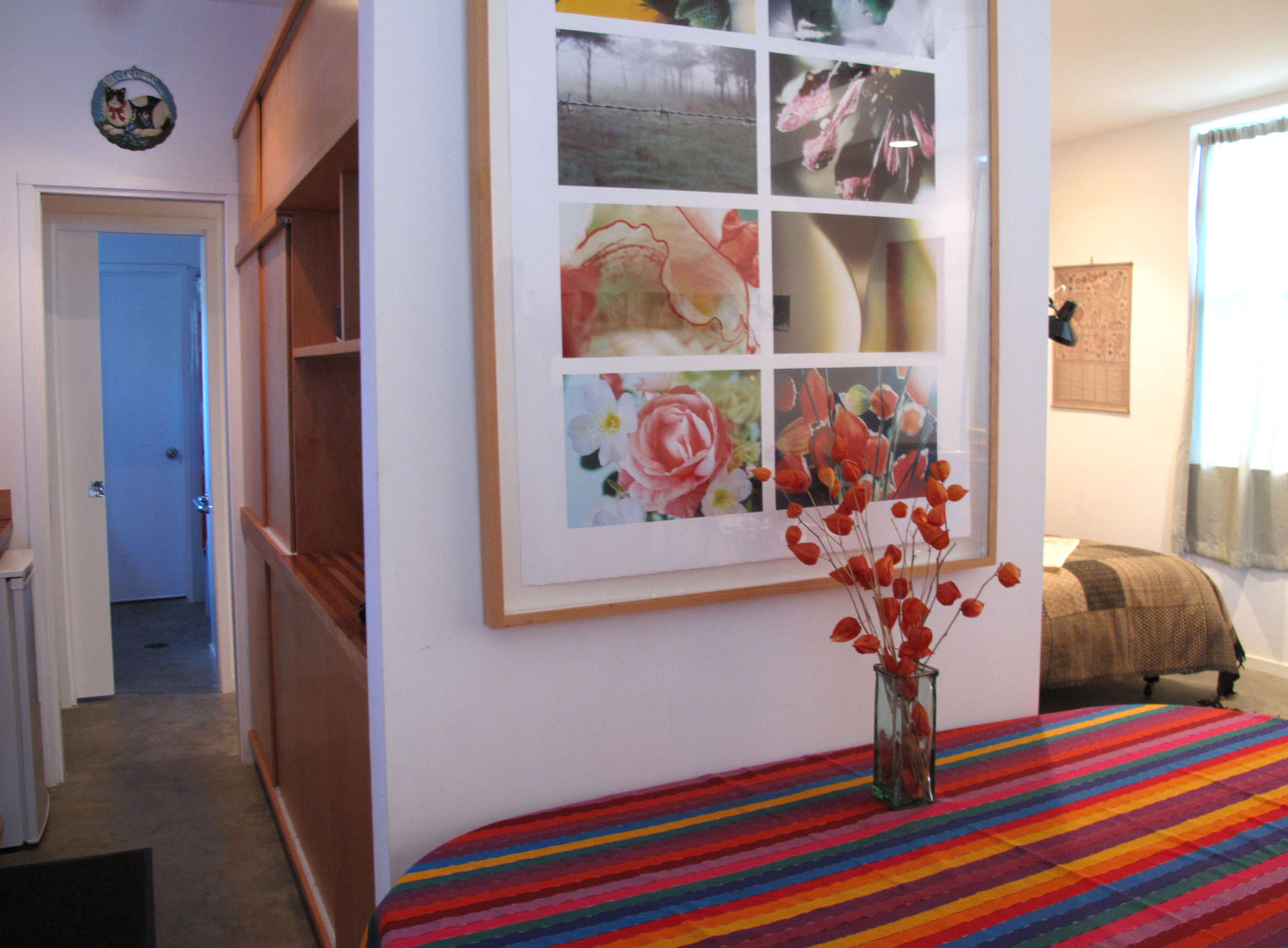
As exhibition designers the Eames were early conduits for the science/art crossover. Famous for information rich environments honoring physics to mathematics to early computer technology. As a designer working on interactives at the Exploratorium, I was thrilled to see this old example:
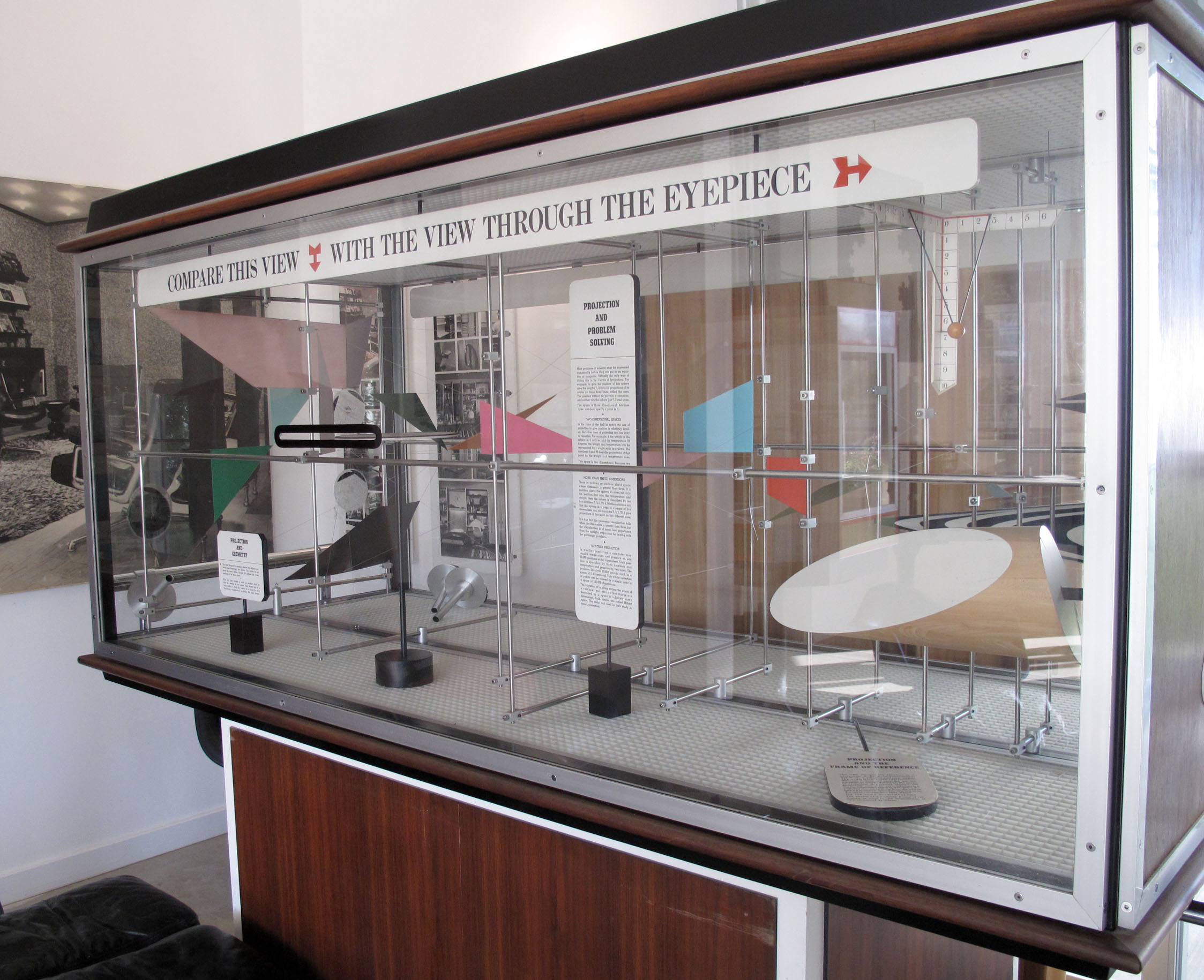

It's interesting to consider that their charming and complex graphics would be considered too dense for today's design approach, inaccessible in some ways.


I couldn't photograph it, but i want to describe my favorite moment; looking into flat file drawers full of the tiny model people used in exhibition design models. They photographed a group of their friends, meticulously printed each of them at about 6 different scales in the darkroom, mounted them on cardboard and carefully cut around each figures. That's how they did things.
Portland, Oregon. My favorite core exhibit at the Jewish Museum and Center for Holocaust Education uses flip panels as a powerful way to present positive and negative social forces, back to back. Since no museum is neutral, color reinforces the positive bias.

The panels look at Jewish history in Oregon through the lens of tools of discrimination (Scapegoat, Intimidate, Appropriate, Segregate, Exclude and Dehumanize) using black and red, on one side...

.....and tools of resistance (Persist, Create, Celebrate, Protest, Organize, and Reform) using color, on the other side


"Spin" suggest twirling the panels casually, but the experience calls for a slower "Turn", a thoughtful consideration of contrasting forces, and the power of choice.

The theme is reinforced using floor graphics circling a nearby display that amplifies the same dilemma with examples of issues beyond the jewish community.


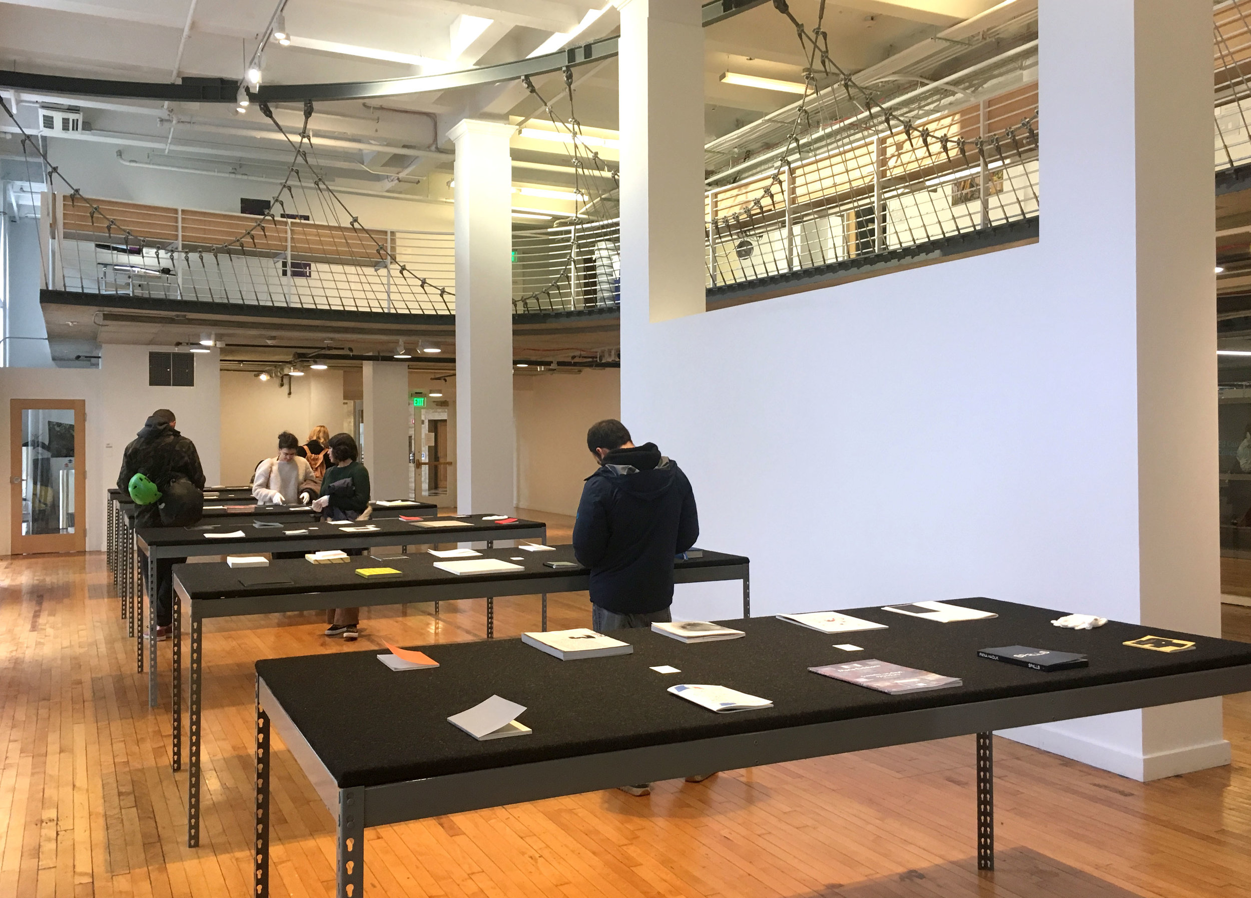
Portland, Oregon. What are the unique qualities of campus exhibition venues, situated in the context of a learning environment? Student energy seems like a real, or implied factor, because school is a place of youthful struggle and transformation. I went to a book arts lecture and related exhibition "Projects for the Page" at Pacific Northwest College of Art.

This PNCA building is a renovated post office building.


A minimal tabletop presentation, with white gloves provided to touch the fragile books.


PNCA wayfinding captures the studio mood using splattered paint within the typography

When students are accepted to the program, they are invited to respond with art.

Communication Design Poster

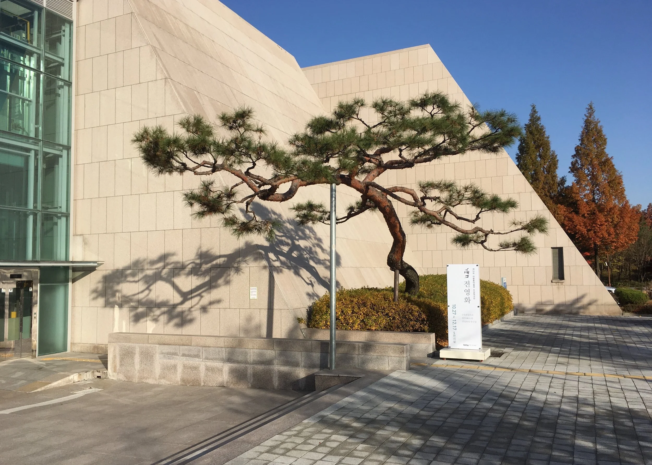
Daejeon, Korea. The most prominent sign at the entry of this art museum is the mysterious M1, which suggests a code on a city map?

The official title is more understated, pedestrian level at the beginning of the entry pathway.

A slice of the landscape through the cement wall comes first.


And then a tree.

Located around the side, these massive dimensional letters are practically hug-able.

Elegant slatted wood treatment in the galleries.

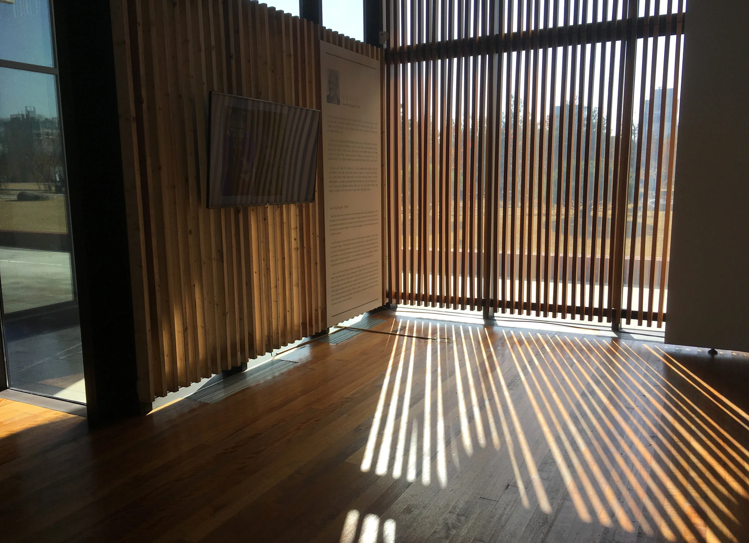
I always enjoy this detail, the changeable shadow effect of graphics on window shades

An english typographic treatment used for photos.


Daejeon, Korea. I borrowed a bicycle and peddled around the gorgeous Botanical Park where 2 museums are located. At the Daejeon Art Museum, the group exhibition "Variance of Objects" was well worth the visit. I wonder how intentional it is, the way this venerable tree is placed at the entry, so that the corner of the building folds it's shadow, so beautifully.

Translucent entry banners, which are right-reading from the street, are reversed to visitors as they enter on foot.


Icon in a permeable parking space

The lower entry doesn't get a lot of traffic in the morning

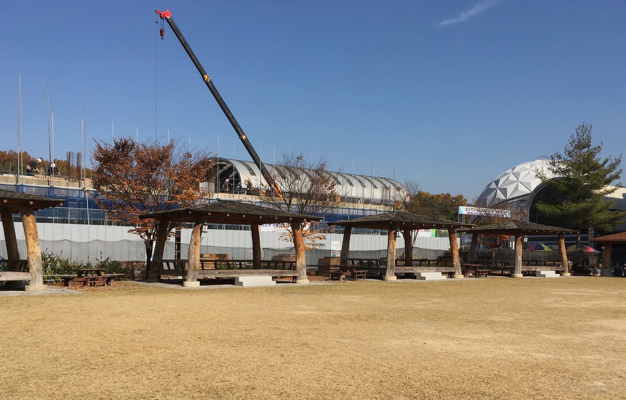
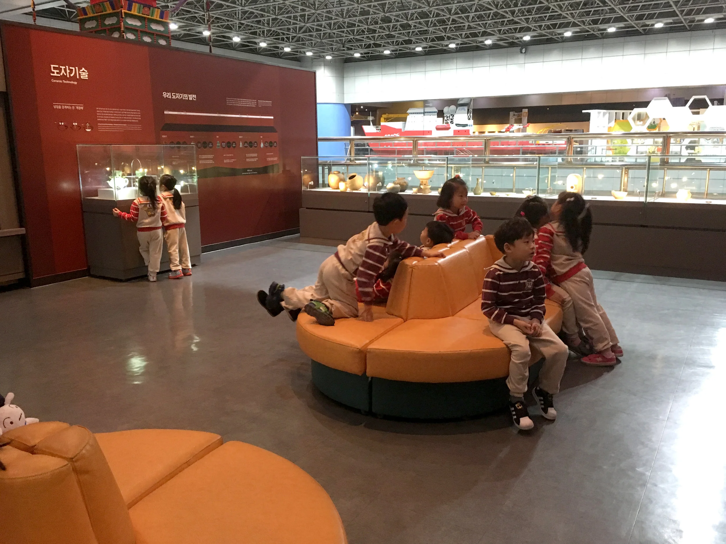
Daejeon, Korea. (ISSM Conference) I was invited to speak at this conference held at the National Science Museum. When I got a short break from our wonderful Korean hosts, I took a self-guided tour, sprinting through the museum.

Modern architecture side by side with traditional pavilions, which are probably used for visitor lunch time and museum events.
The interior is a cavernous patchwork of exhibition areas, delineated by lower wall partitions, without much transition or pacing from area to area.
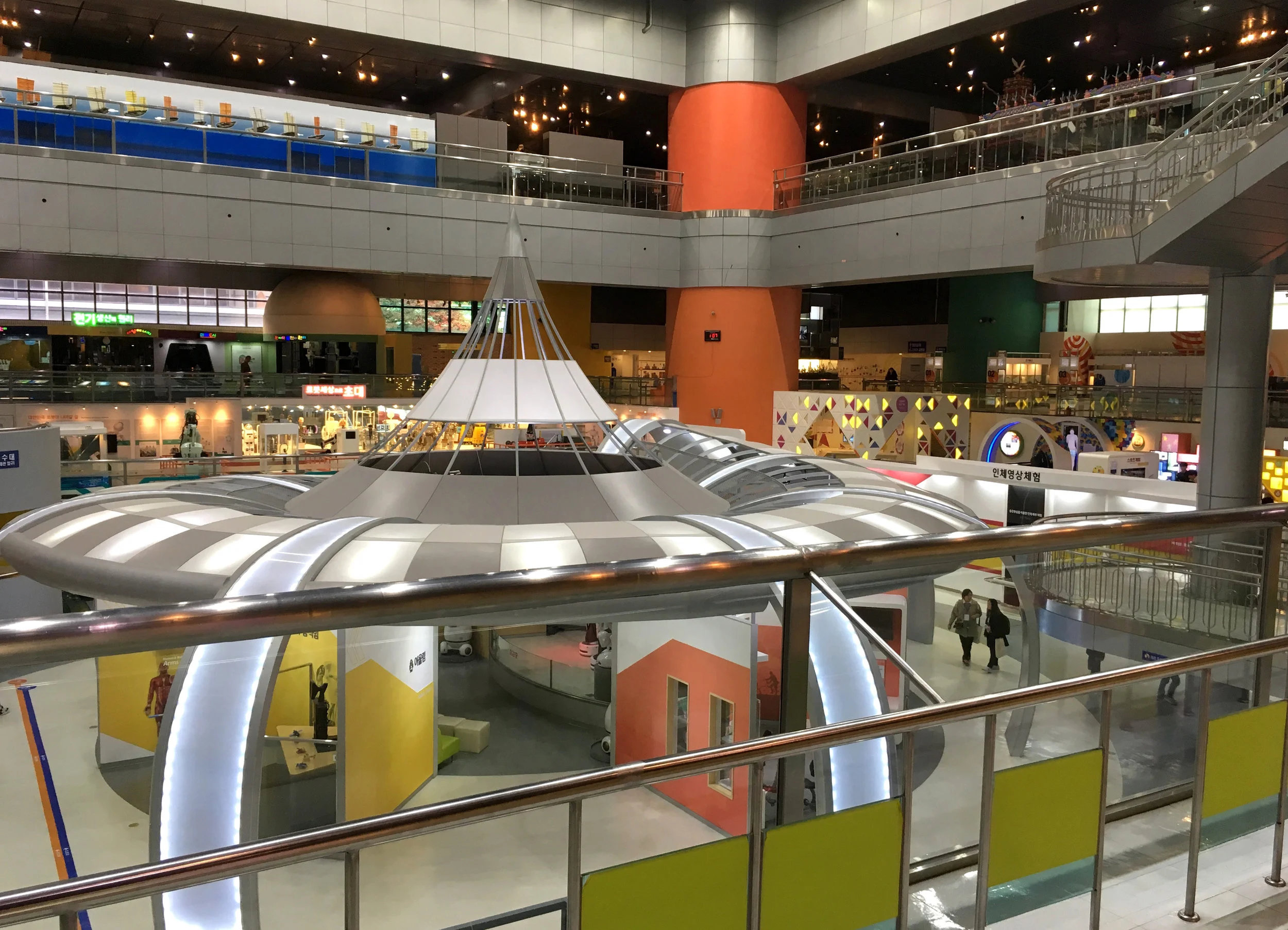
This science museum aesthetic reminds me of a shopping center. Everything competes for the same level of attention, as if for shoppers, who may be driven more by distraction than attraction. There is a slightly dazed sense that we could be anywhere in the world.

Especially in this context, it's interesting to see how local cultural aesthetic permeates the more generic design approach. In a section about nuclear technology, models are treated as exquisite jewels, set into a wall geometry suggesting origami.


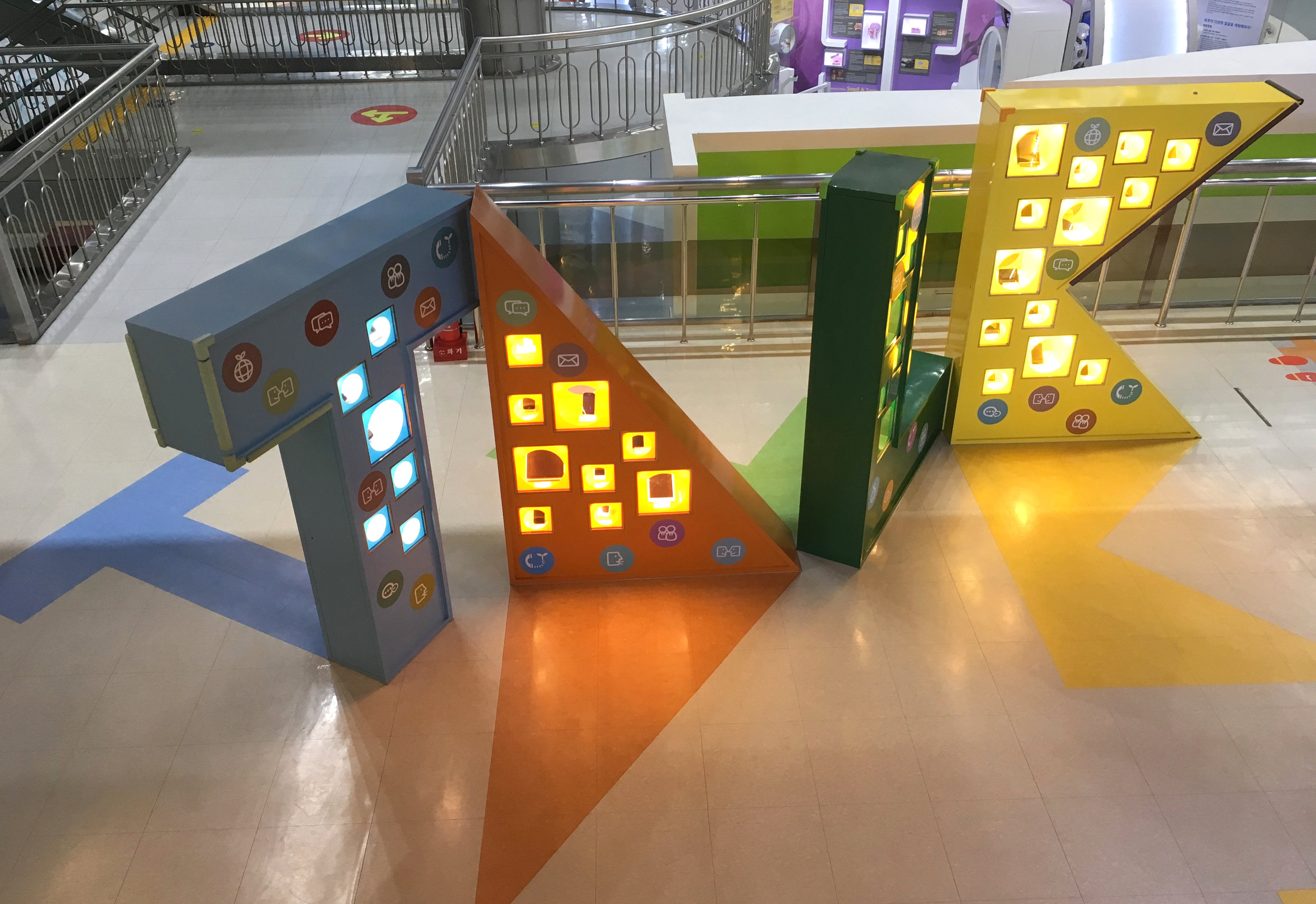
Visually elaborate icons are pervasive. I hoped they would help me read meaning, as a non Korean speaker, but for me it was hard work.

The choice of colors used with old artifacts and elaborate colorful animations.


The entry to the alcove about kimchee is elegant, and welcoming, like a bow.


English appears only with some titles, but like everywhere in the world, it also appears here and there as a "global" design element.
I confess as a westerner, my amazement that the ever popular outlined typography can be legible with alphabet systems such as this Korean Hangul.

At a science museum like this, a variety of design is no surprise. When some sections, like these, are visually simpler, with clearer focus, I wonder if it is due in part to a sponsor's involvement (?)


Like this history of technology area,

with white space, and an interaction between grey images and real shadows from the objects.

The lighting on this massive 4 sided, multi-tiered tower turned off and on in different vitrines, synchronized with related videos.

As usual, the (Korean) history of science and technology is located in a quieter area, top floor. As often happens, the historical area of the science museum shifts suddenly to the history museum stereotype, more dignified and restful for visitors.

The objects were stunning.

Science feels qualitatively different in a historical context. It meshes with culture, art, function, and belief systems, intrinsically. Even if the connections are not explained, they are still implied, effortlessly. Why is it more difficult to convey or to sense this relevance with current content?

In this world of busy icons, a plain rectangular icon is mysterious.

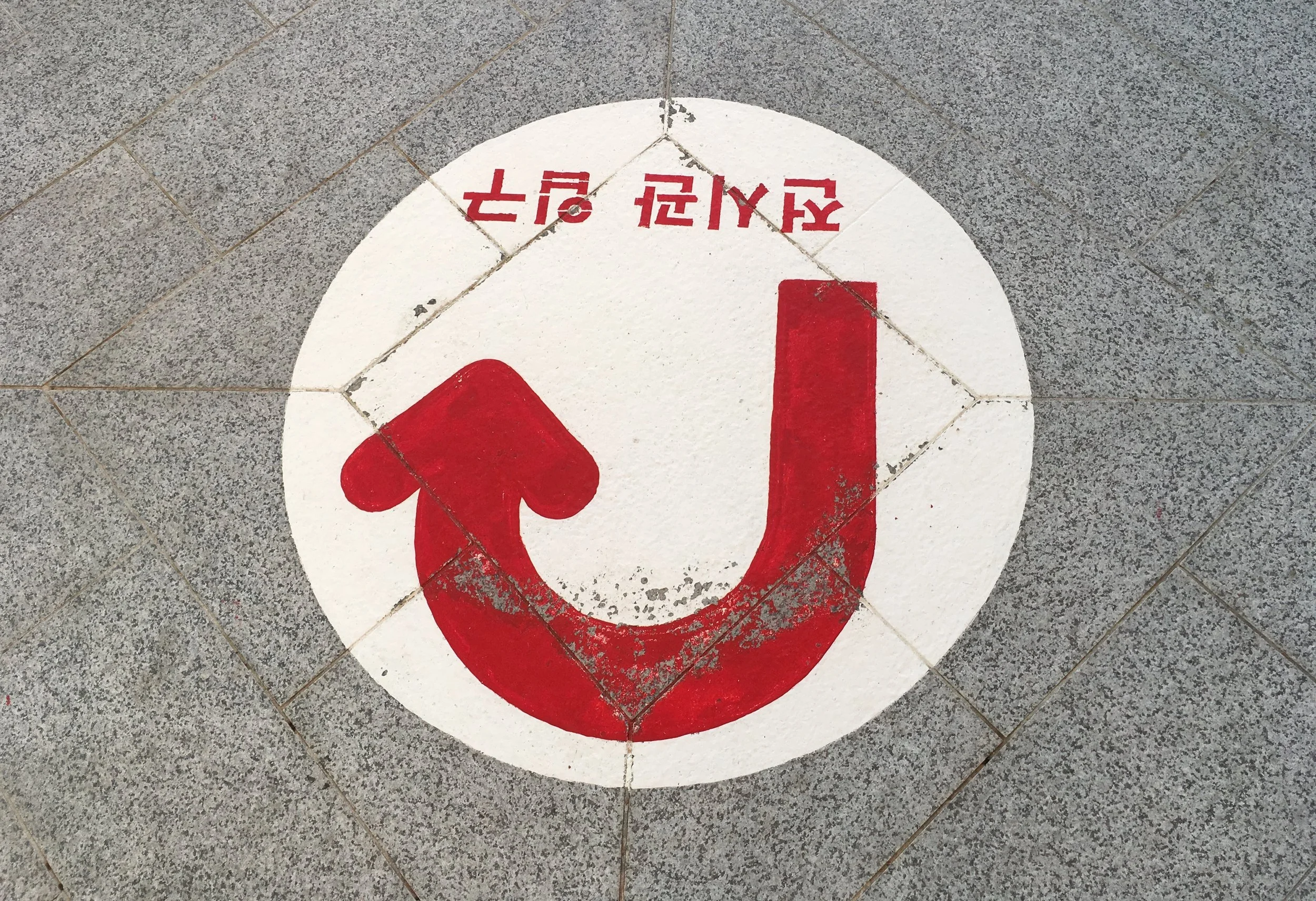
A gigantic ancient map of Korea is displayed on a curved vertical surface to make it easier to view as a whole.


I know it's a bizarre practice to sprint through a museum, looking at the design without diving into the actual experience and content! It's ironic too, because form follows _________(you name it). Perhaps it's dangerous, and maybe not "better than nothing". For me it raises my awareness about the most automatic, unconscious design associations we make.
I returned to the conference feeling grateful for the invitation to Daejeon, and lucky to be part of the cultural exchange within the museum world.

Michigan, roadside. Hope is free. But to go back in time costs a dollar.


San Francisco, CA. Does physics matter in logos? Maybe only to veterans of science museum work. Fed Ex Kinko's logo is a rearrangement of the original FedEx typographic colors. In the window of a printing service center, the three overlapping shapes seem to imply color primaries. Print primaries are magenta, cyan, and yellow, which would combine to make blackish in the center. But the logo uses light primaries—red, green and blue, which should combine to make white in the center, where it's dark blue.

San Francisco. The artifacts are incredible, but I couldn't help admiring the vitrines as well, in "Teotihuacan, City of Water, City of Fire" at the De Young Museum. The pedestals are stepped at the bottom giving them extra weight and presence, like the architecture the artifacts would feel at home in.


Even where a base might not be neccessary, the pedestal adds something to the presentation.

Freestanding vitrines have various stepped pedestals set inside a full sized plex box.

So the plex seems to float, giving the artifacts breathing room.

San Francisco. Simple typographic street art, beautifully constructed, with plastic x shapes tucked into and zip tied to a chain link fence.

The result is a sarcastic embroidered message on a homeless block in the mission. These chain link fences are put up as a deterrent to homeless encampments in some parts of the city. According to the artist, "I don't pretend this is going to solve anything, but I wanted it to get people, like me, to do a double take—to build awareness and empathy.”

When I took the photo, the sliding gate was open, so that "Home" is behind "Street"...

...creating an interesting double layer.

San Francisco. Exhibition and narrative are ubiquitous, including where we eat, and drink. Random objects and images displayed in restaurants and bars may be campy, and overly designed interiors may be vaguely artificial. But sometimes the story of the place and it's clientele is an authentic narrative, organically evolved and expressed from the inside out. And sometimes artifacts are smartly integrated in the space, teaching us a thing or two about exhibition design. This is true of a little seafood restaurant in my neighborhood.

The space is small, oddly shaped and split, but the many columns and corners are well incorporated as vertical display space.


There's a humble pleasure in ordinary spaces that are nicely arranged, whether it's someone's living room or a little restaurant. The negative spaces are not jarring. Flat and dimensional elements are integrated from floor to ceiling. Evidence of real TLC without too much or too little. Pulleys and ropes tie it all together.

Dignified "Most Oysters Eaten" awards, and 2 small "found pearl" vitrines add relevance through diner's participation, like signed photos of celebrities.

The window-framed monitor runs continous clips from black and white seafaring movies, such as the classic "Moby Dick".

The movie clips give the illusion of an expanse "outside", extending the little space with a sense of motion and sound. Rolling waves and seagull's cries convey the mythical drama of the sea.

Objects include historically dated hooks, reels, traps, measuring gauges, scrimshaw. All are simply labeled, and respectful of the fishermen's craft.

Little treasures include a yellowed article on kitchen hypnotism to calm a lobster.


Perhaps the narrative details in these environments are delightful because we encounter them in our "down time" in non-museum spaces, where it isn't expected and narratives are free to find meaning without official analysis. In our living rooms, we're not required to display personal objects, but we do out of our innate human need to find meaning and beauty in our story.
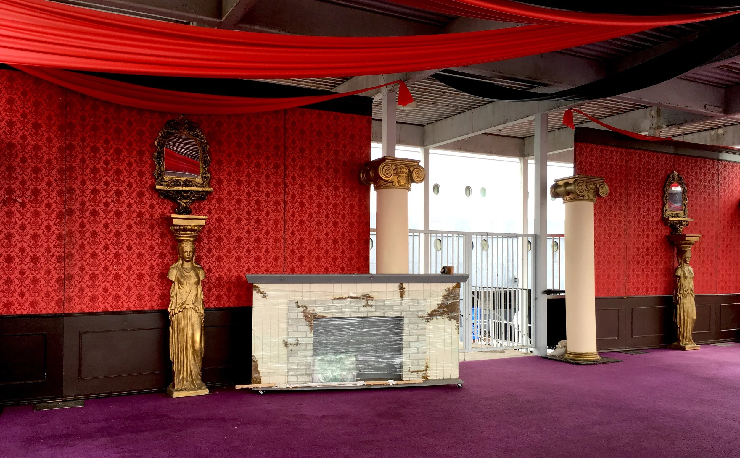
Long Beach, CA. I had 2 hours to wait at the docks, to pick up someone from a cruise ship. So it seemed appropriate to kill that time on another cruise ship. The Queen Mary is a museum, and a hotel with dining and shops. It's a venue for nightlife, team building scavenger hunts and multicultural weddings. It even has a Russian submarine on a leash. It's on the water of course, not on a sea of grass.

Outdoor photo murals often have a surreal quality, especially when the image is mounted on the the real thing it represents. Here the image goes back in time, and distance, like a parent, or a baby in the belly of the ship.

A photo of an excited traveler boarding the maiden voyage is so welcoming, I wish I could move it to the actual ticket entry, which is far away. These 2 great photos are splintered by a third one with bad corner cropping.

The space between the boat and the land is a "behind the scenes" that can't be hidden, a work area full of umbilical chords and other bridges that turn a ship into a building.


Actual views of the ship are hard to see. An elevator tower obscures the view at the entry, which is (sort of) part of the hotel reception, but around the corner.


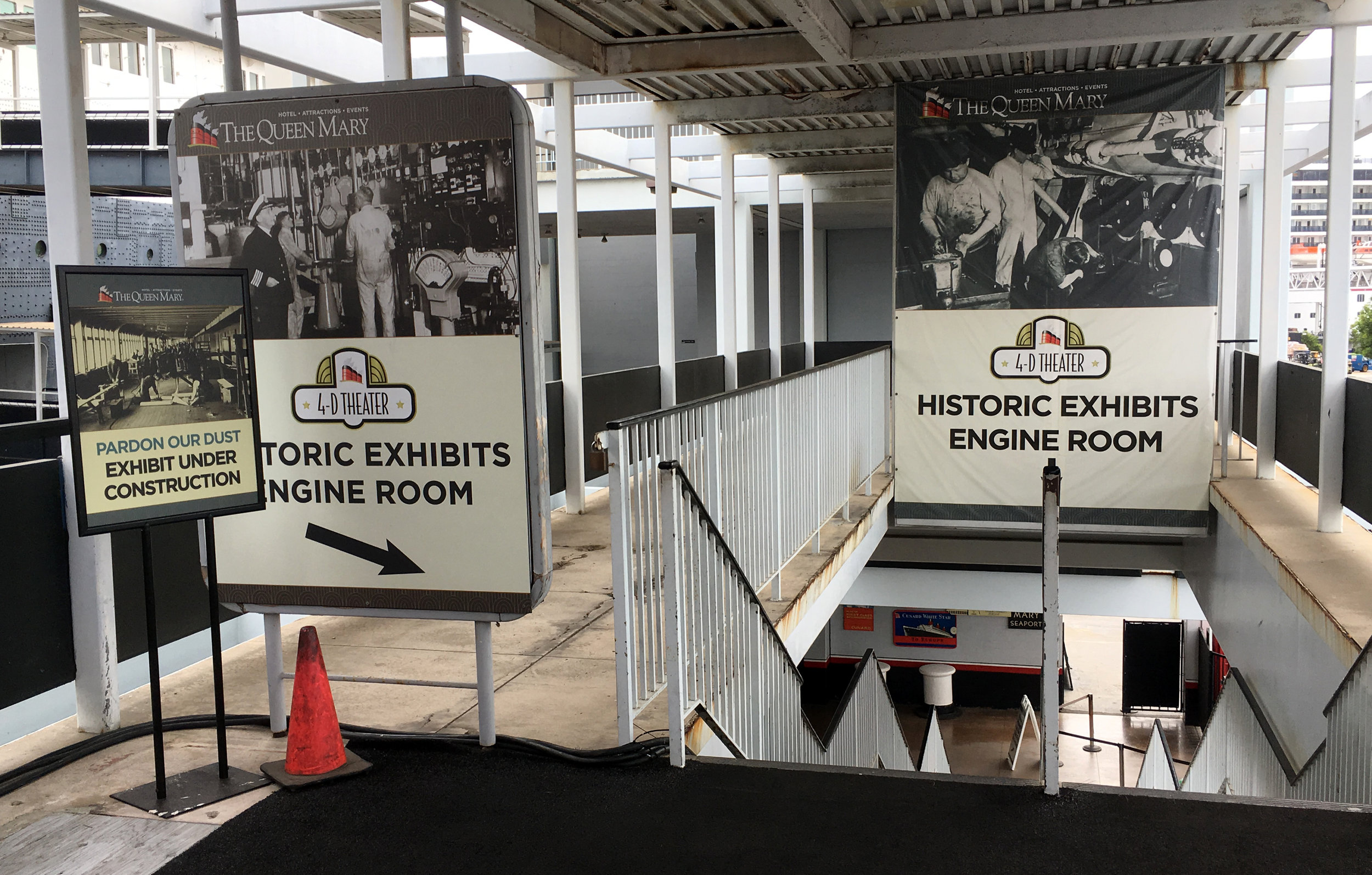
It's confusing to buy a ticket, called a "passport", because there are so many packages to decipher, called "voyages". Most of them involve special tours or shows, on various themes, including an evening paranormal tour. Because the idea of "boarding" the museum as an actual passenger is so enticing, why not do it in a realistic way?

The cheapest ticket visitors (like lower class passengers) are sent directly down a long ramp to the engine room at the stern. The walkway is melancholy, strewn with residual event decorations and furniture.

Double signage is like fighting fire with fire.
The Queen Mary is a historic Art Deco jewel.

But the logotype is traditional serif. Next to it is some deco wayfinding (MB Picturehouse or Nova Deco?)

This painful deco treatment is probably older, no longer in use.

Other aspects of the wayfinding are based on the simpler cruiseline font

The overwhelming array of options reappear at the real museum entry.


Beautiful deco wall.

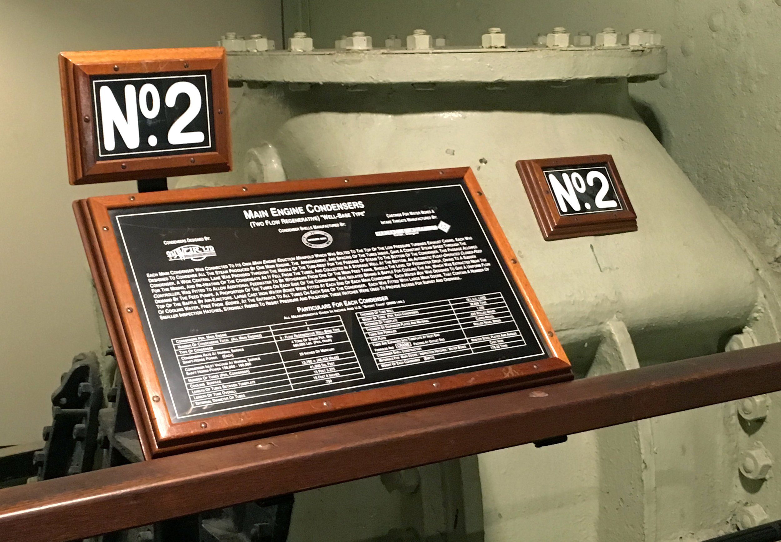
The original typography on the ship's controls, hand-shaped and spaced to fit the wedge.

Heavy wooden frames on the engine labels.
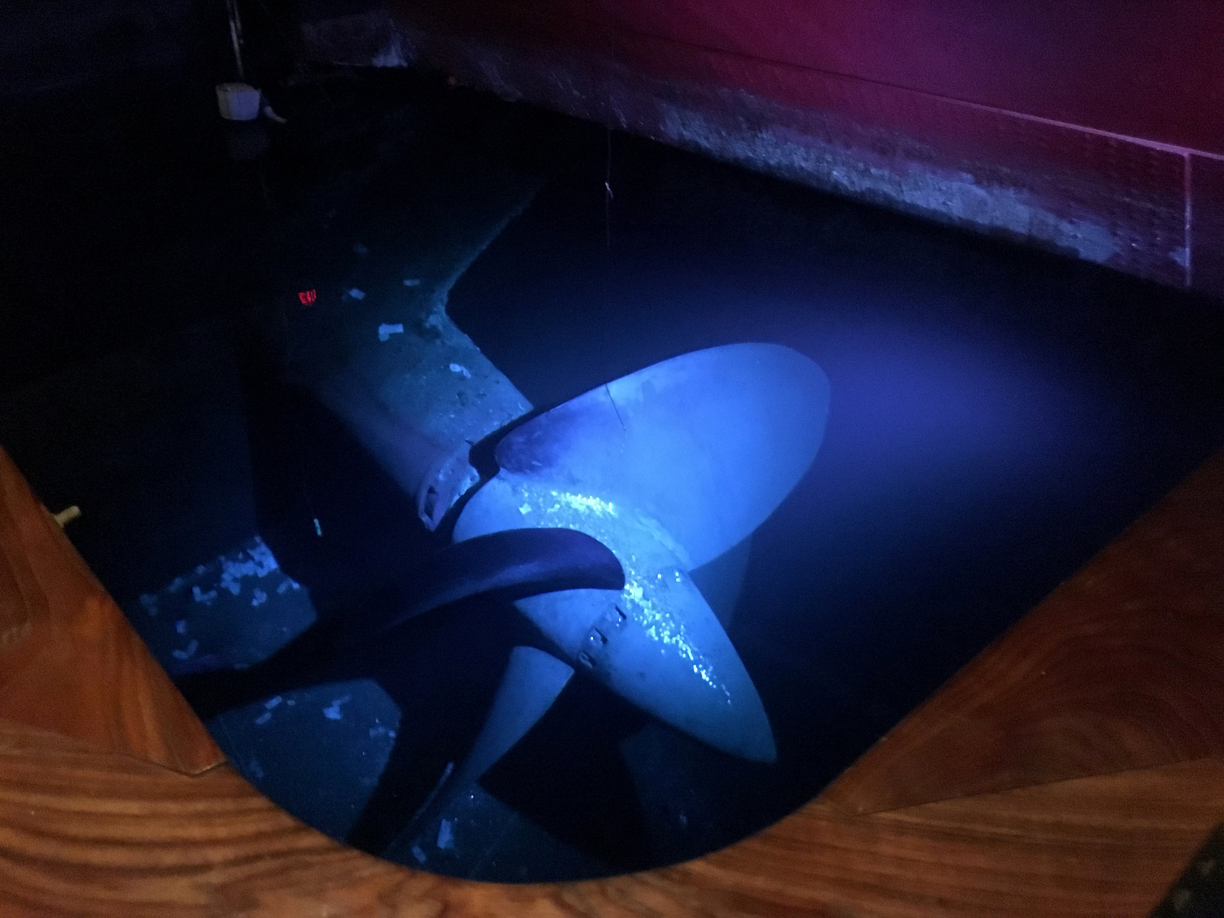
This dark alcove walkway for viewing the actual propeller under water was really moody. It had whatever quality it is (hope, fear) that compels people to throw coins.
The museum has the dense claustrophobic quality of a ship, and the personal stories have the fleeting, temporal quality of a passenger.


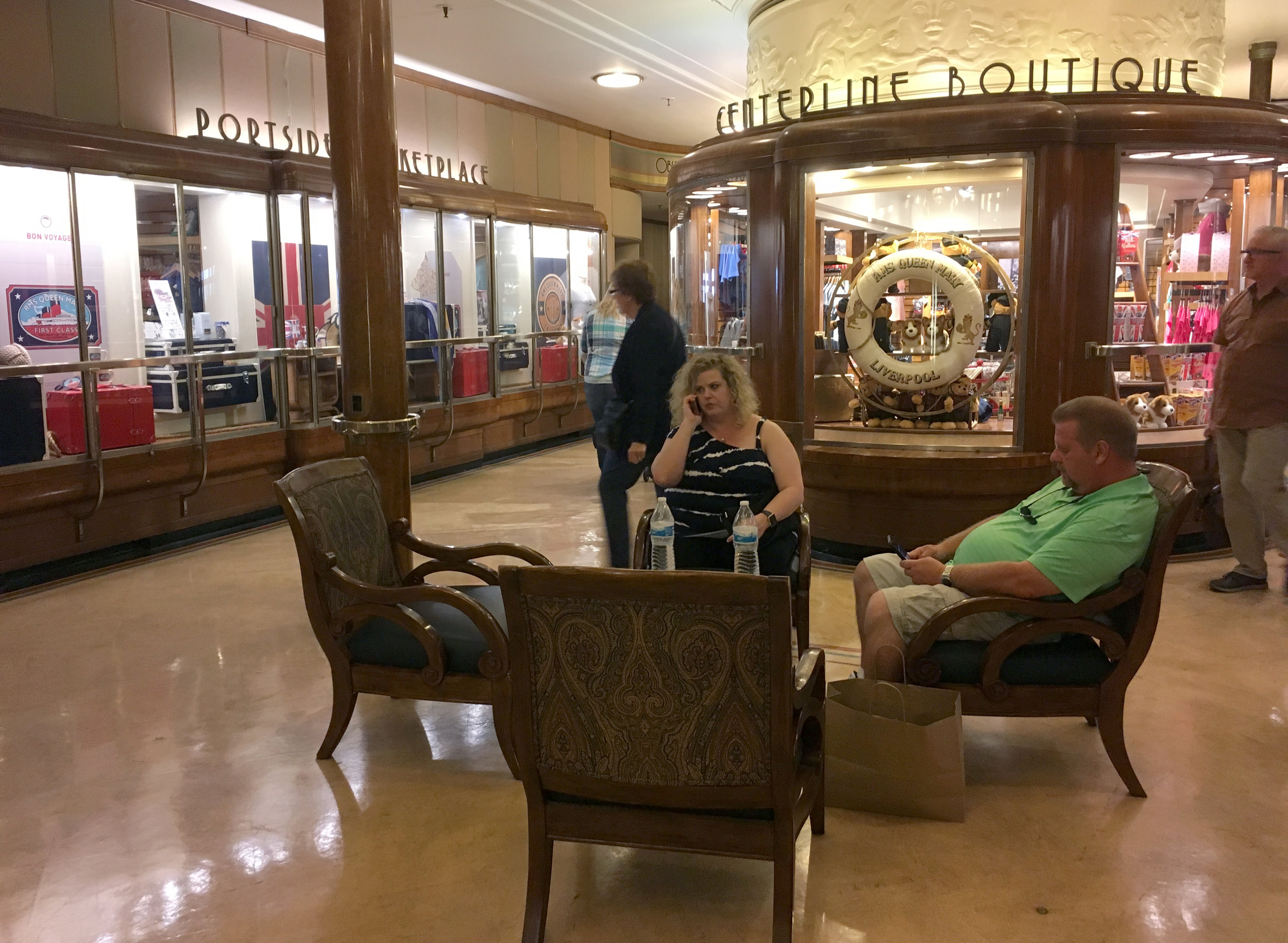
At the upper level, the ship becomes a common ground for tours, hotel, shopping, dining, conference, photo studio, with other exhibits somewhere in the mix.
Photos and anecdotes of non celebrity passengers help make it accessible.


A Lego ship model and lego building stations

A Lego mosaic
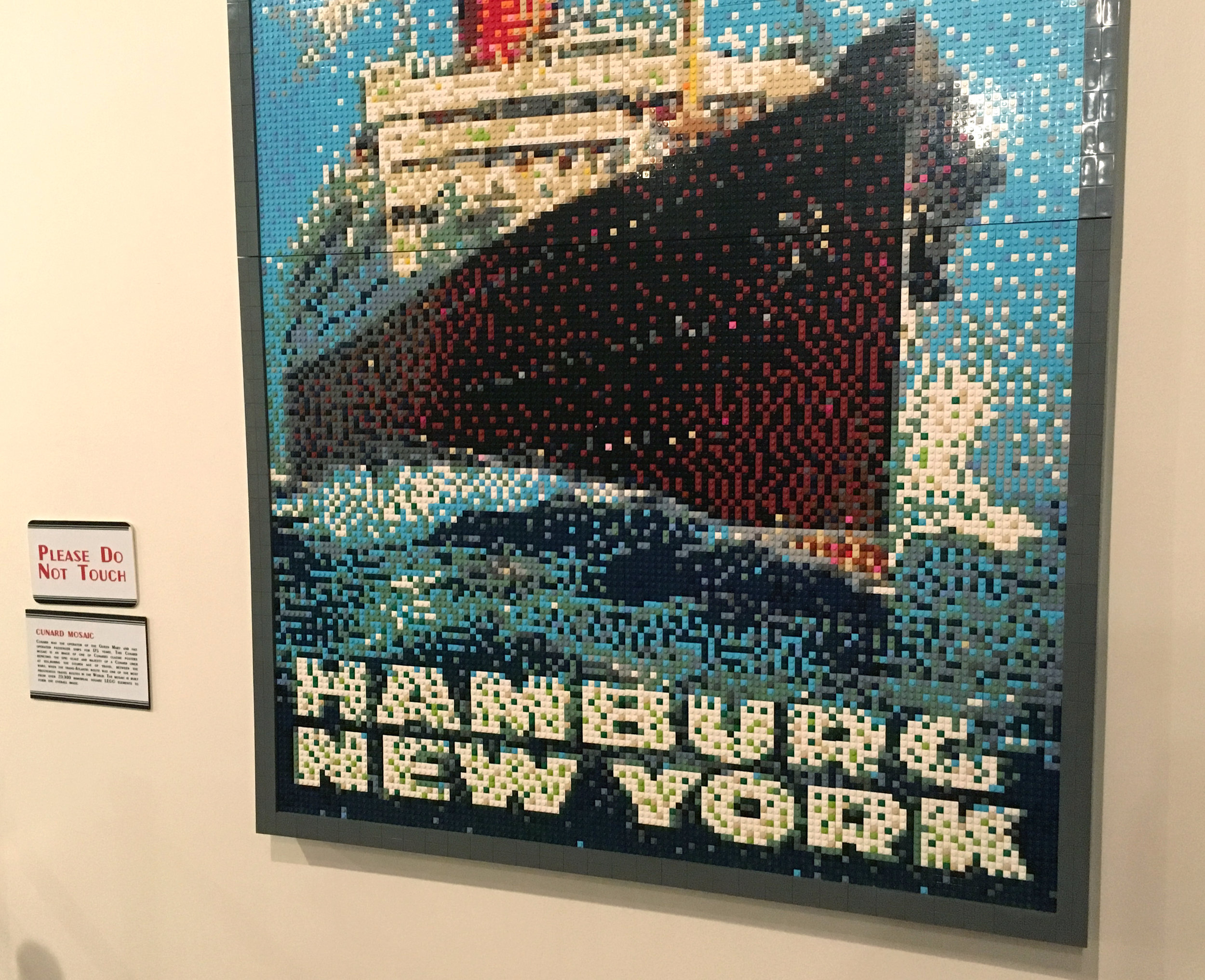
So the photo mural texture is probably Lego inspired.

Starbucks on the promenade deck just doesn't seem right.

Lifeboats will not be needed.

The ship's natural landscape is the sea, but as a visitor on a docked ship, we can't experience that. I wanted some of the windows to reveal a (photo) view of the vast expanse of the sea, the horizon.

The ship is bordered by a mini circus arena with a few amusement rides.

Next to this is the "Queen Mary's Dark Harbor, Fear Lives Here" exhibition. It could be under construction. It's hard to say because the aesthetic is wreckage. Like a home made spookhouse, but with an aspect of hollywood stage set design.

It's an interesting juxtaposition between this outdoor exhibition and the carnival. There's a messy boundary between museum exhibition and attraction. What are the roots, of true story and fantasy, in the fair and the circus?

Los Angeles. The Broad Museum. Viewing the work of a graphic designer on an art museum wall is always gratifying. Barbara Kruger's work seems as vital today as it did in the 80's & 90's.


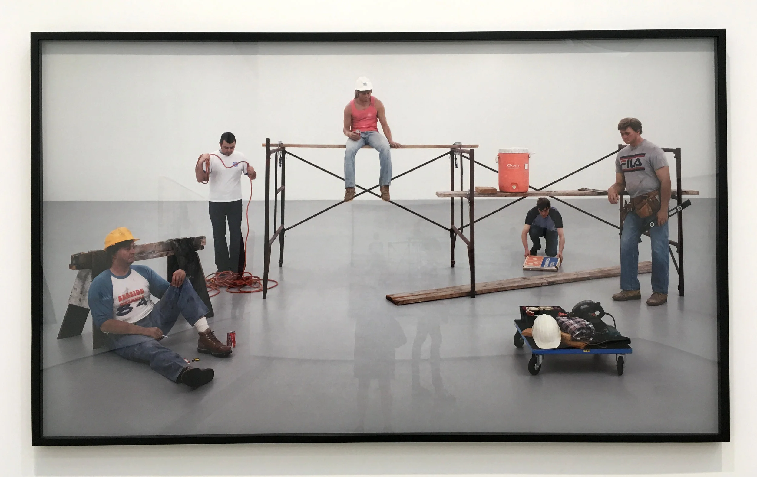
Los Angeles. The Broad Museum. Exhibition installation is a surreal performance in it's own right. Here, four photos of two (real) museum preparators in the process of installing three (Duane Hansen) figures, at the Scottish National Gallery of Modern Art. Sharon Lockhart describes it as a "synchronicity: the physicality and tools of labor, the interest of two artists in the beauty of the ordinary people, and the potential for artifice to expose a hidden layer of truth". The formally posed "set up" of the installation makes this even more amusing.


San Francisco, CA. One year, 14 countries, and more than 230 posts later, I've returned to SF and caught up with this Design Sabbatical blog. Looking more closely always reveals more. I realize now that Design to Go is a useful way to see and think, and I plan to keep the blog going... (after I catch my breath!)

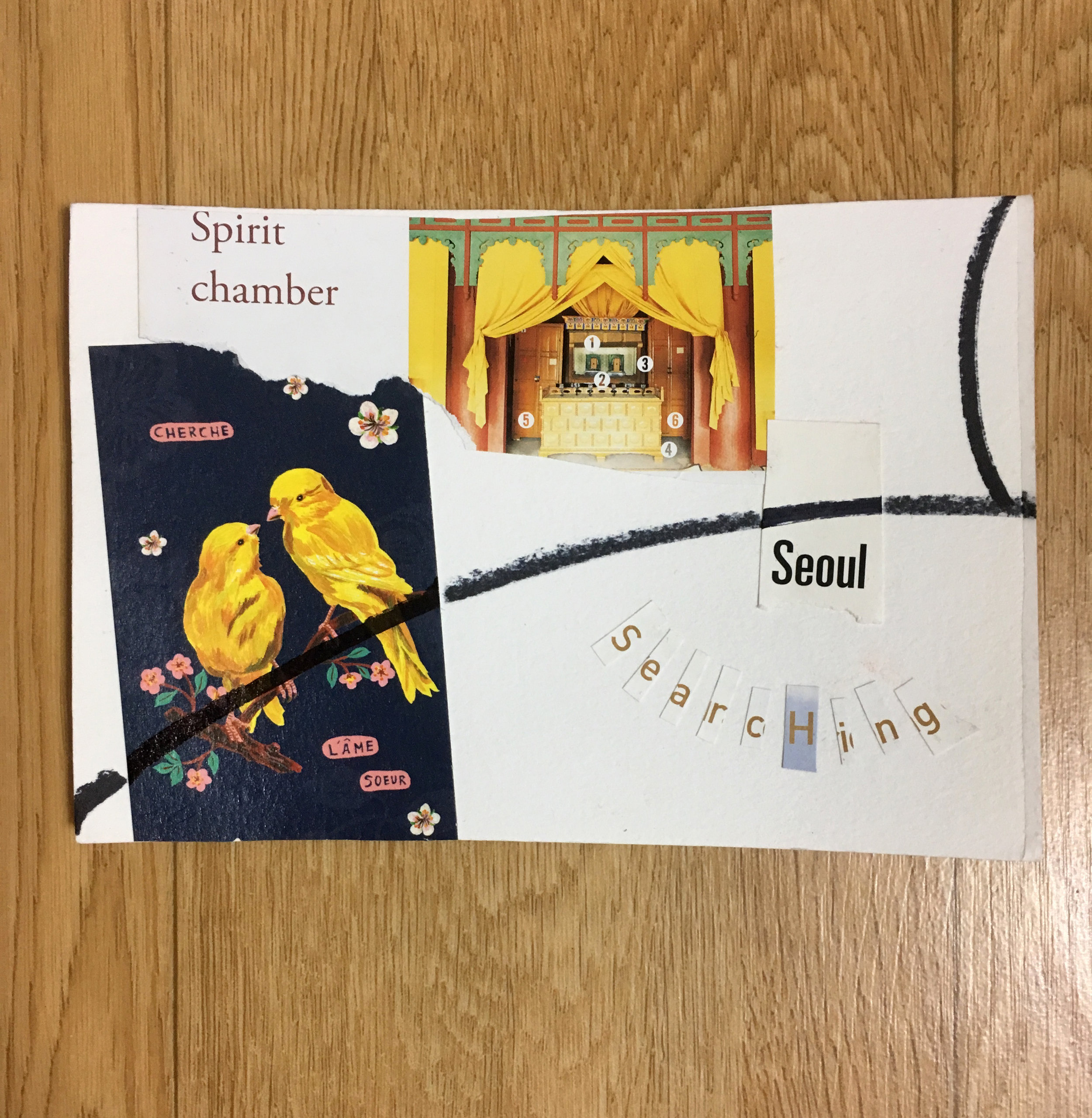
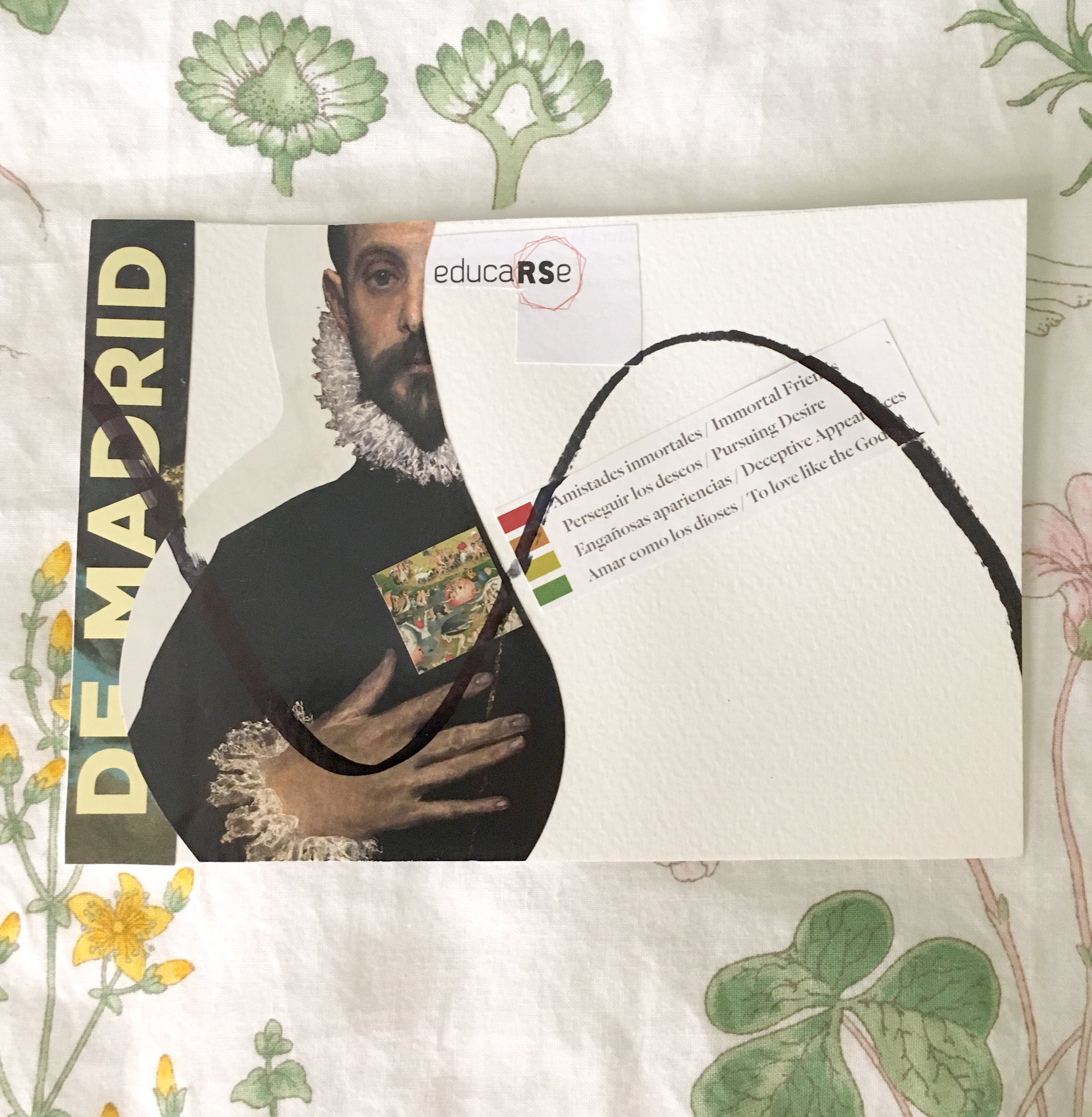
During my Design Sabbatical, I created postcard size collages to process my experiences on the road. I photographed each one on site, and then carried them home, arriving with 176 of them in my back pack. If graphic design is the arrangement of word and image to communicate a pre-determined message, then for me collage is graphic art in the service of mystery, an unconscious arrangement of found word and image to discover complex meanings. A visual poem of experience. This personal practice replenishes my design mind, so I have decided to continue it, whether I'm traveling or not.


One of my "misc" categories is food imagery, the craving expressed in large scale food photos.


London, England. A few examples


