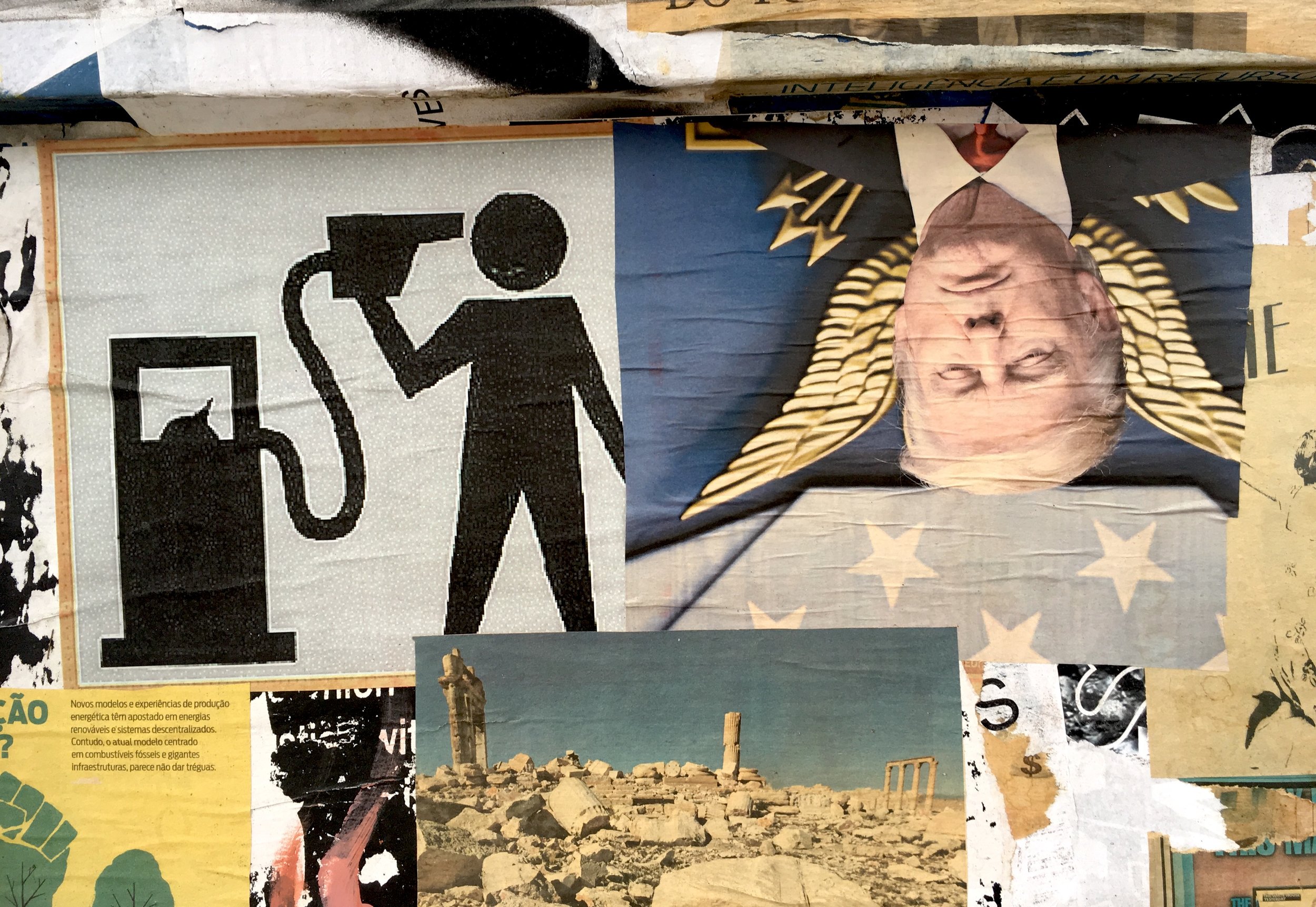
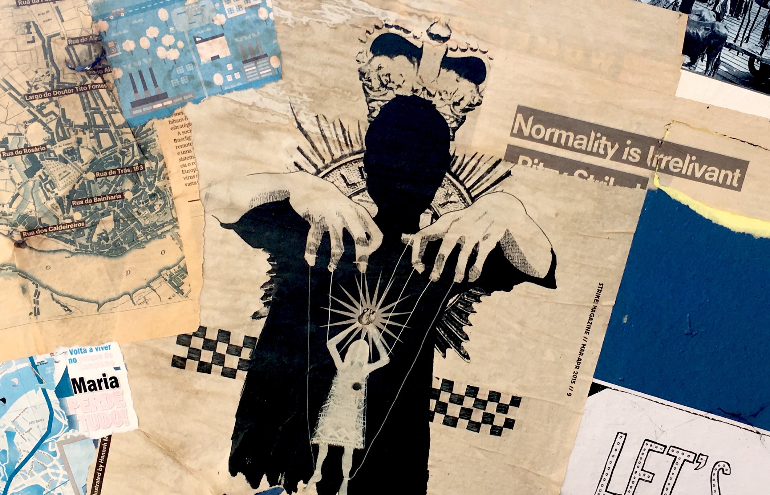
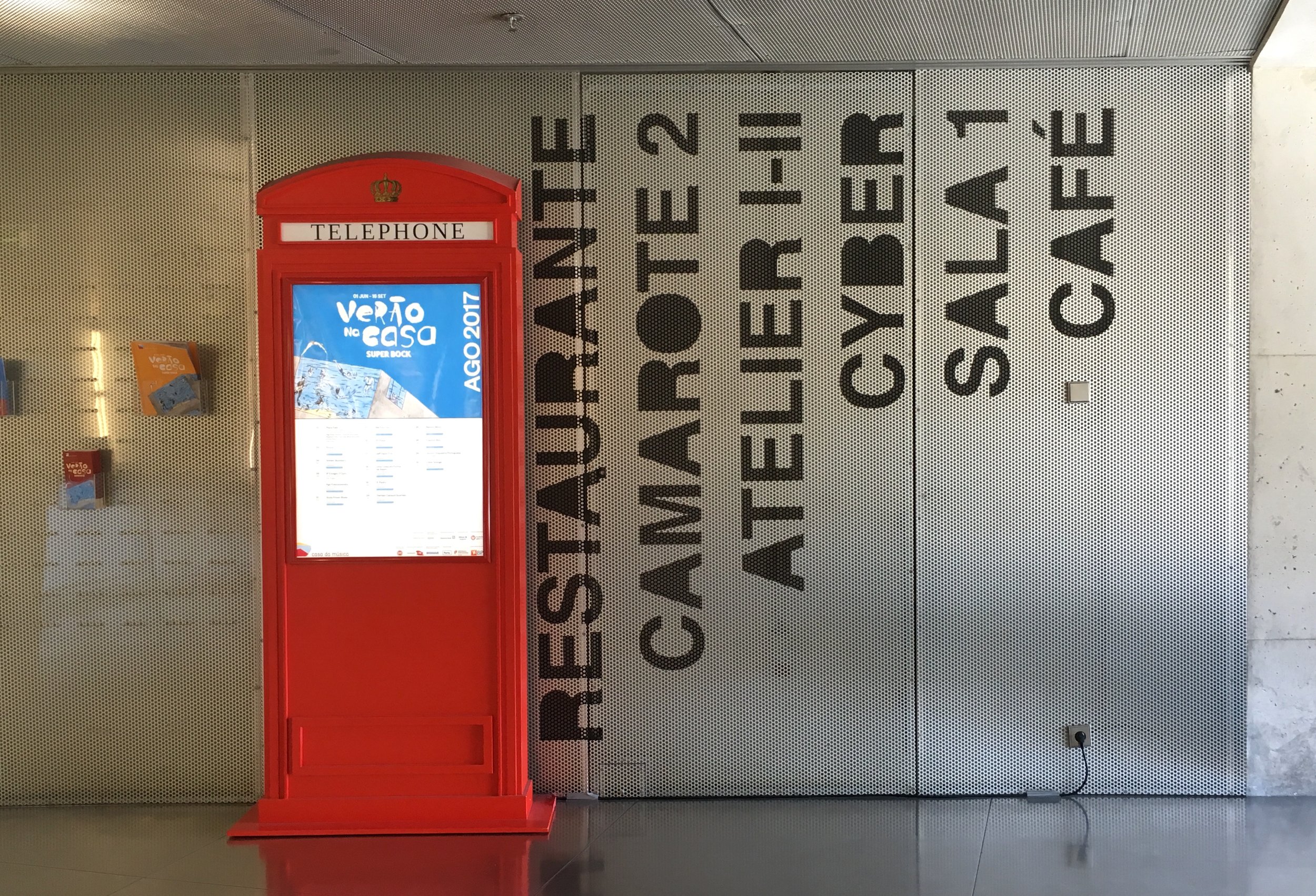
Kiosk (Porto)
Porto, Portugal. A news kiosk taken over by students of the Art school nearby.
Porto, Portugal. A news kiosk taken over by students of the Art school nearby.


Porto, Portugal. A whole field of rye was specially reserved and grown for this installation by Portuguese artist Alberto Carneiro. Bringing the raw force of nature into a museum is a powerful gesture.

The receptionist, who was sneezing and weeping a bit, pointed to the asthma and allergy warning by the entry. The atrium was densely sensual, dusty and aromatic, hushed by the muffled crunch of thick pillowy cut grass underfoot.

Porto, Portugal. The city is famous for it's blue and white tiles, and so is it's logo, a system of blue & white icons. They each represent a landmark or aspect of the city, used alone or "tiled" into patterns or landscapes. The effect is sometimes busy but always festive. The period after the city name has a touch of pride, a kind of "so there".


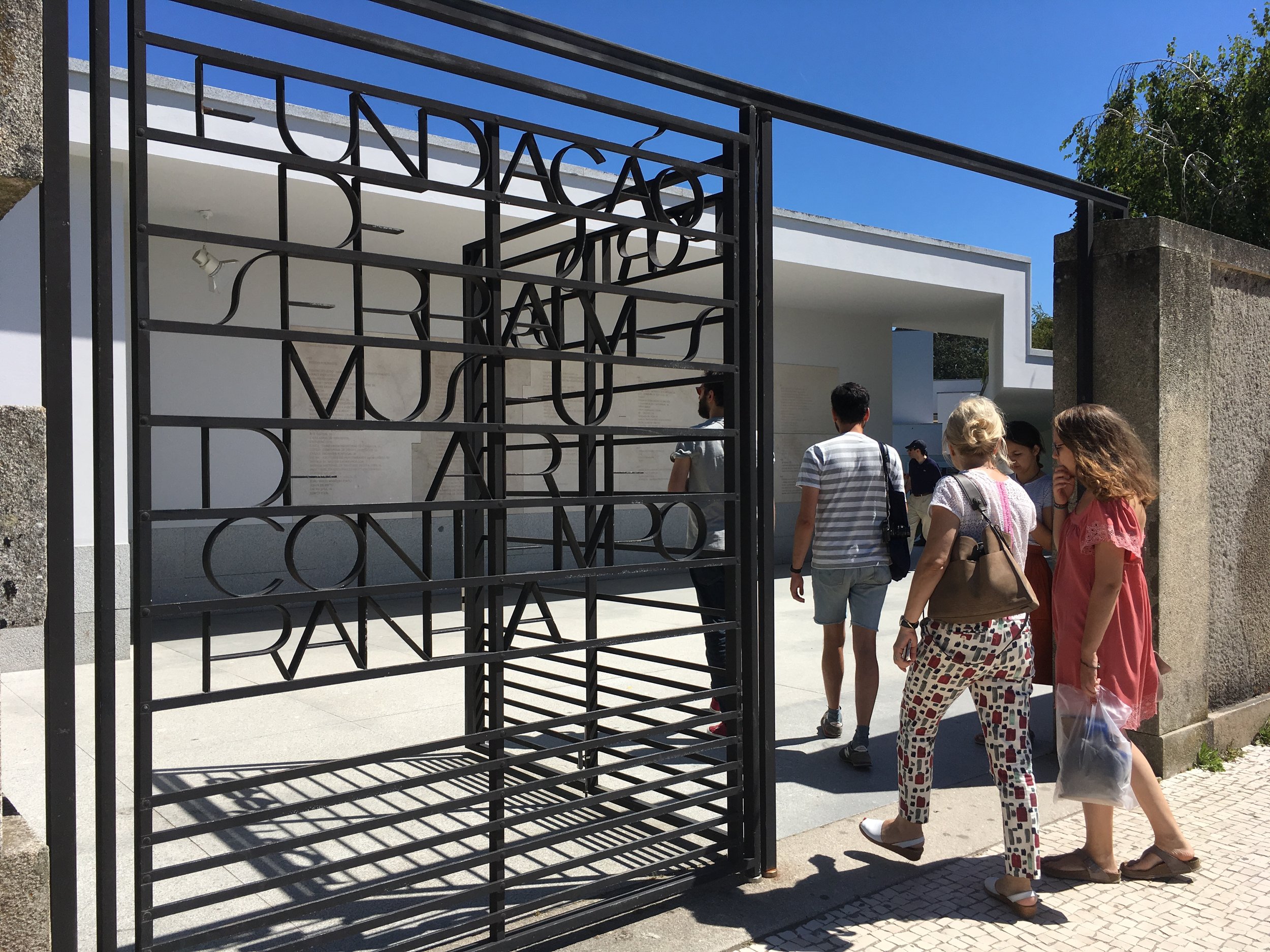
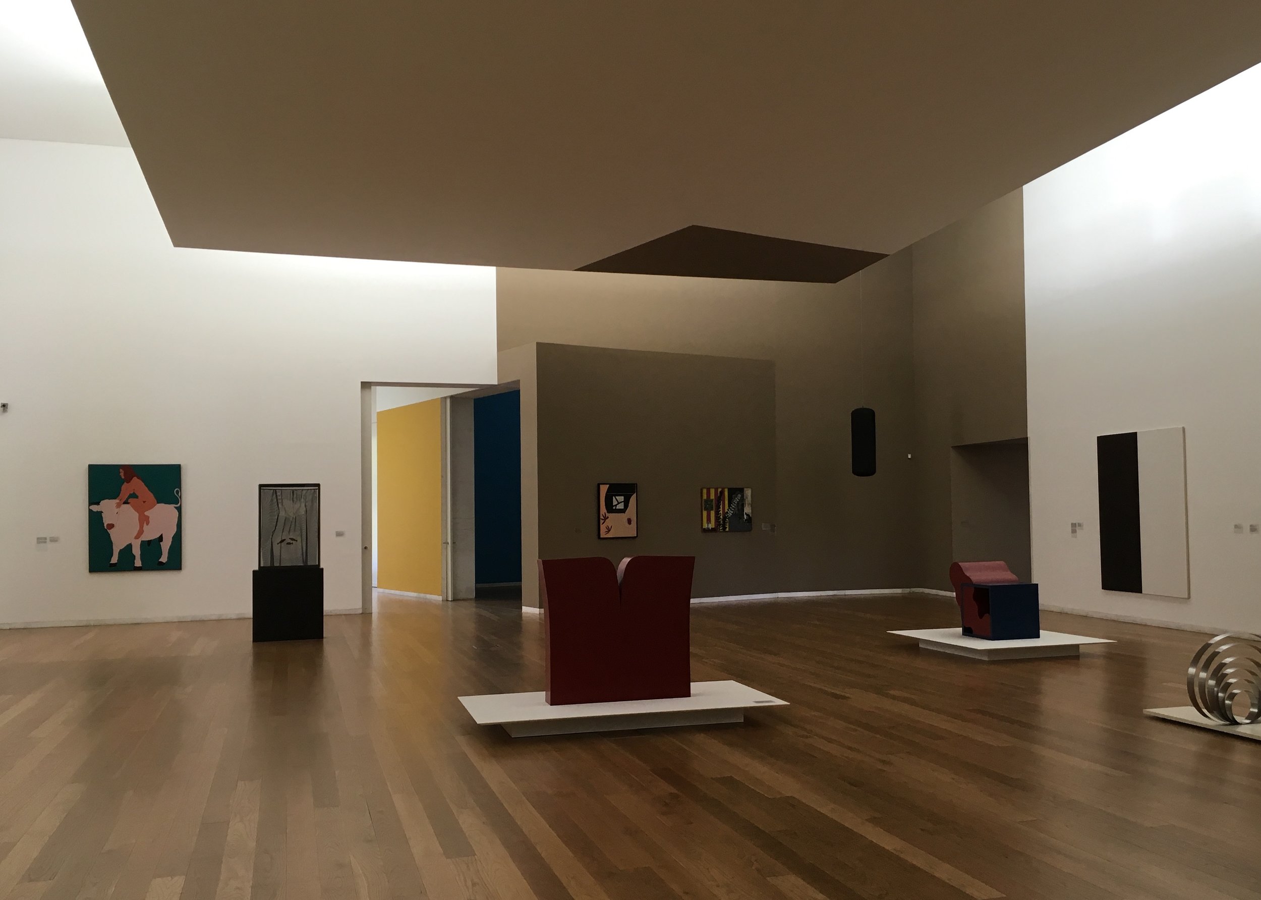
Porto, Portugal. Designed by local architect Alvaro Siza, the modern art museum is built within the grounds of an old villa estate with an extensive sculpture garden.

The shaping of the galleries is unusual, and the wall color treatment even more unusual.


The old art deco villa is a separate venue for art installations


Guimares, Portugal. A sign of change, even in small towns. Locals on their smart phones instead of checkerboards. Next to the hashtag sculpture.

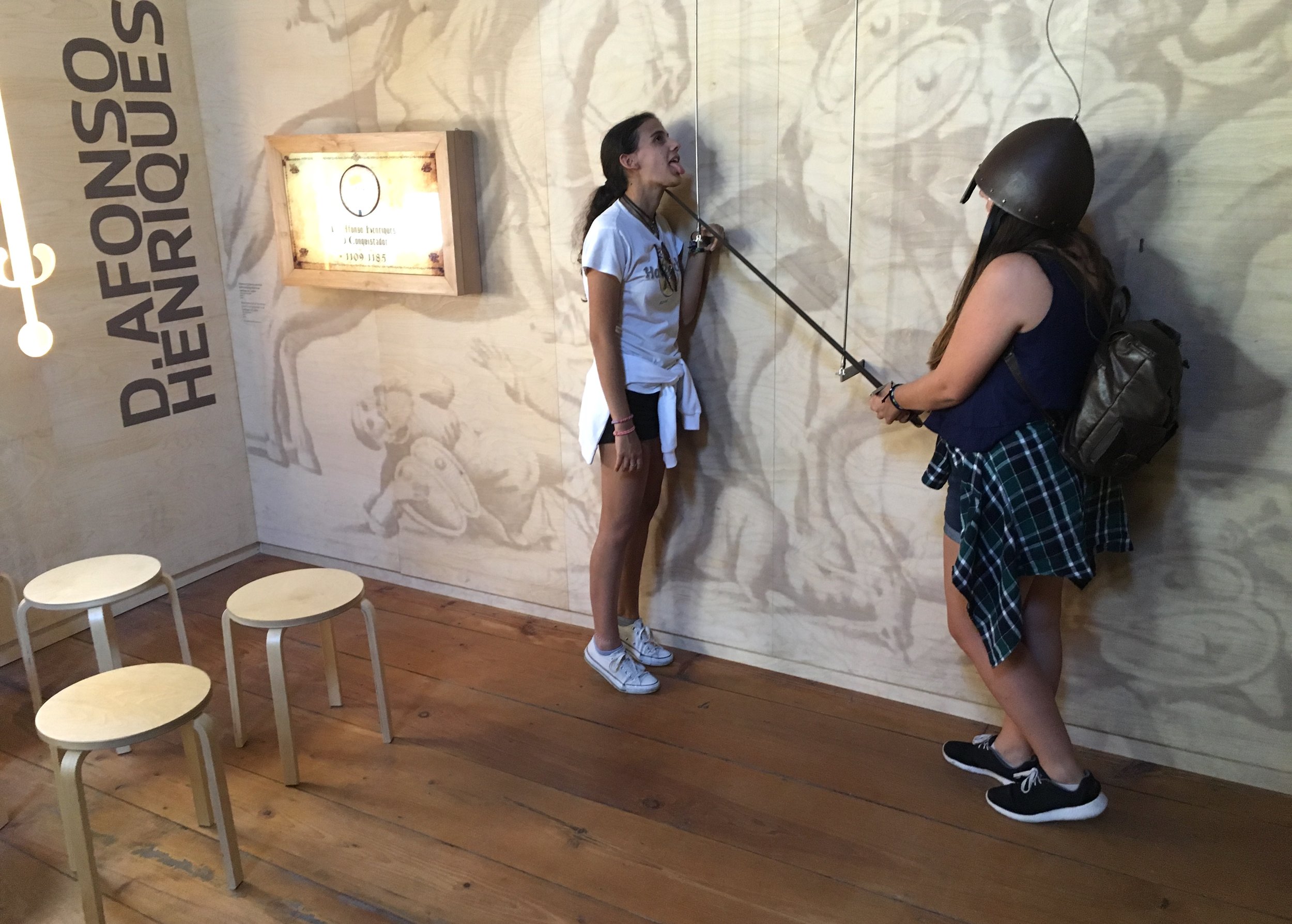
Guimares, Portugal. Climbing around castle ramparts, most visitors are looking for a chance to "act out". Kids will do it anywhere, with or without props. Here at the interpretative center, in the castle tower, adults get one modest opportunity.

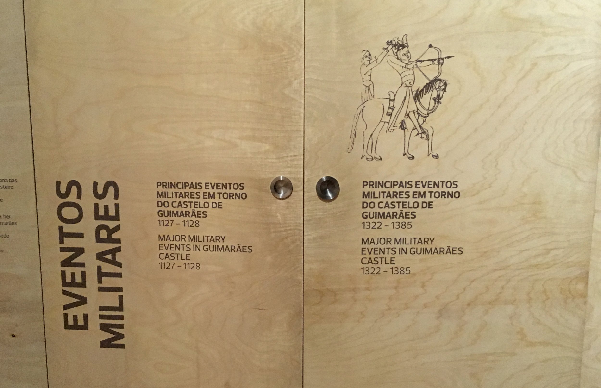
Plywood panels stand out from the stone walls. Text in Portuguese and English.

With dimensional cut outs.

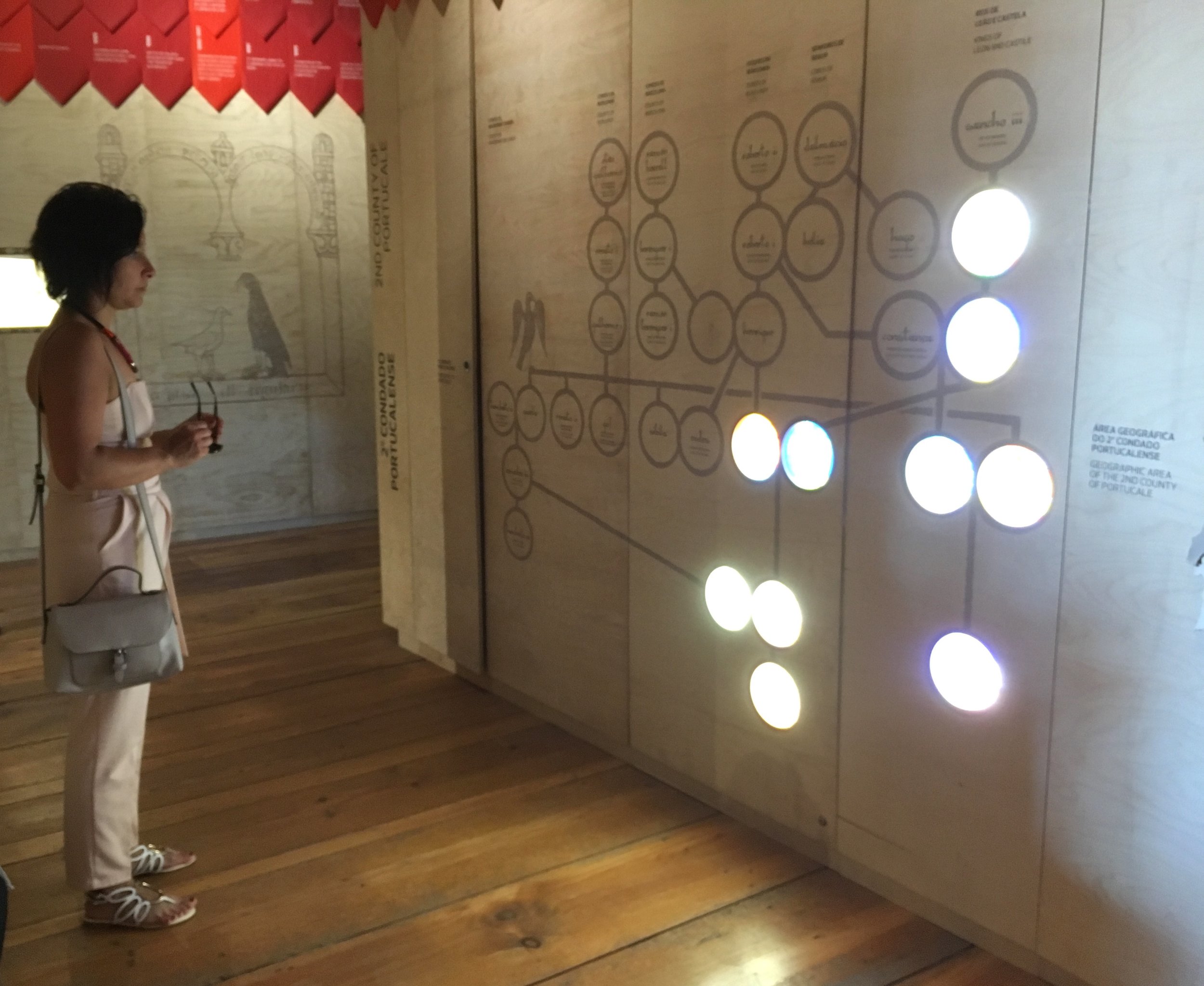
Red banners follow the timeline. The space is surrounded by a stairway spiraling upwards, to 2 more levels.

Some plywood panels have unmarked handles and open like cabinets for more information.
Finally the chance to "act out", with restrictions. The sword slides at a fixed angle between two chords, close to the wall and too high for young children.

Why is the alluring uppermost stairway always closed?

It's a narrow bridge back out to the ramparts.

Porto, Portugal. Founded in 1499, the Holy House of our Lady of Mercy cared for the poor and sick in Porto for 500 years. The building is now the Museu da Misericordia do Porto (MMIPO) , which includes the beautiful church next door. There are various types of design drama here. The first is between the modern exhibition design and the old architecture, art and artifacts. Ribbons strung across the Rua das Flores announce the museum's entry.

The centerpiece of the museum is the "Fons Vitae" painting, depicting christ's blood as the fountain of life. A touch screen to the side allows visitors to enlarge details of the painting


"My Blood is Your Blood" by contemporary sculptor Rui Chafe, is a thick black artery that passes through the upstairs wall of the room, and drips blood onto the street below.


A tapered tube aiming out the window points to an important church on the next hill


The second contrast is between the small white rooms and the black display structures that fill them. The alcoves are tight and convoluted in places to maximize space along narrow walk ways. Unfortunately numbers are used as titles.


Many of the paintings are large but can't be seen from a distance. It's only possible to see parts of them, up close, or the whole painting at an awkward angle.

This effect is the third drama, contrast of scale, which they fully embraced, exaggerating the contrast by blowing up some of the painting details on walls here and there.


The fourth drama is the uncentered displays, with angled panels to insets or vitrines.


The fifth drama is the lighting, using side spots and delicate vertical tubes.


They host modern art installations in the central atrium, itself an airy contrast to the small rooms.


The museum opens directly into the church balcony above and visitors can loop through the church below


Porto, Portugal. 2 fish seem to curl around to make the M for this market logo.


The words seem to swim around, and over each other. like a school of fish.


Porto, Portugal. This building (and skateboard park), designed by Rem Kohlhaas, is difficult to capture in one photo. Walking around it is a constantly close view, with neck straining views upward at the angled planes.


I came to pay my respects to the logo designed by Sagmeister & Walsh for the Casa da Musica. Based on the building's shape, which looks different from every angle, the logo can rotate freely, like the "roll of the dice."

It was designed so that subidentities can pick up on various angles, image colors, typography or textures, in almost endless ways.
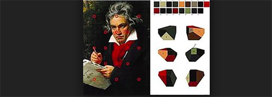

I admire the sophistication and versatility of the logo and I was hoping to see it in action, on the building and on different printed materials. In all it's glory. But first I noticed, along with the lower case logo font, what seemed like an odd mix of other font treatments.


The mirrored logo at the entry was promising.

But then I started to worry that the logo concept, with its shaping and rotational motion, had been tampered with. It seemed incorrect, flattened, and frozen, especially when used as a pattern.

Branding is about creating beautiful order. A versatile logo like this can only work if it is applied in the way it was intended, conceptually. I'm sure there's a good story here, about why it went astray. But I left feeling sad.

Porto, Portugal. In front of the University of Porto is a beautiful hyperbolic slot in a human size triangular vitrine. Unfortunately it's not interactive, but hypnotizing in it's constant rotation. This one has two poles that meet at the top.


Porto, Portugal. By Joao Louro, 2015.

Porto, Portugal. An old graphics studio
Porto, Portugal. A butcher's doorway

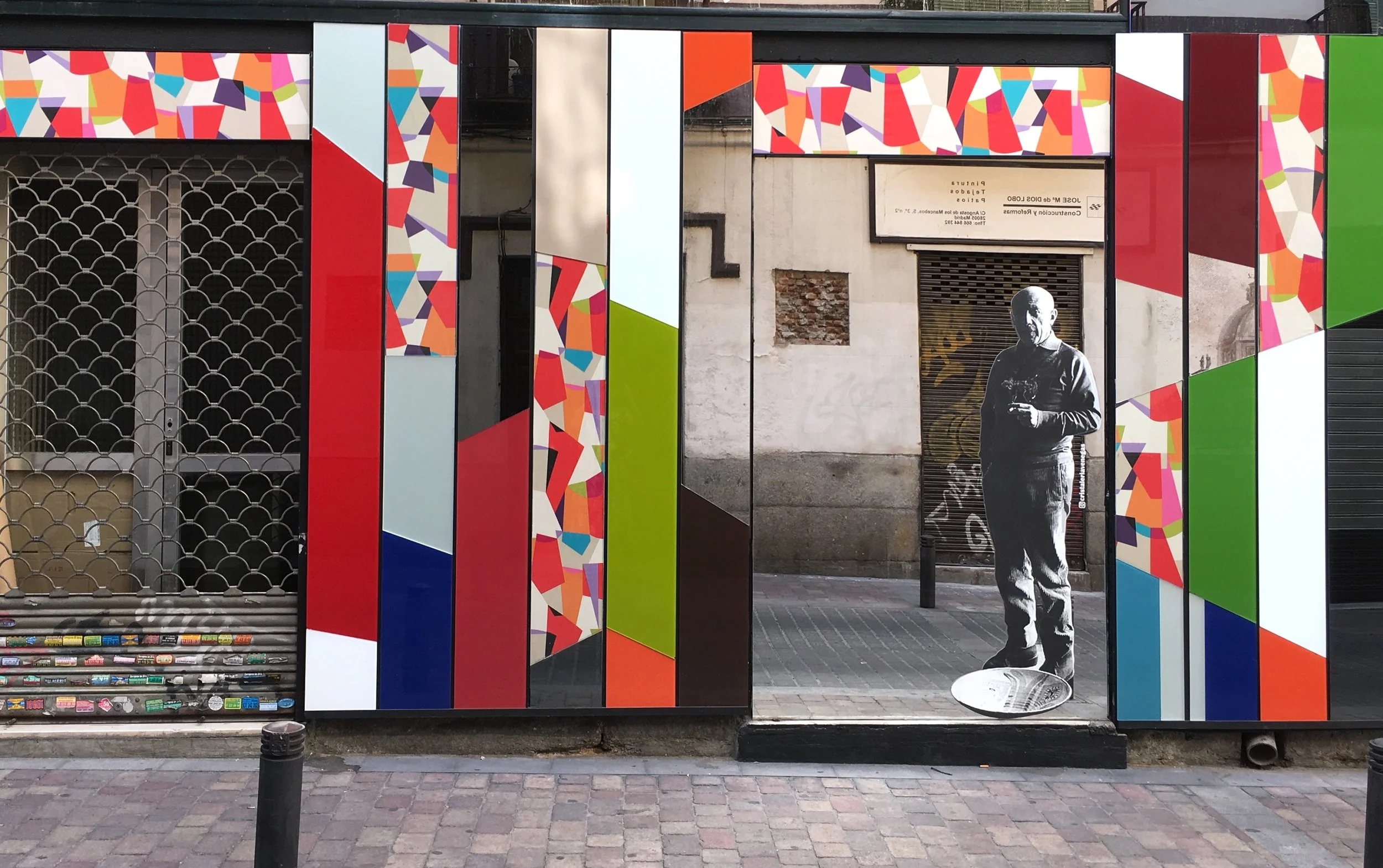
Madrid, Spain. Can't wait? The waiting area at the Atocha train station gives the surreal impression that you're already on your way.
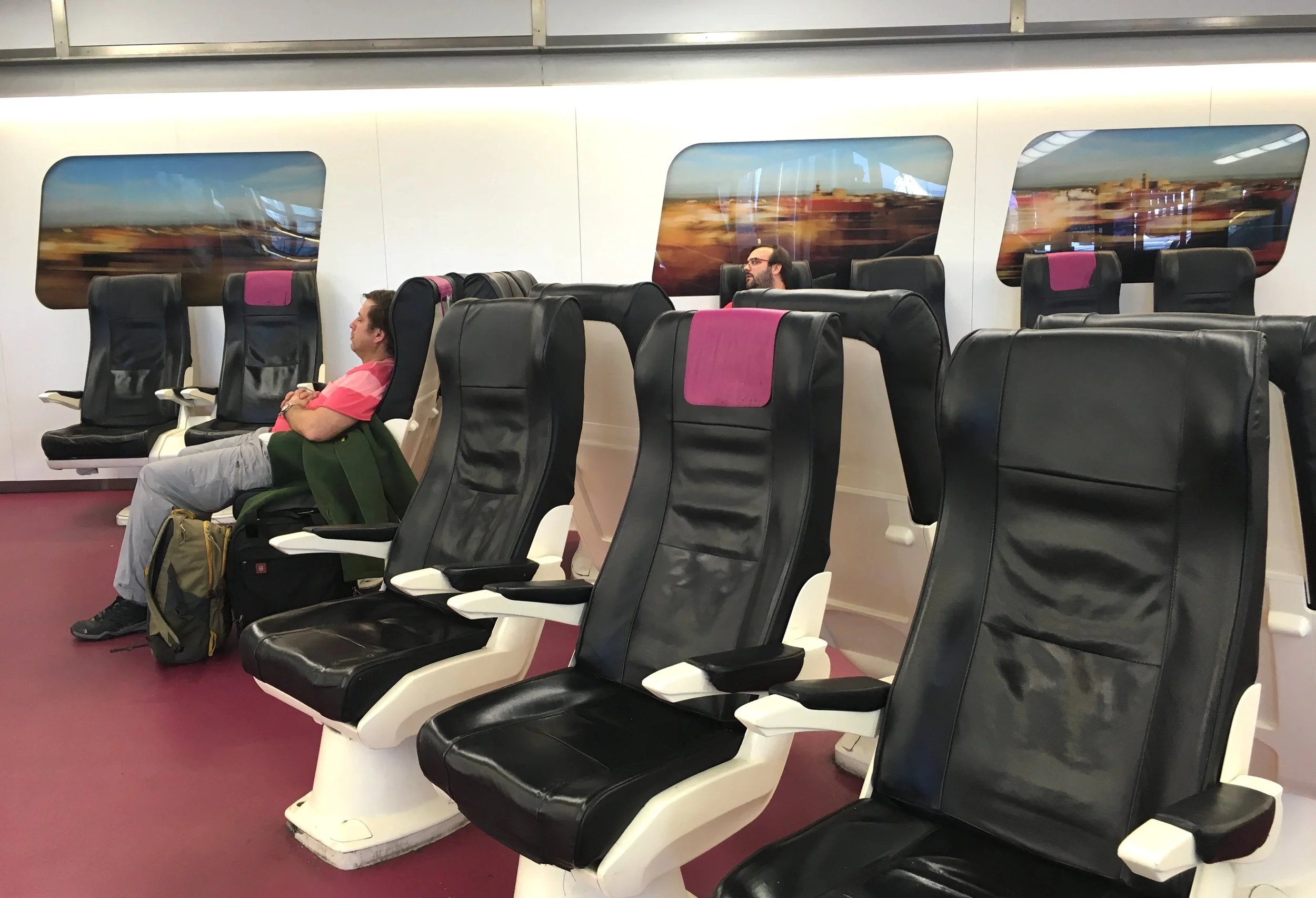
Madrid, Spain.
Crossing over the windows.
The ghost of Picasso (on a mirror)
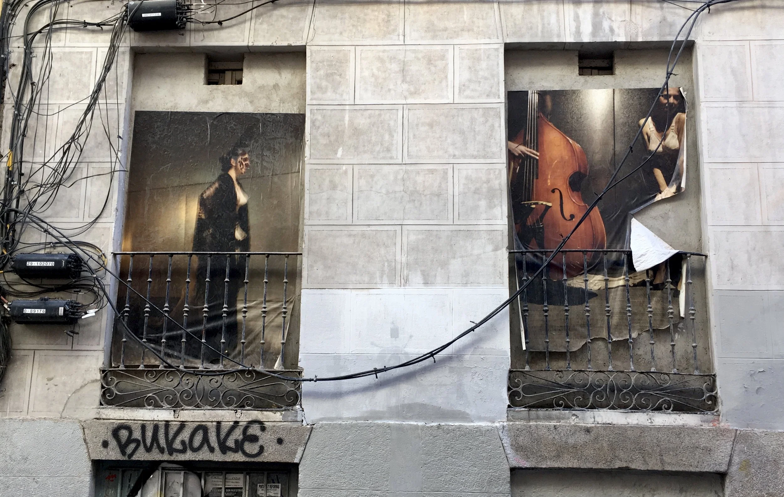
I've been looking at a lot of storefronts, which now seem to me like a formalized (facade) form of street art, graphic design integrated into the architecture. The older storefronts are the most venerable.

Madrid, Spain. The first is from "Libros a la Calle", excerpts from books in the metro cars.


This restaurant hand writes their name on every napkin

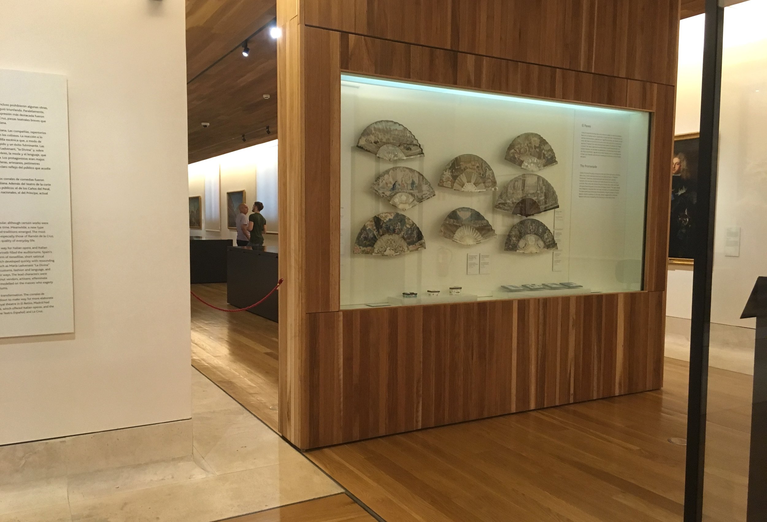
Madrid, Spain. The Museum of Popular Arts and Traditions is in the rennovated "El Corralon" from 1860.


2 floors of exhibits are stacked along a hallway, organized by "stall". The upper floor is a mezzanine.
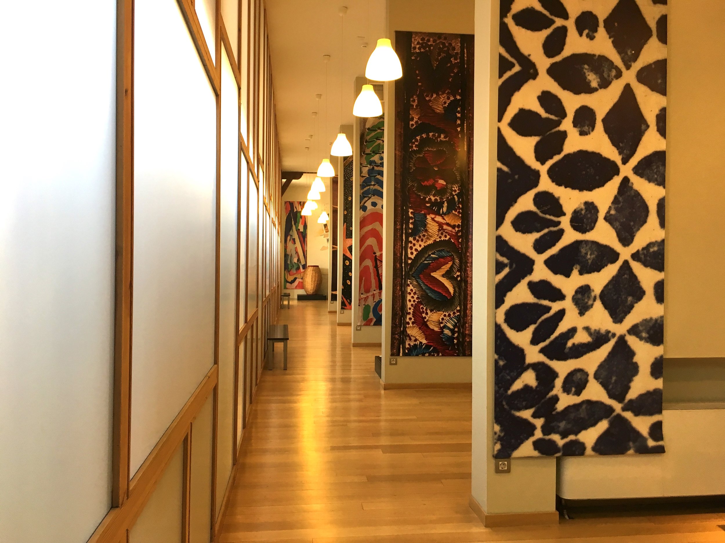
Translucent panels face the courtyard.


In museums, everything is taken out of context, simply because it's placed in a museum. To me, this feels most poignant with costumes, worn by real people and meant to be part of lively community events and rituals, displayed on stiff mannequins. This universal museum dilemma seems most dramatic in ethnographic museums. Are they preserving the memory of a culture, and at the same time confirming that it's "all over" because it's in a museum?


The answer is always in the programming, but that's not always evident to visitors. How does a museum connect to current cultures, that may be enriched by looking back at their own history?

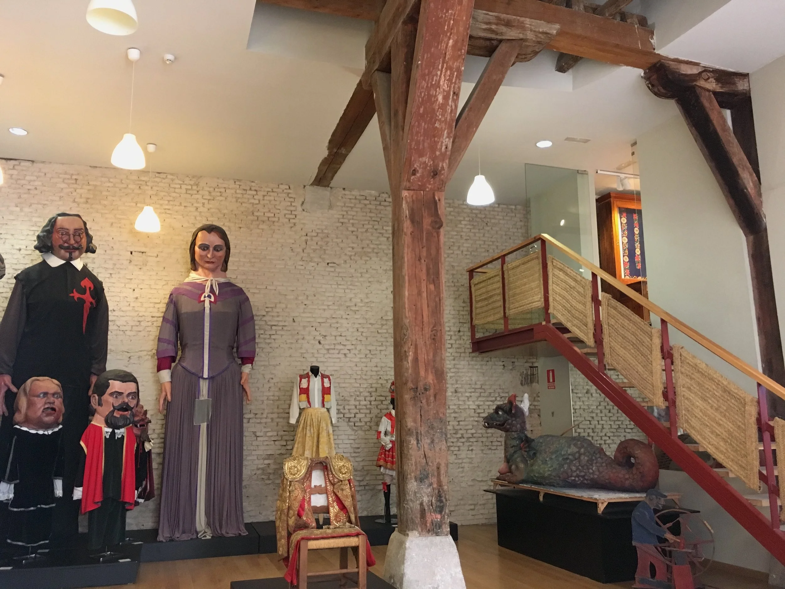
Rattan mats on the stairway, and a mirror underneath.

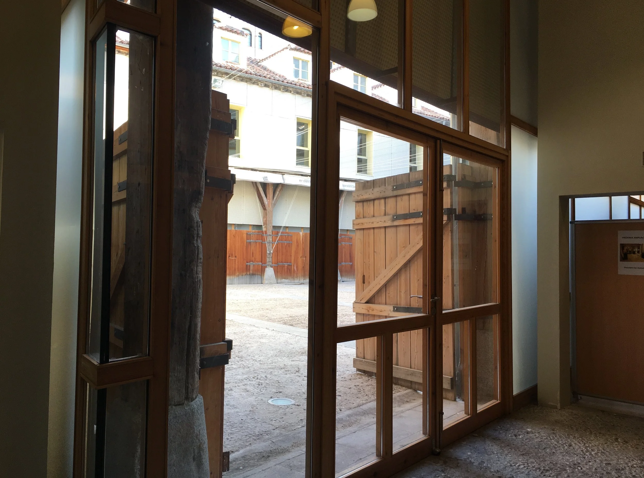
These plex panels have that "added" look, probably for safety reasons, after the Artisan areas were installed.

A funny transition between the end of the hall and a barn area, leading to another hallway under install.


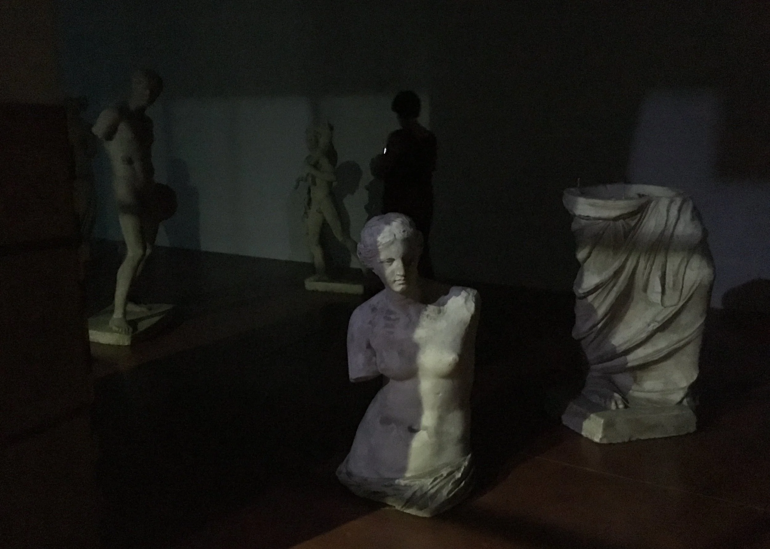
Madrid, Spain. Near my apt in Lavapies, I came across this art exhibition, "Guia Nocturna de Museos", at the Tabacalera, a raw art venue in an abandoned tobacco factory. Photographer Fernando Maquieira took night shots at 50 museums, looking for emotional aspects of art that are more evident at night.

Past the reception desk, the space was extremely dark. The exhibition was across a projection room and in the lower level.


The dark photos were mixed with sculpture and installations, in a warren of separate rooms.

Portrait of a night guard, and a small room of security monitors


Large color transparencies were hanging in the only (relatively) light room


Maybe this was all a dream I had... probably I've been visiting too many museums.? Art venues are so much more adventurous than museums, even in how they interpret "Art in Museums".
Also at the Tabacalera, an installation of Suzy Gomez in the factory latrine.
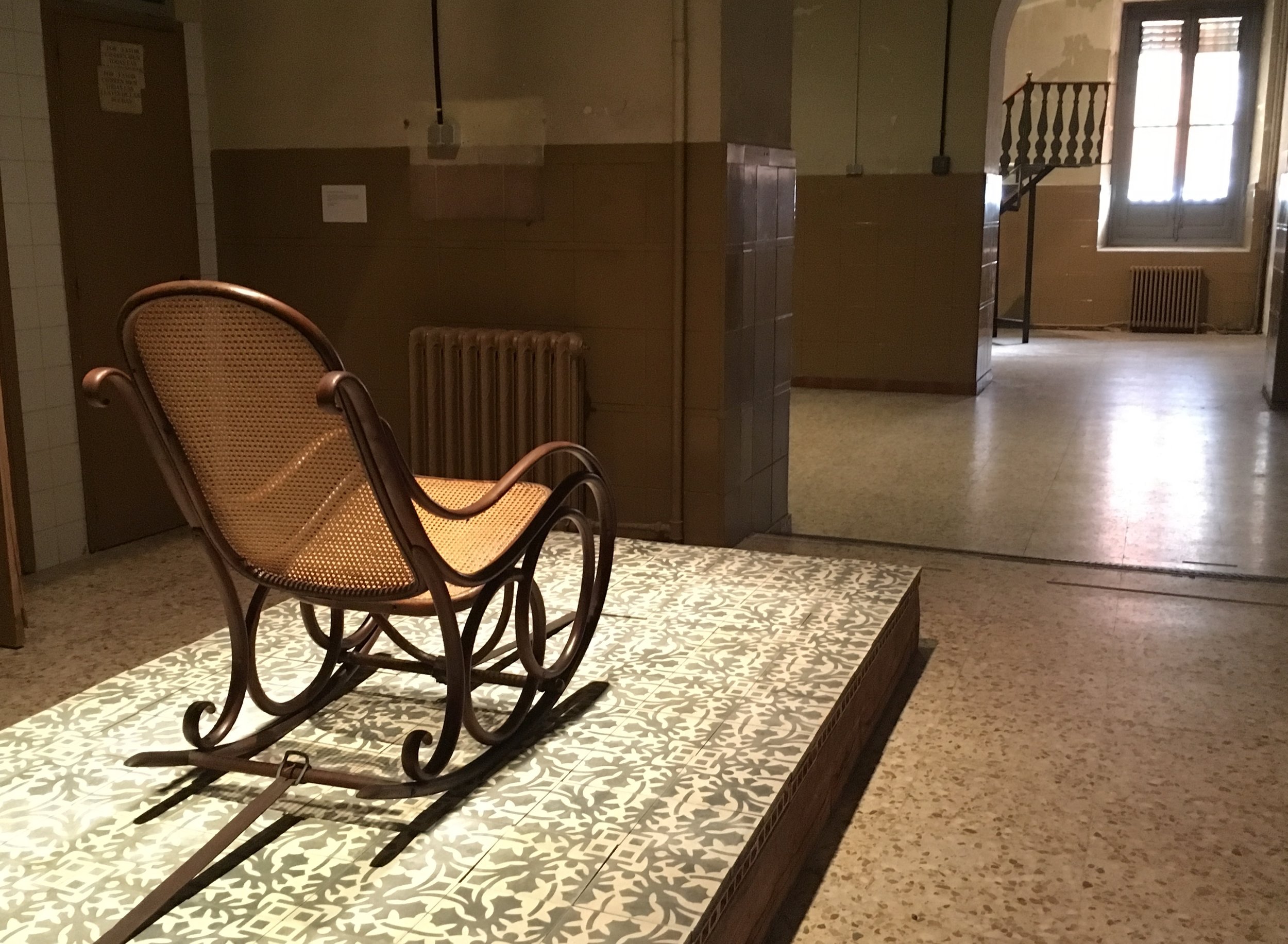


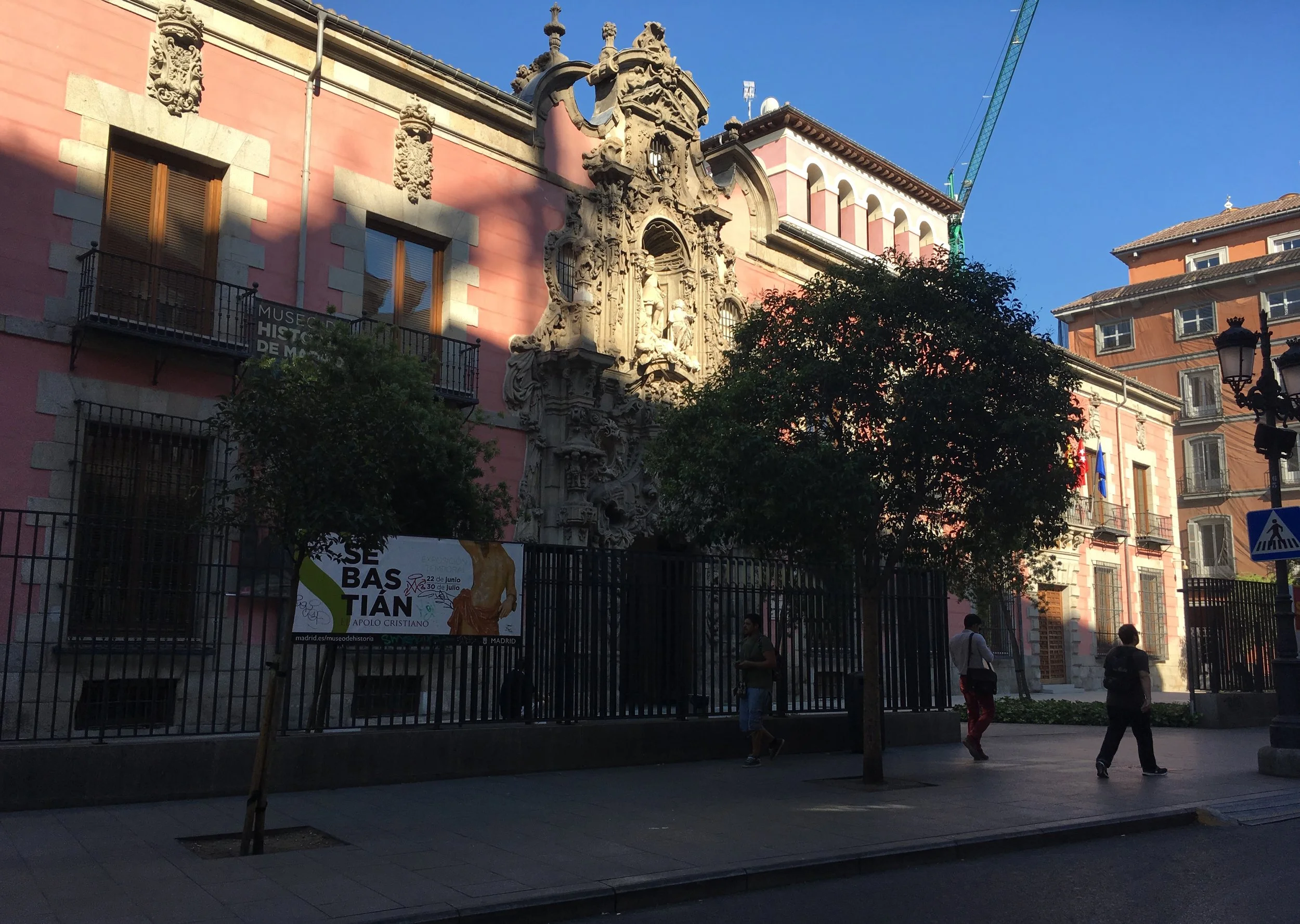
Madrid, Spain. The remodeled San Fernando Hospice, completed in 2014, is the home of the Museum of History.
The architecture style uses gaps that create a feeling of floating planes and lightness.

But In the galleries, the same approach to gaps, between panels and walls, confuses visitor flow. Visitors naturally want to slip through these spaces, but they're not quite wide enough, officially. Irritating barriers are put in as after thoughts.
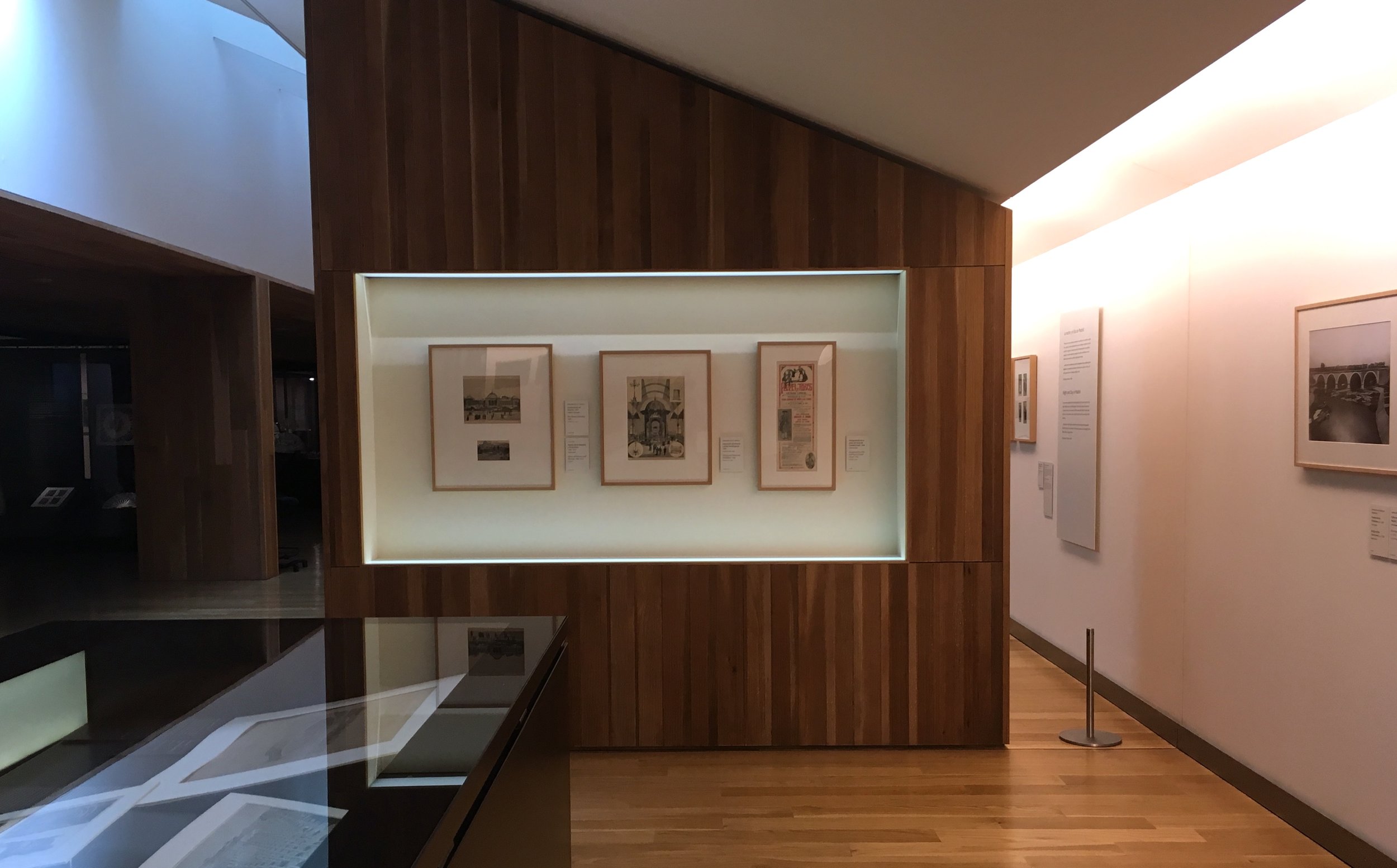
The gap resonates with a floor edge treatment that creates a buffer between visitors and the art. Wherever there is a slight elevation change, it seems that bannister barriers were intentionally designed into the plan.


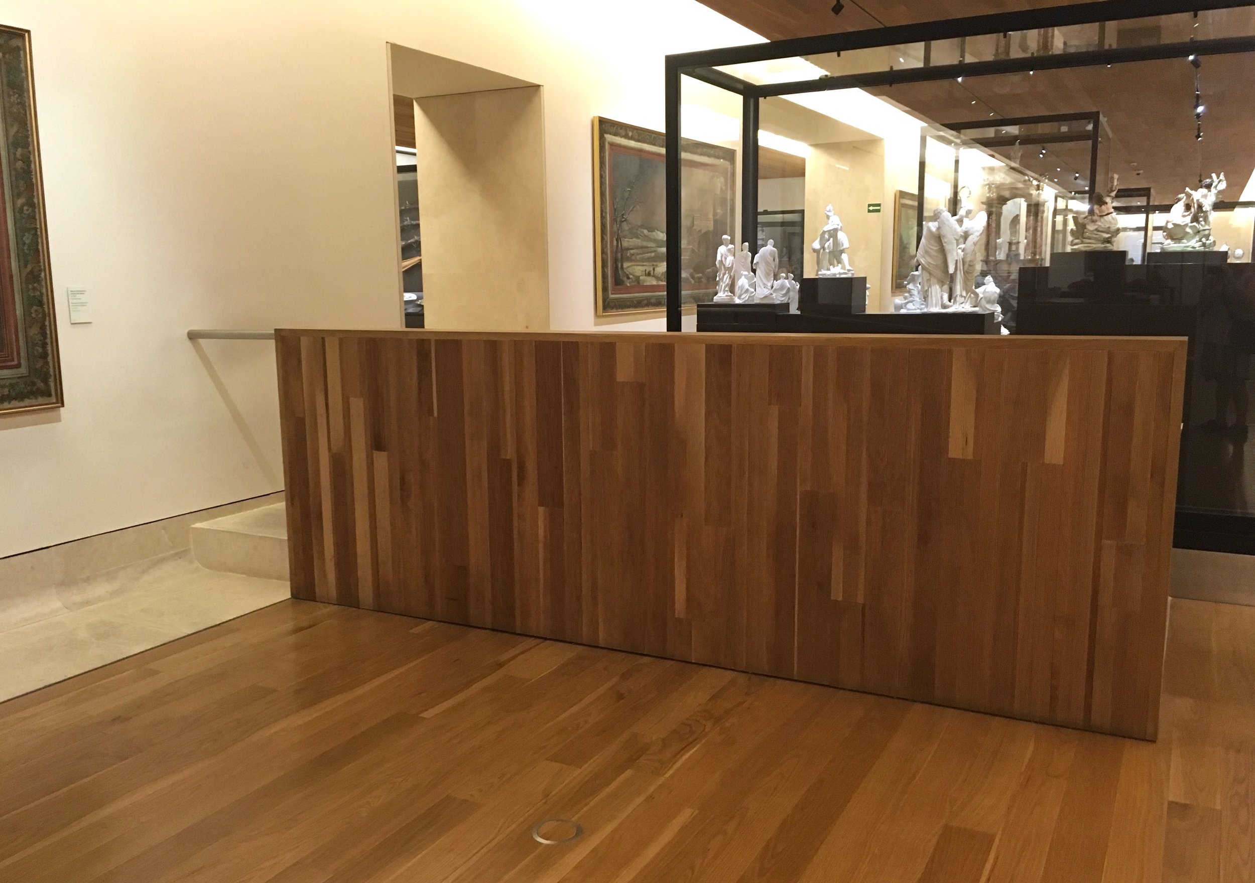
Even designed in a more integrated way (before, or after opening) these can feel like a mistake (whether or not they actually are).

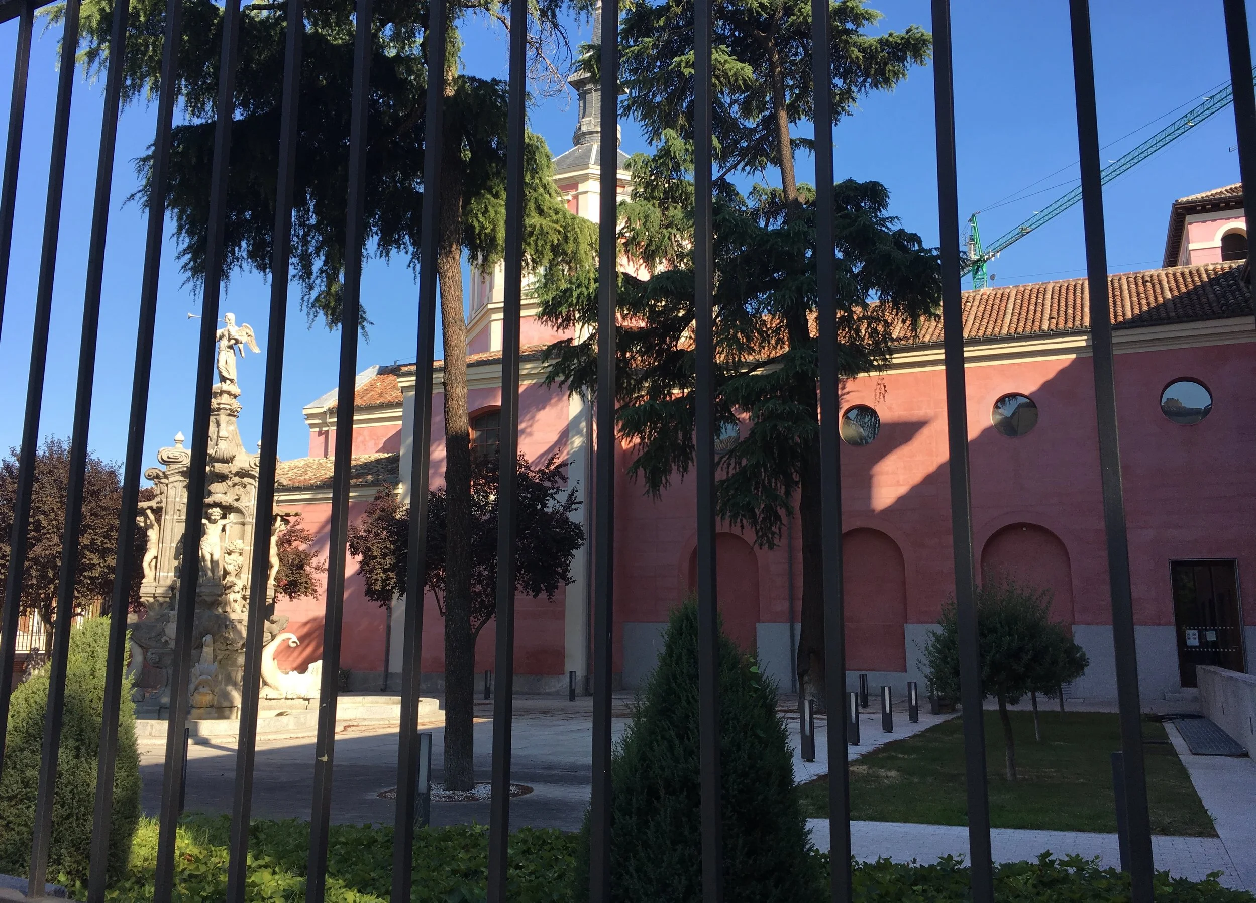
It's heart breaking to see a nice garden closed to the public, like this one at the back of the building, visible from the street
Valencia, Spain. An odd logo, with two eyeballs in one eyelid. One is dilated.
