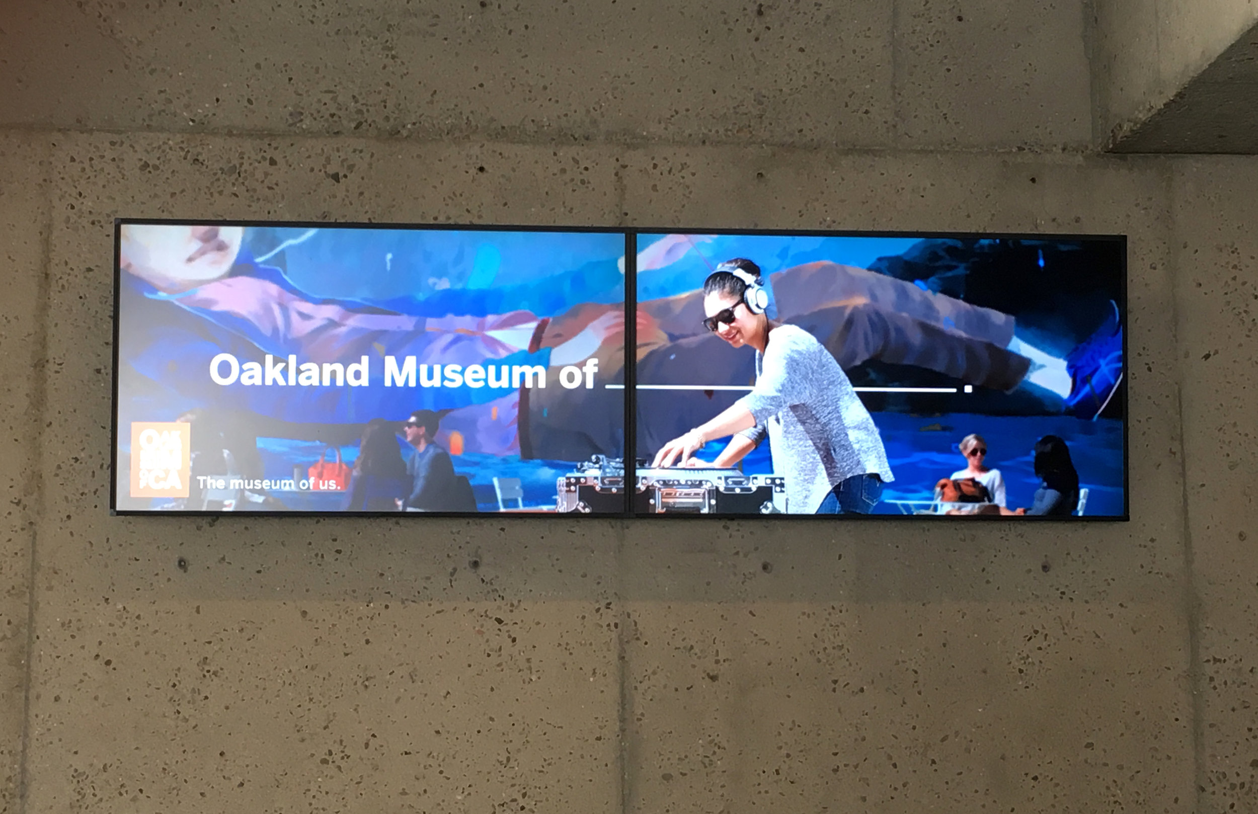
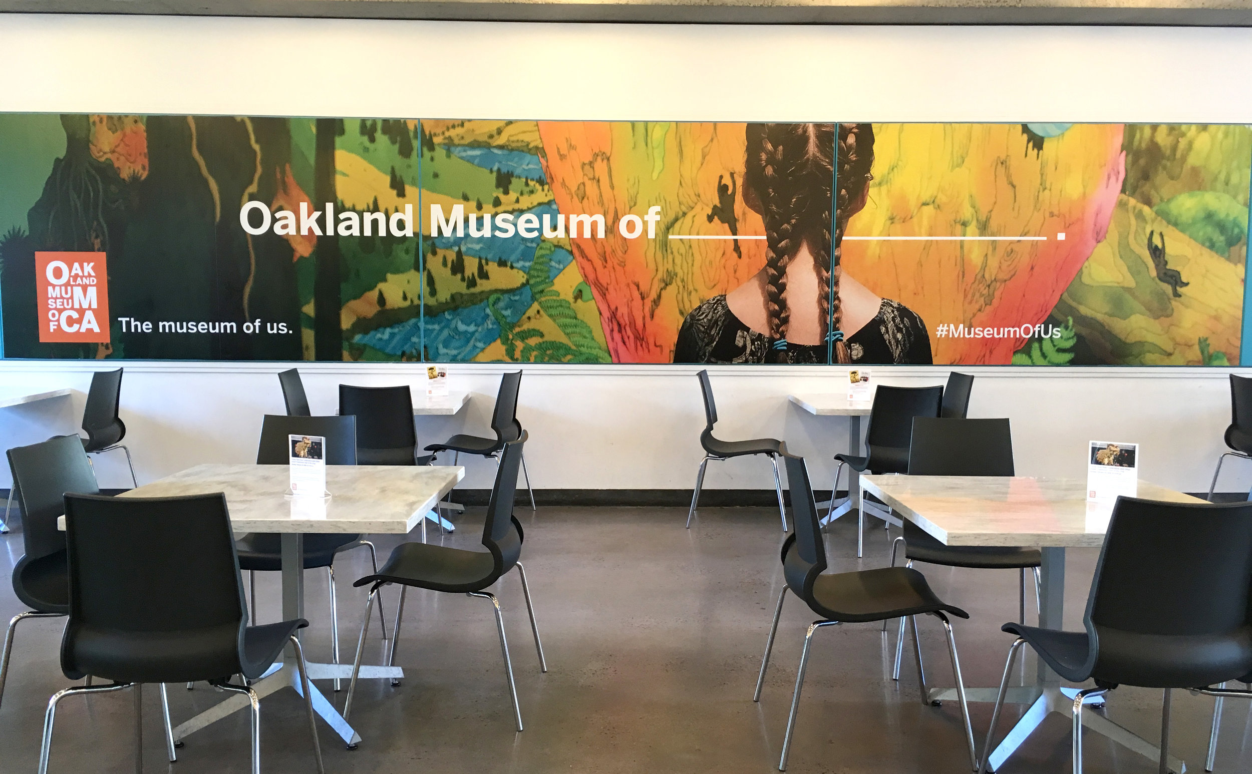
The Museum of __________ (CA)

Oakland. I started coming here in the 80's when I lived in a warehouse in the neighborhood. That was before it was transformed into OMCA, another important Bay Area museum dedicated to being inclusive, collaborative and responsive to community. Now it's known as a visitor-centered museum focused on "interdisciplinary connections, multiple perspectives, and active engagement." 

IMG_9743.JPG

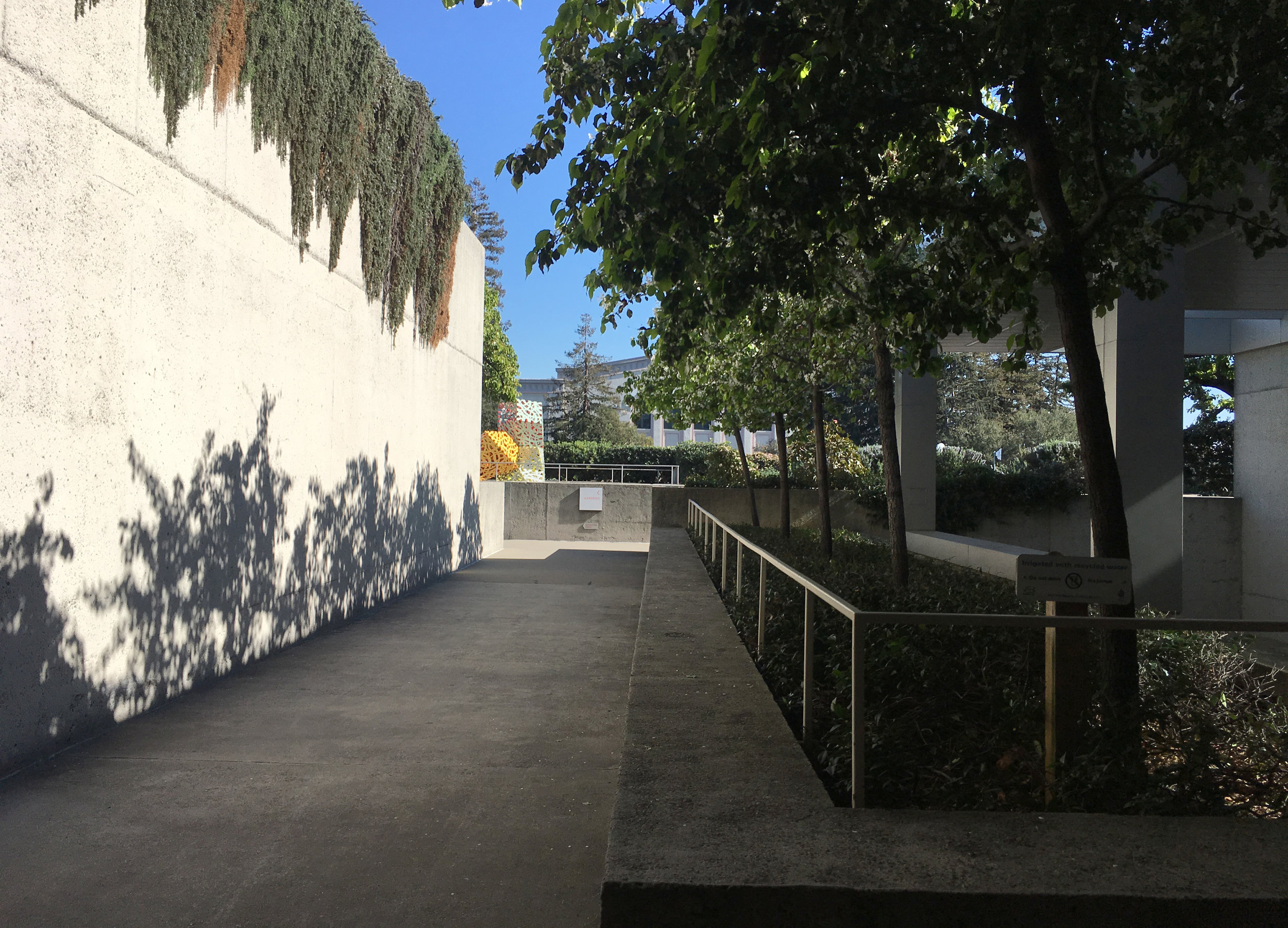
The "museum of the people" first opened in 1969, in a mid century modernist building with wonderful roof gardens and terraces. During the renovation an overhead structure was added to help define the front entry.

IMG_9501.JPG
IMG_9613.JPG
IMG_9511.JPG

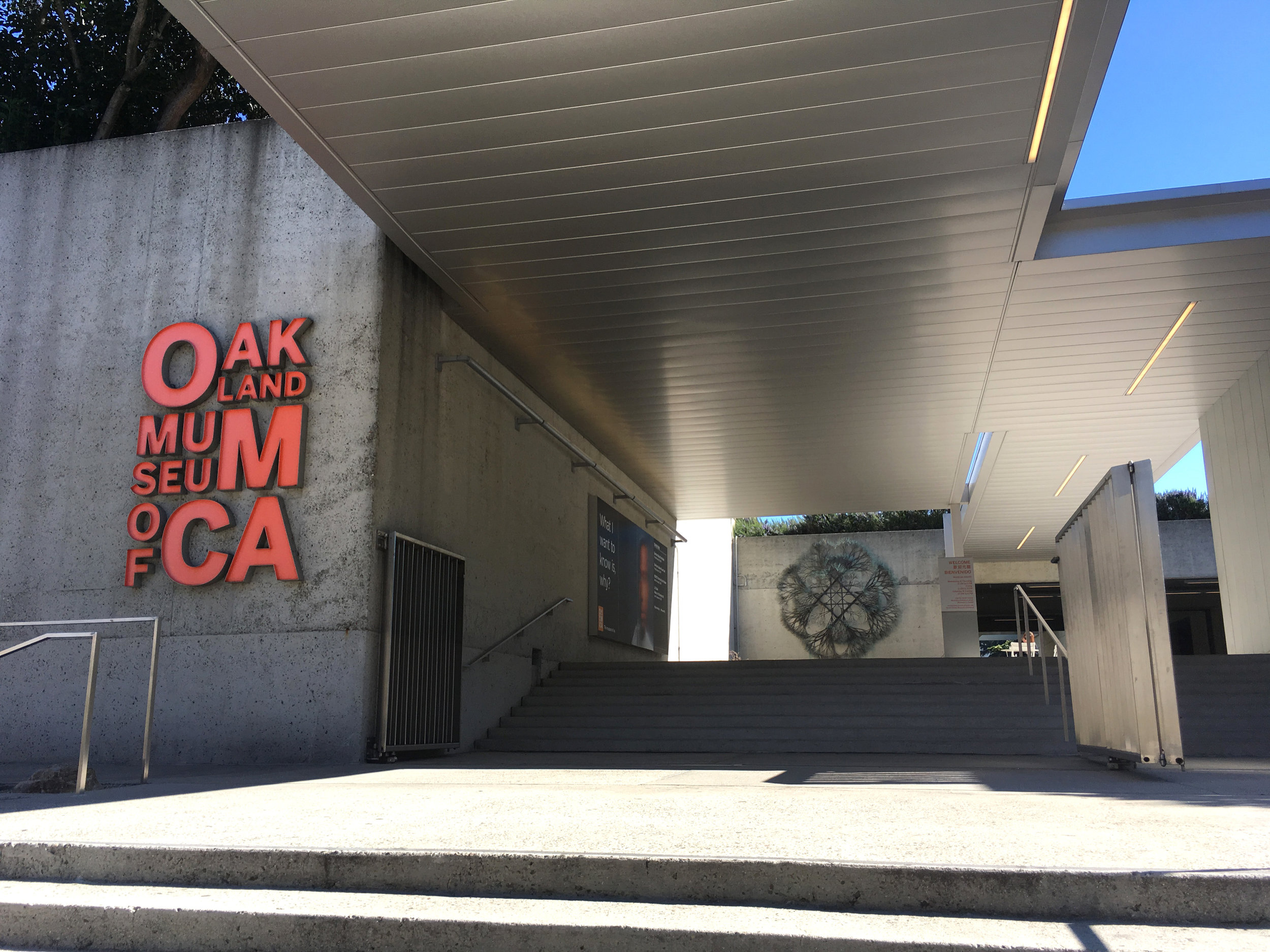
With separate entries for Art, History, and Natural Sciences, on three seperate levels along a central outdoor stairway, the way finding solution was to place the information/ticket desk outside on the middle landing.

IMG_9615.JPG

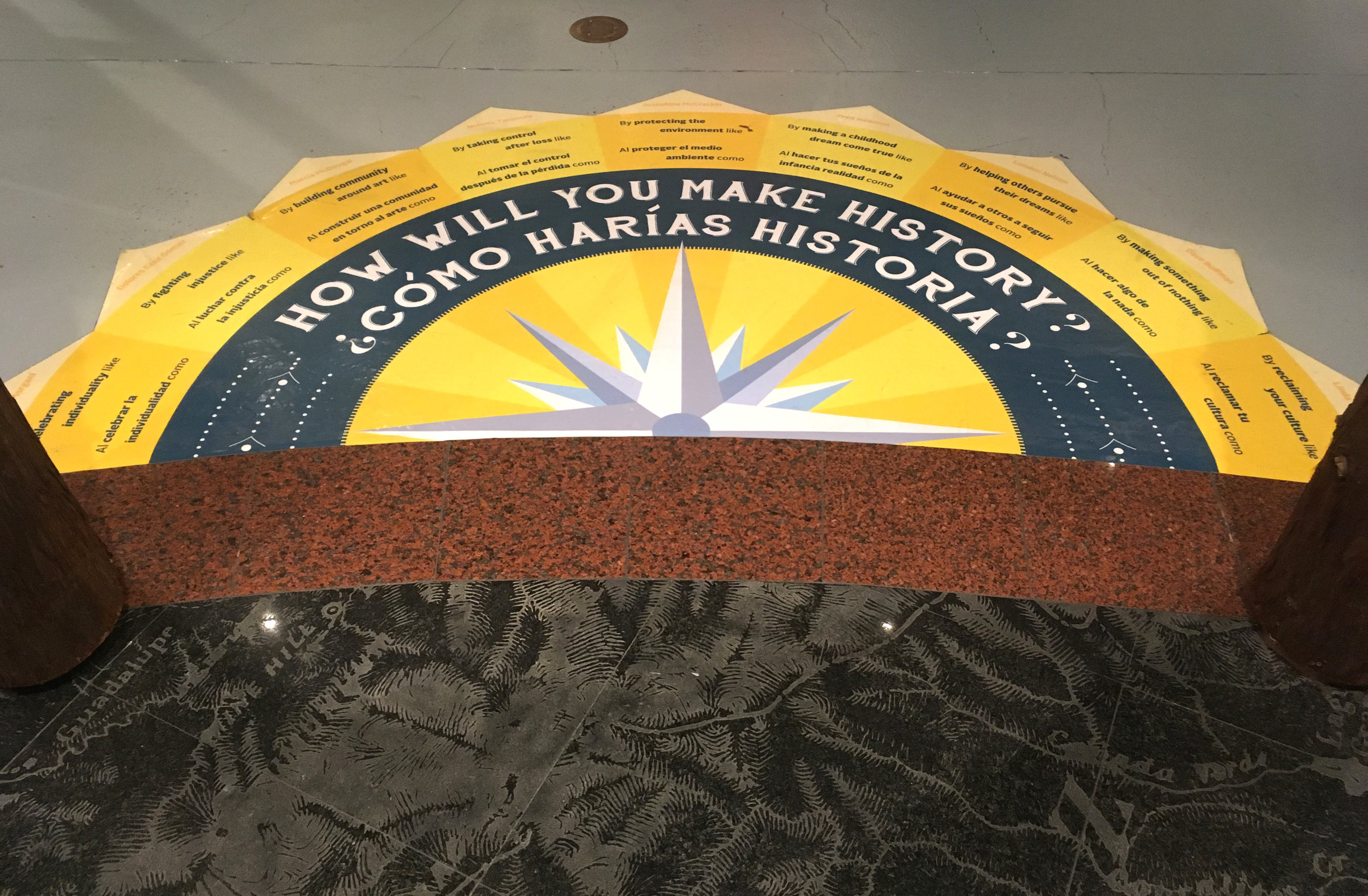
OMCA is the museum of us. The "museum of ___________ " branding invites community ownership, with multiple identities implied. It's a smart combined message because the "_____________" keeps it totally open and the "us" keeps it anchored and responsible.

IMG_9508.JPG
IMG_9677.JPG

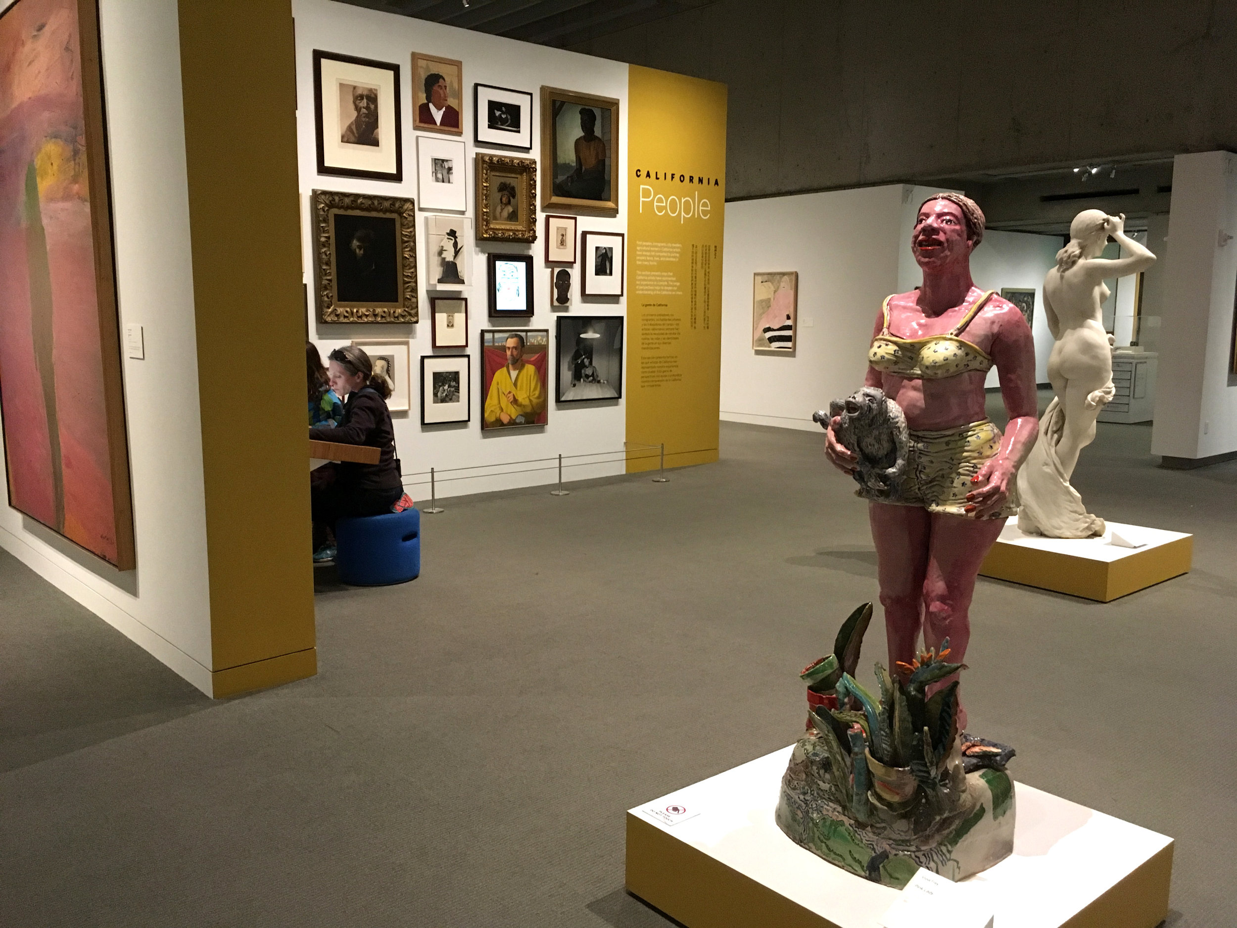
Museum trends roll out unevenly, in mysterious ways. They age from fresh to expected formula in patches and leaps, quickly and slowly, here and there. Art was the first OMCA gallery to reopen, in 2010, and although their strategies are not novel anymore, the core innovative ideas and challenges are fresh and burning. The gallery was redesigned to promote skills for diverse learners to experience and interpret art in a variety of ways. From multiple perspectives. Educational theories of multiple intelligences, game strategies and multiple entry points helped inform the process. 

IMG_9518.JPG

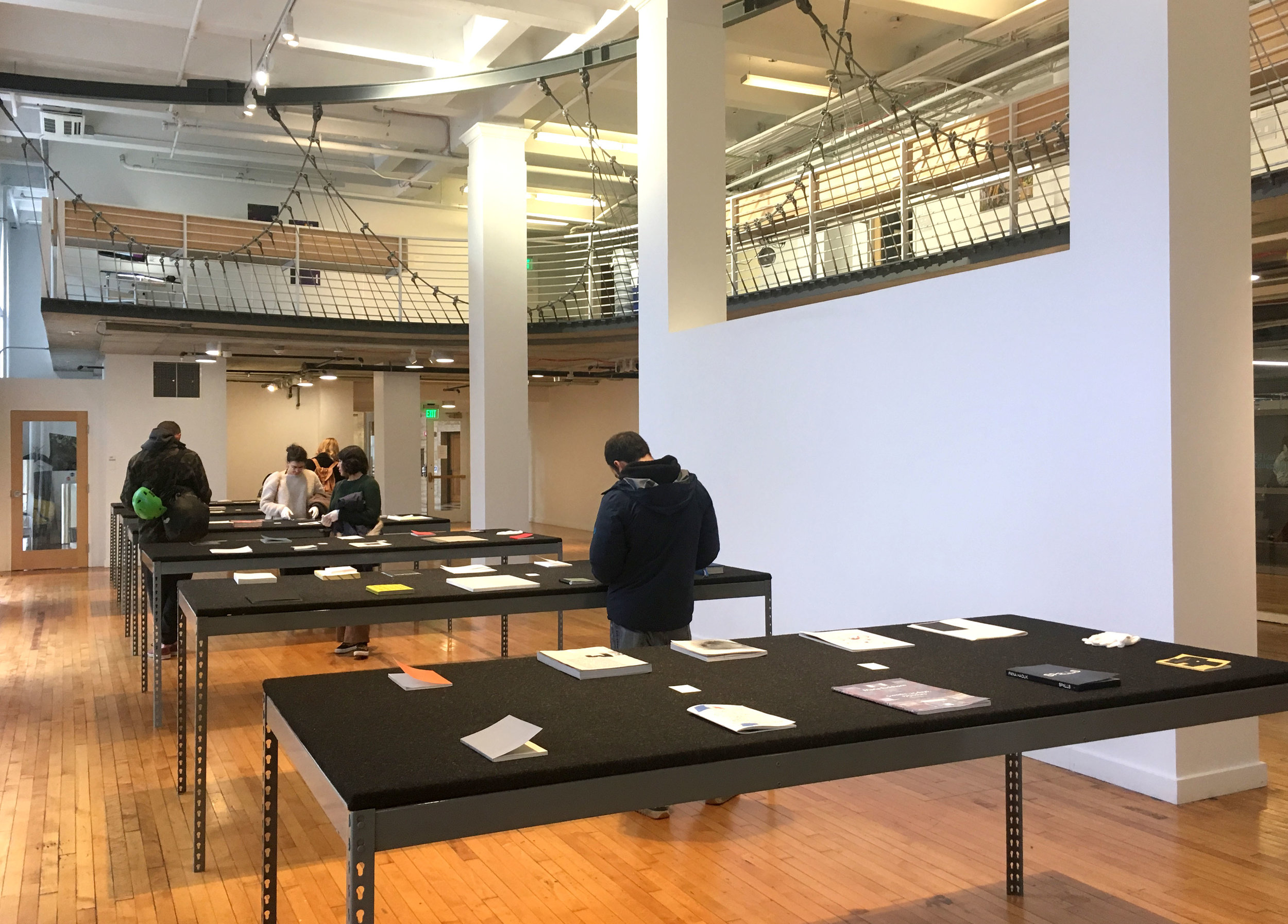
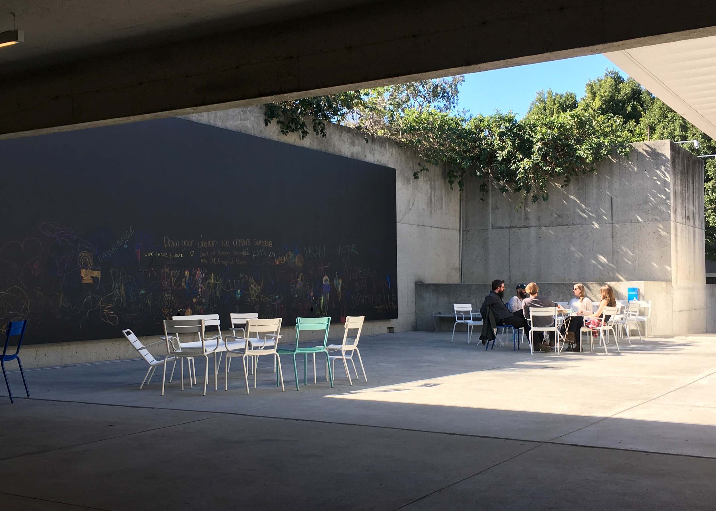
Comfortable seating allows leisurely social behavior. Near the entry is an interactive space "Art 360" presenting one work of art, with multiple interactives to explore it. Unfortunately it was closed for re-install.

IMG_9526.JPG

Three curatorial sections, Land, People and Creativity, are comprehensible to all. They allow surprising variety in the art and narrative. Wall colors were chosen in collaboration with teens, who also initiated "Loud Hours"! The unpretentious environmental design helps visitors move from rejecting art for it's arrogance, to questioning it.

IMG_9533.JPG

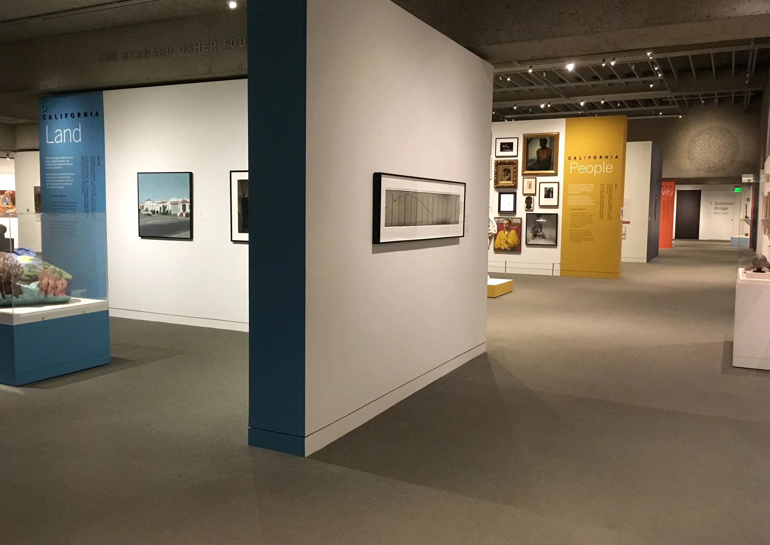
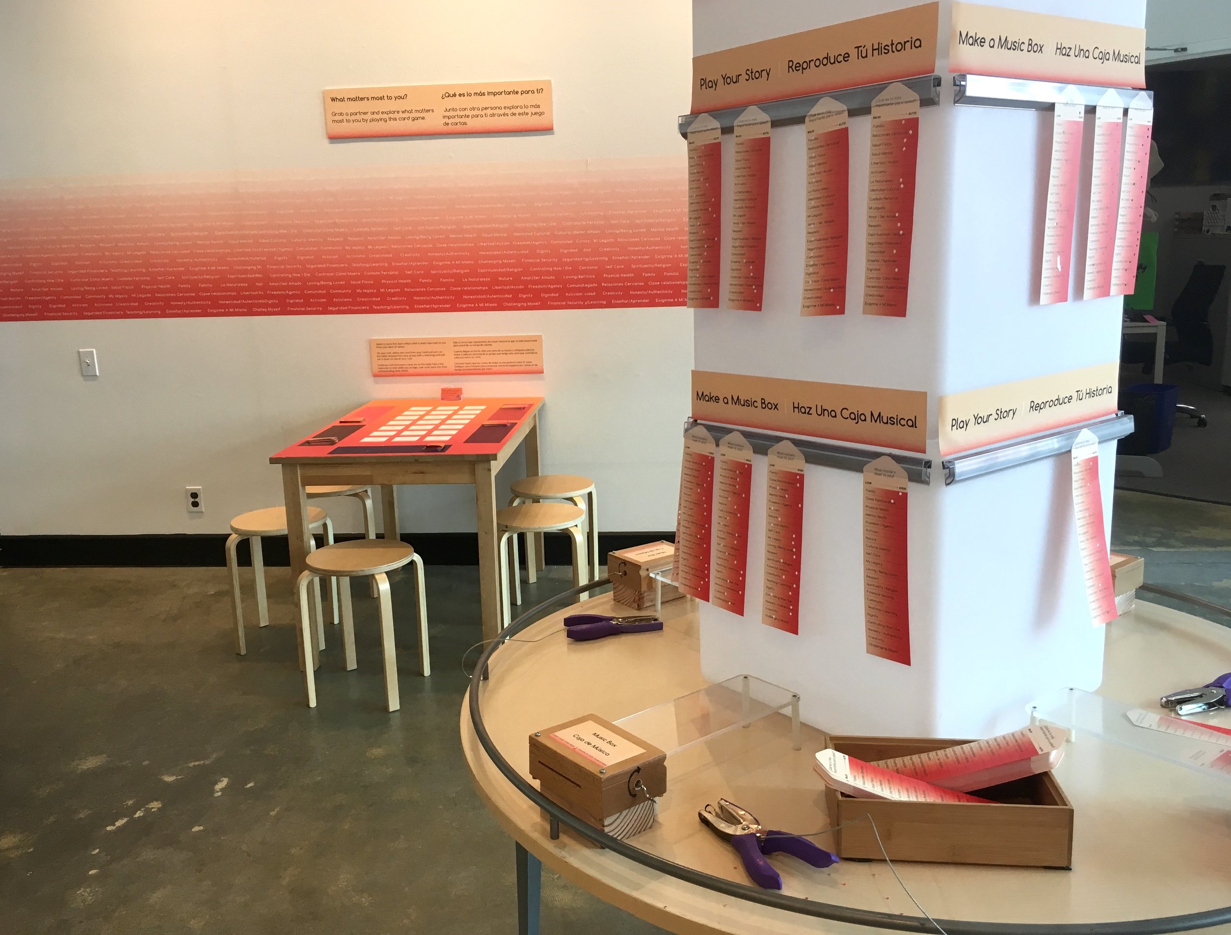
The area sign typographic design equalizes the hierarchy of the three languages beautifully. English is in the conventional top position with Spanish in the central position at eye-level. Chinese, in vertical format is placed at it's conventional starting point, top right.

IMG_9545.JPG

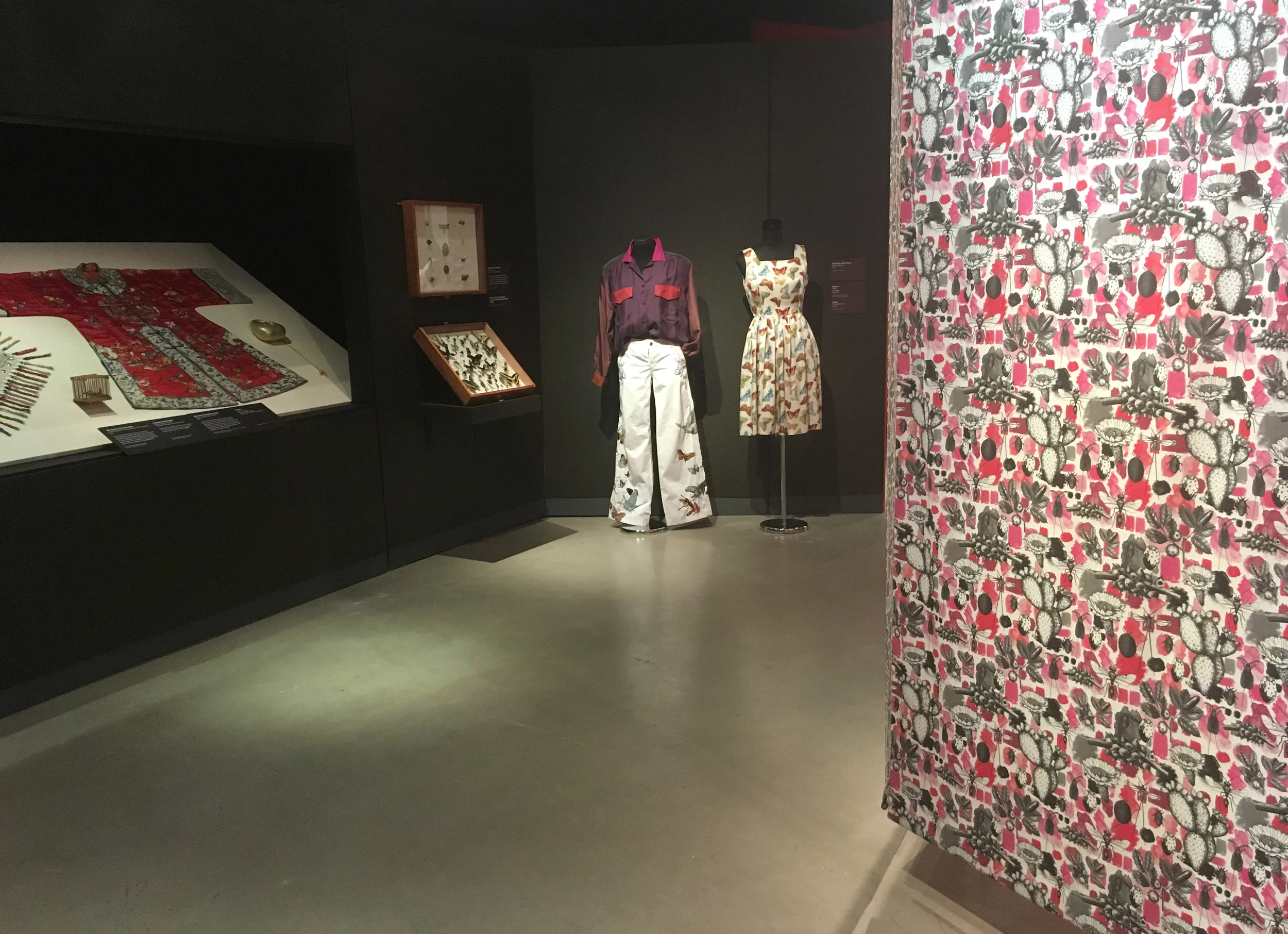
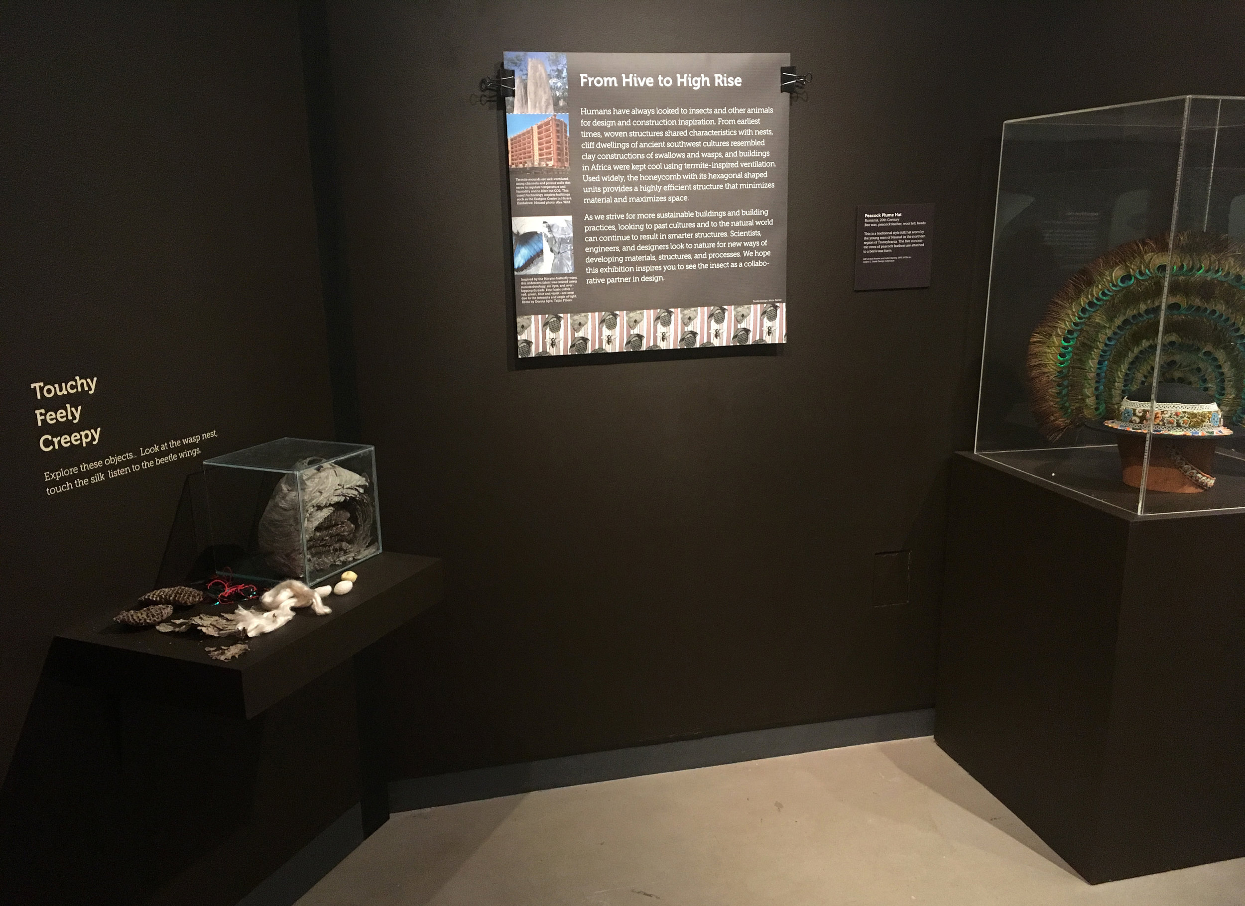
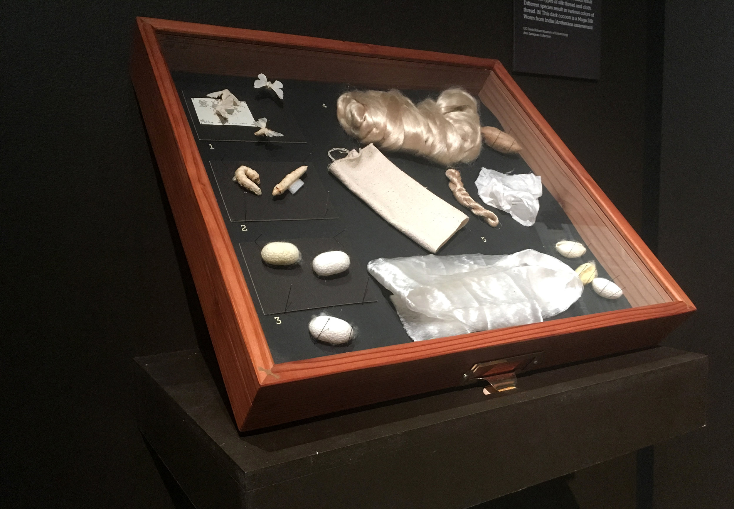
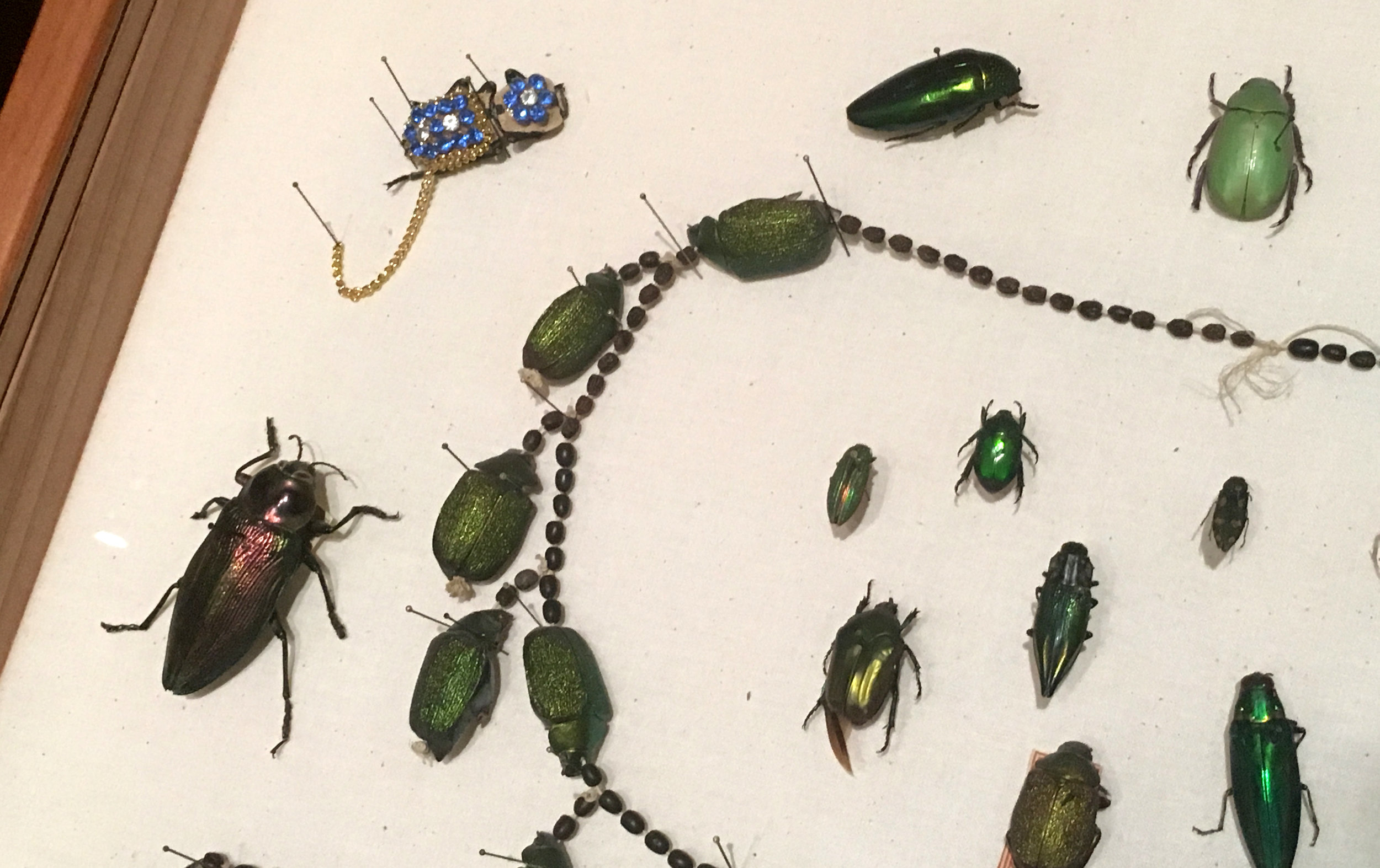
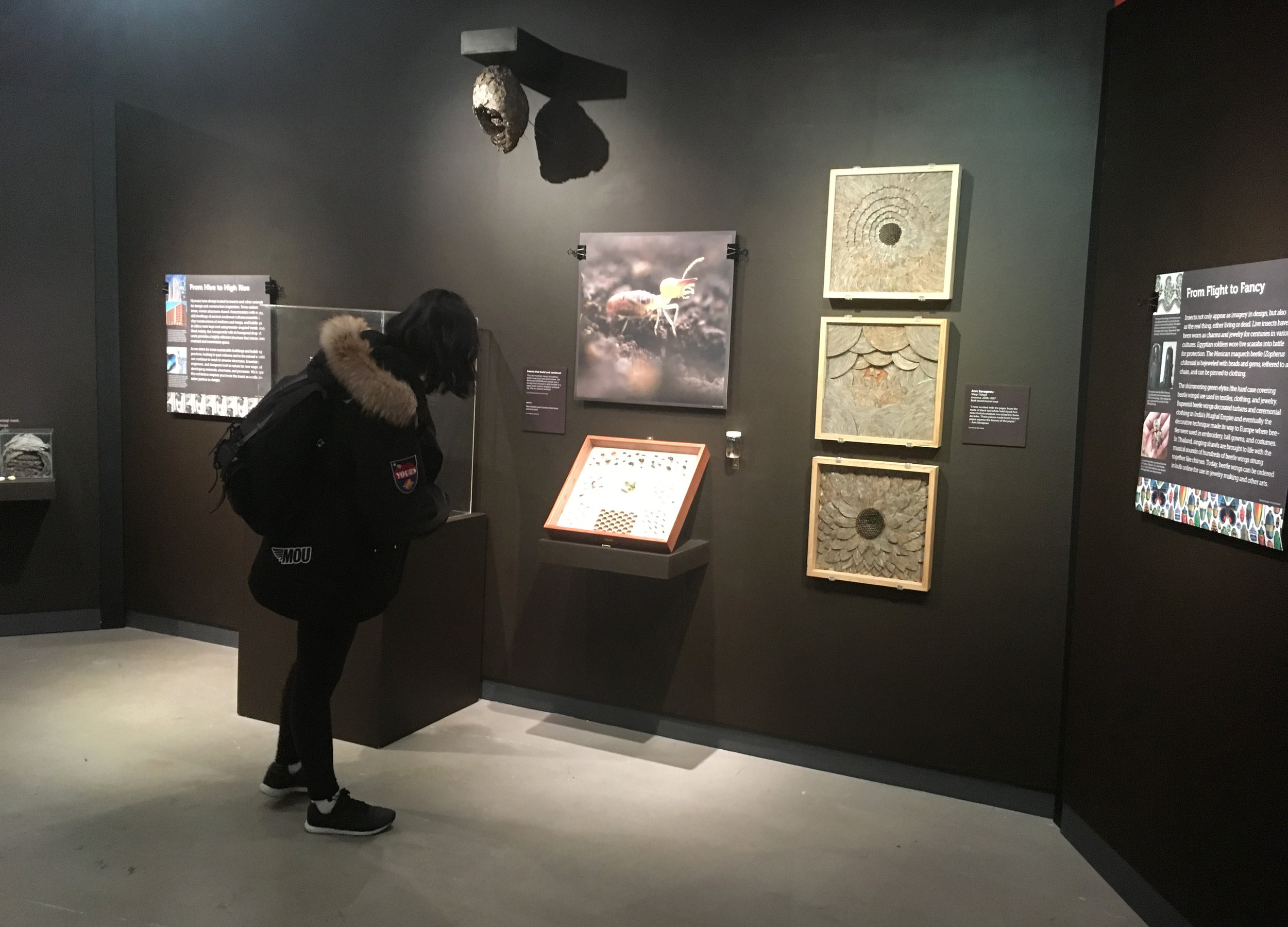
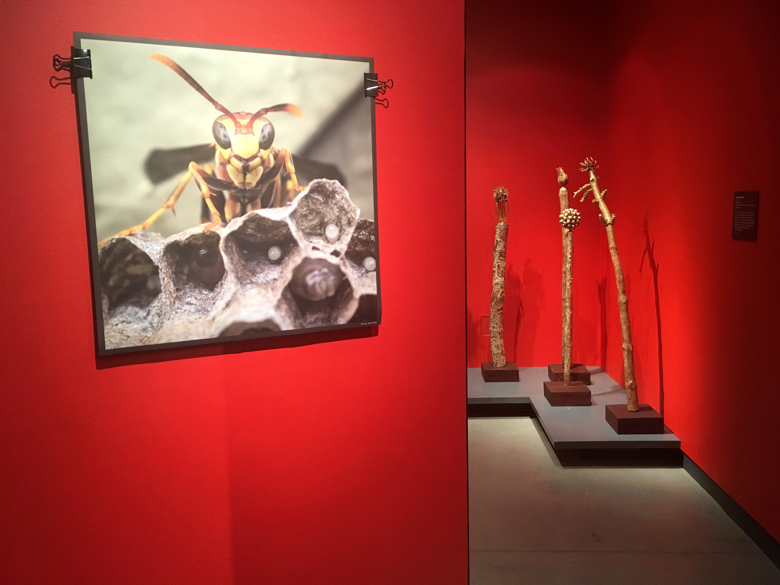
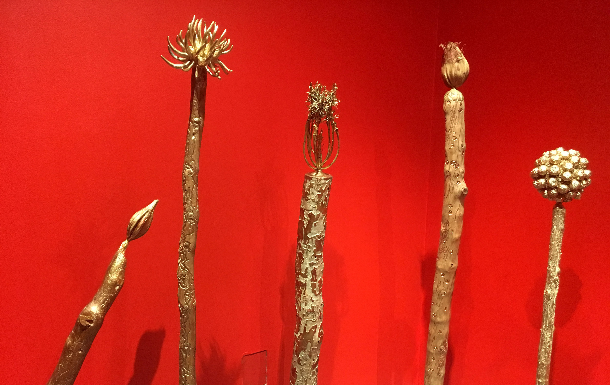
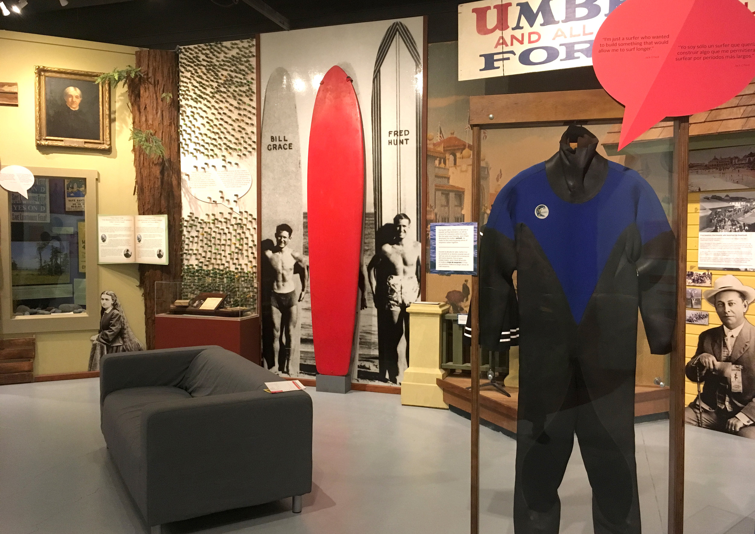
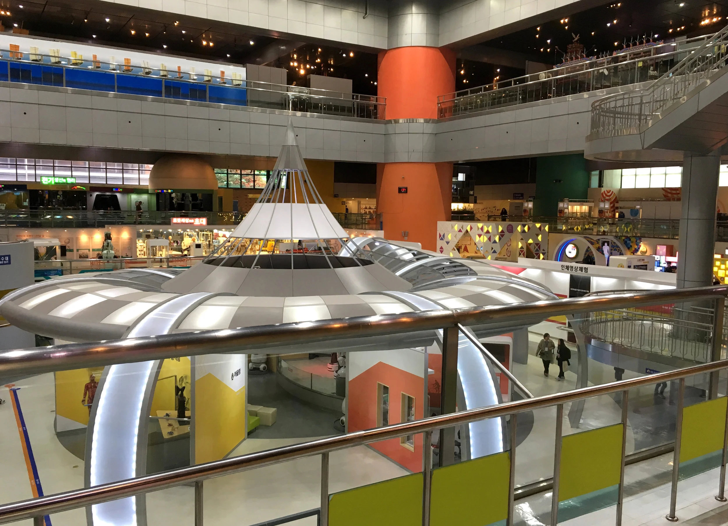
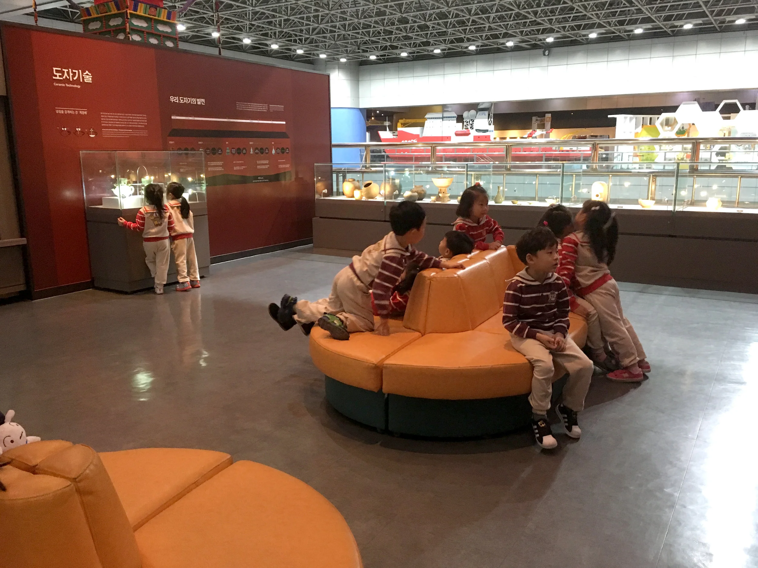
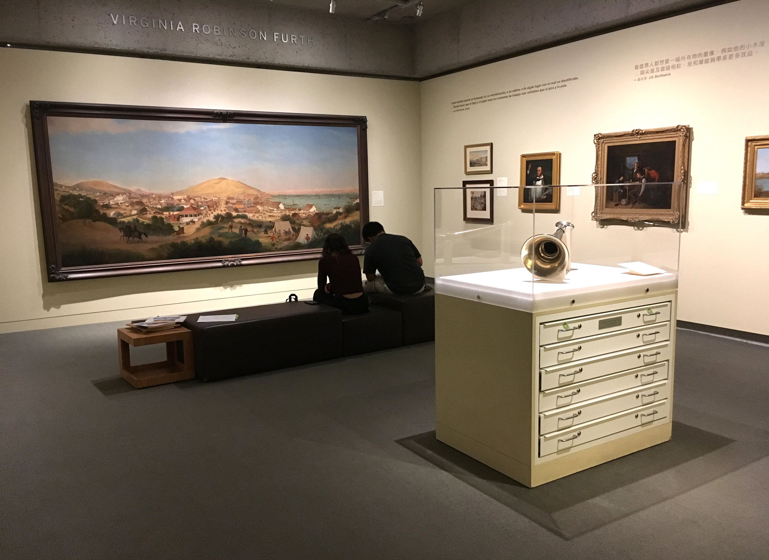
The two other themes of the museum, History and Natural Science, cross pollinate with Art. This interdisciplinary intermingling is a special aspect of OMCA. It has a special power partly because the galleries are still traditionally named, and separated in the building.

IMG_9536.JPG
IMG_9540.JPG

Oakland is a city, and "Urban" is treated as a region in the "Land" section. 

IMG_9547.JPG

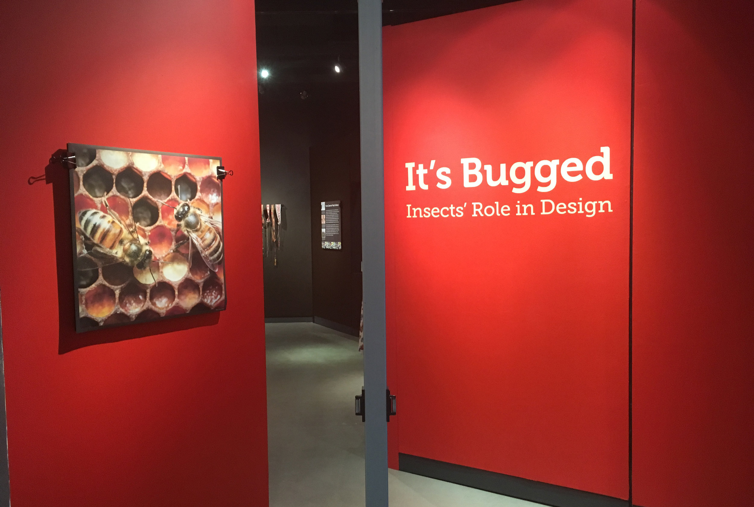
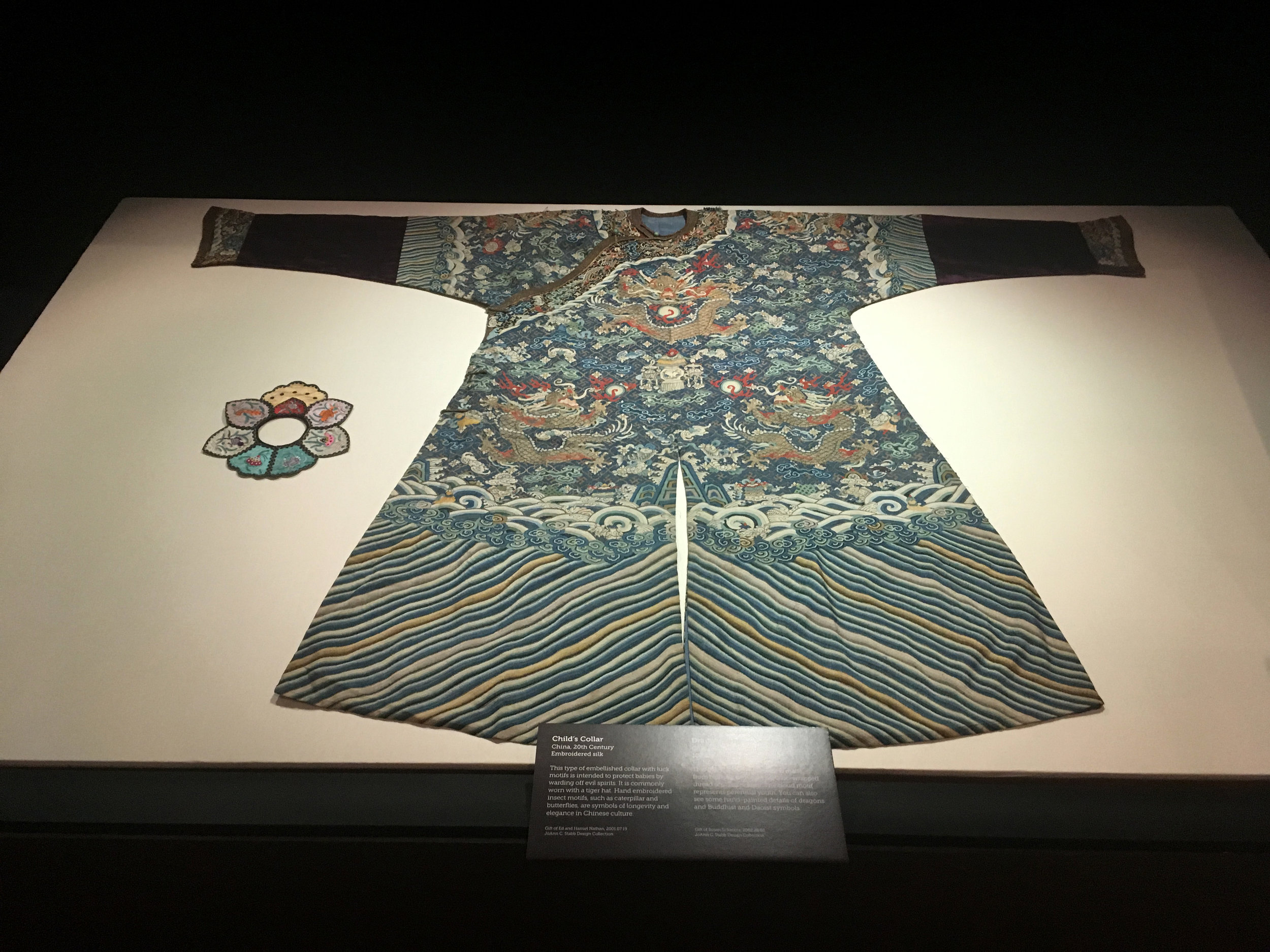
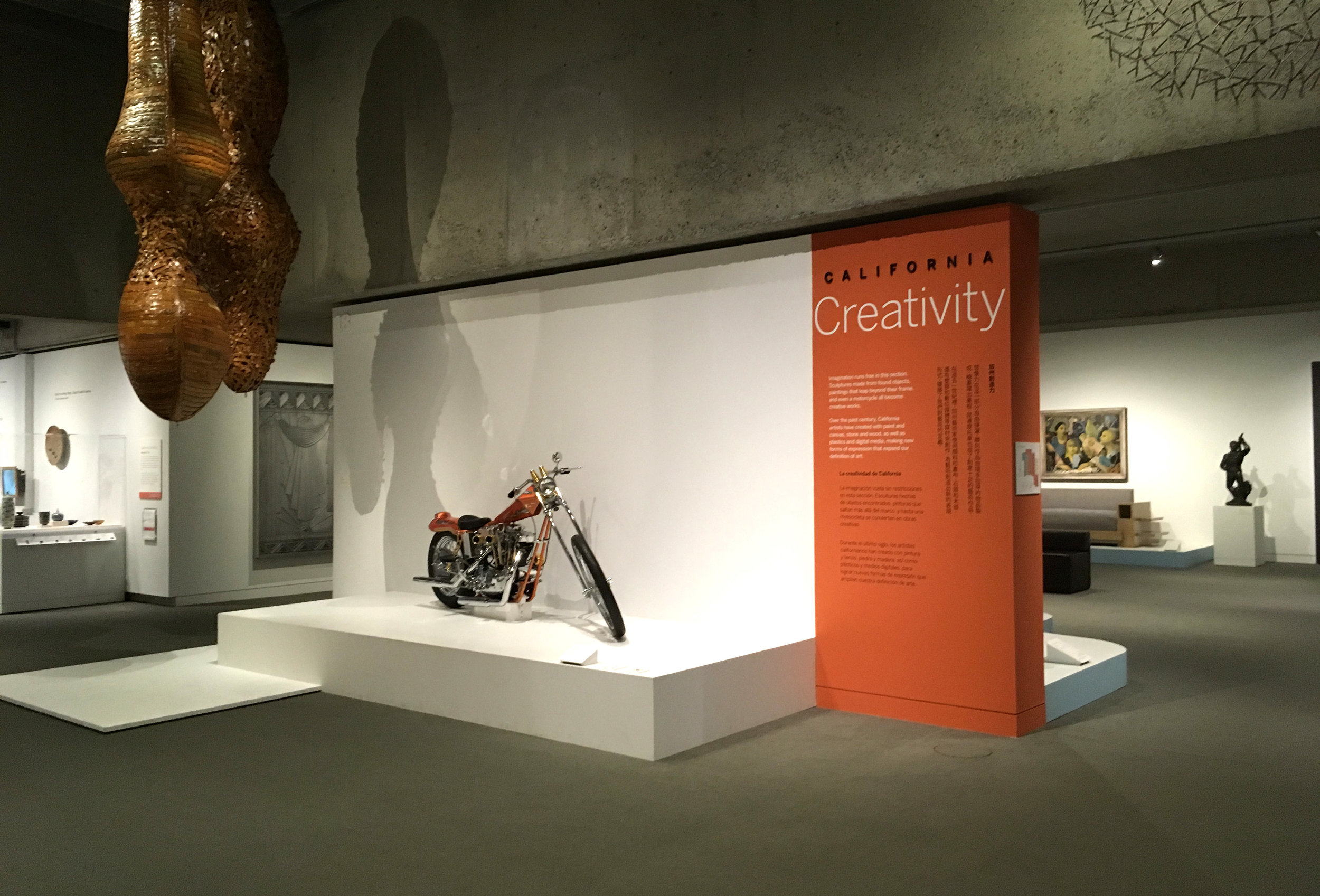
"Creativity" gracefully encompasses everything from pop culture, craft and self taught art to design...making all of it accessible and equally respectable.

IMG_9594.JPG
IMG_9605.JPG

The careful approach to writing focuses on clarity not simplicity. Multiple voices include those of artists, curators, and visitors.

IMG_9602.JPG

Sometimes just explaining the crop of a photograph can be a deep insight to visitors inexperienced with photography.

IMG_9556.JPG

How can visitors "see themselves" in an art gallery? Literally, one way is with a self-portrait interactive. Sometimes obvious and simple ideas are the most successful. A mirror station is provided for visitors to draw themselves, using their fingers on a screen. Their portrait then appears on a screen within the "California Portrait Wall". The digital library of past drawings shows the actual making of each portrait, not just the final image. Side-by-side screens promote social engagement. 

IMG_9564.JPG

Technology is limited, aside from this station, to avoid conflict with the aesthetic experience of the art and artists.

IMG_9561.JPG

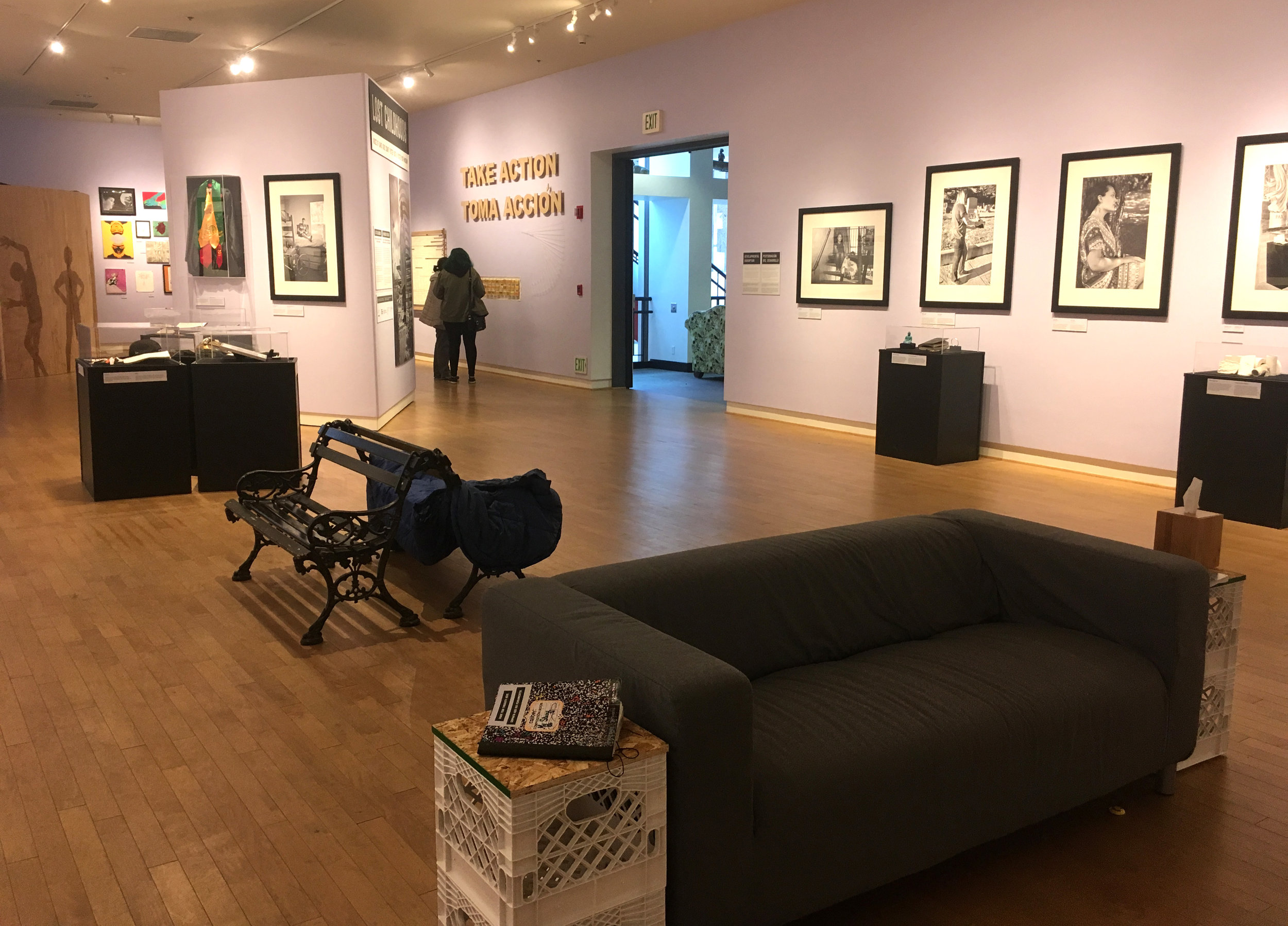
The "Is it art?" lounge is a resting side area "loaded" with provocative interpretation intended to encourage conversation. It's designed to change over time, with visitors informing the experimentation, and measuring the success themselves. 

IMG_9575.JPG

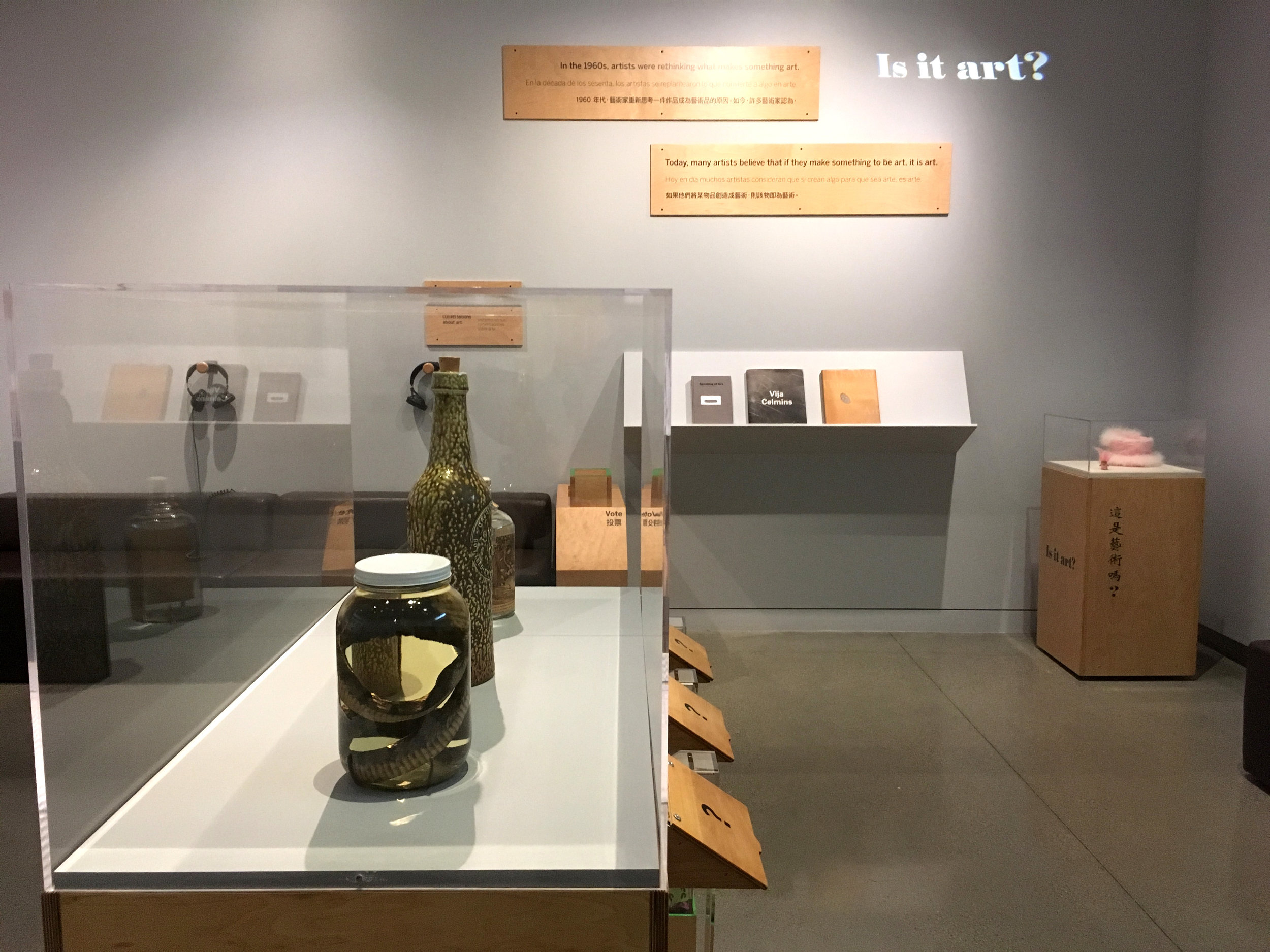
Have questions (used to engage visitors) like "What is...?" and "Is it....?" become trite? Are visitors getting immune to them? Maybe, but in the context of ART, they seem to be truly in their element!! Art intention and definition are truly open to exploration. Visitors can listen to other visitor's thought provoking conversations about art, although it feels scripted, as if it was re-produced, not captured spontaneously.

IMG_9581.JPG

Has visitor voting become gimicky? Maybe, but in the context of ART, it's an engaging and complex task, especially with good examples to consider.

IMG_9566.JPG

Great questions in the right context are natural conversation starters.

IMG_9572.JPG

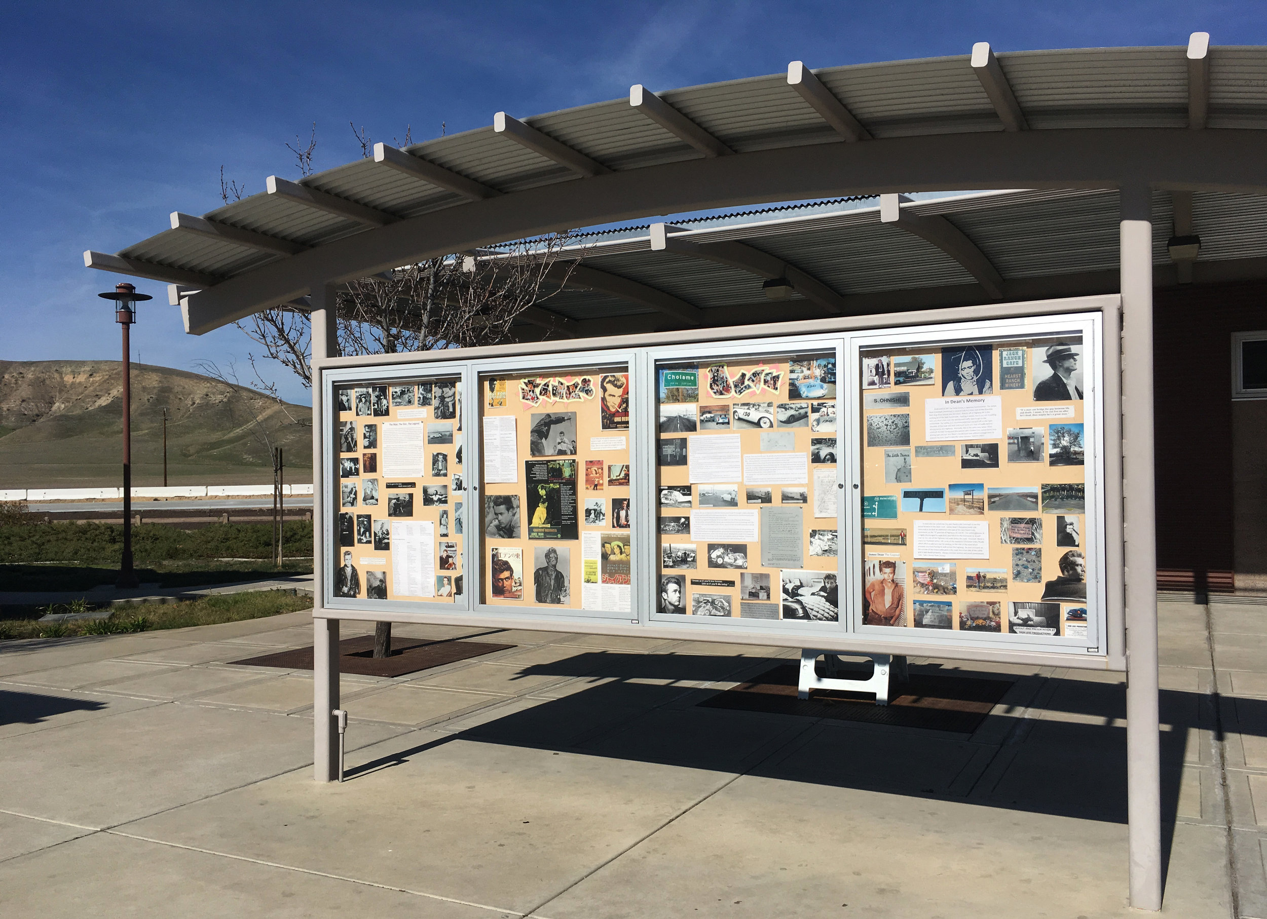
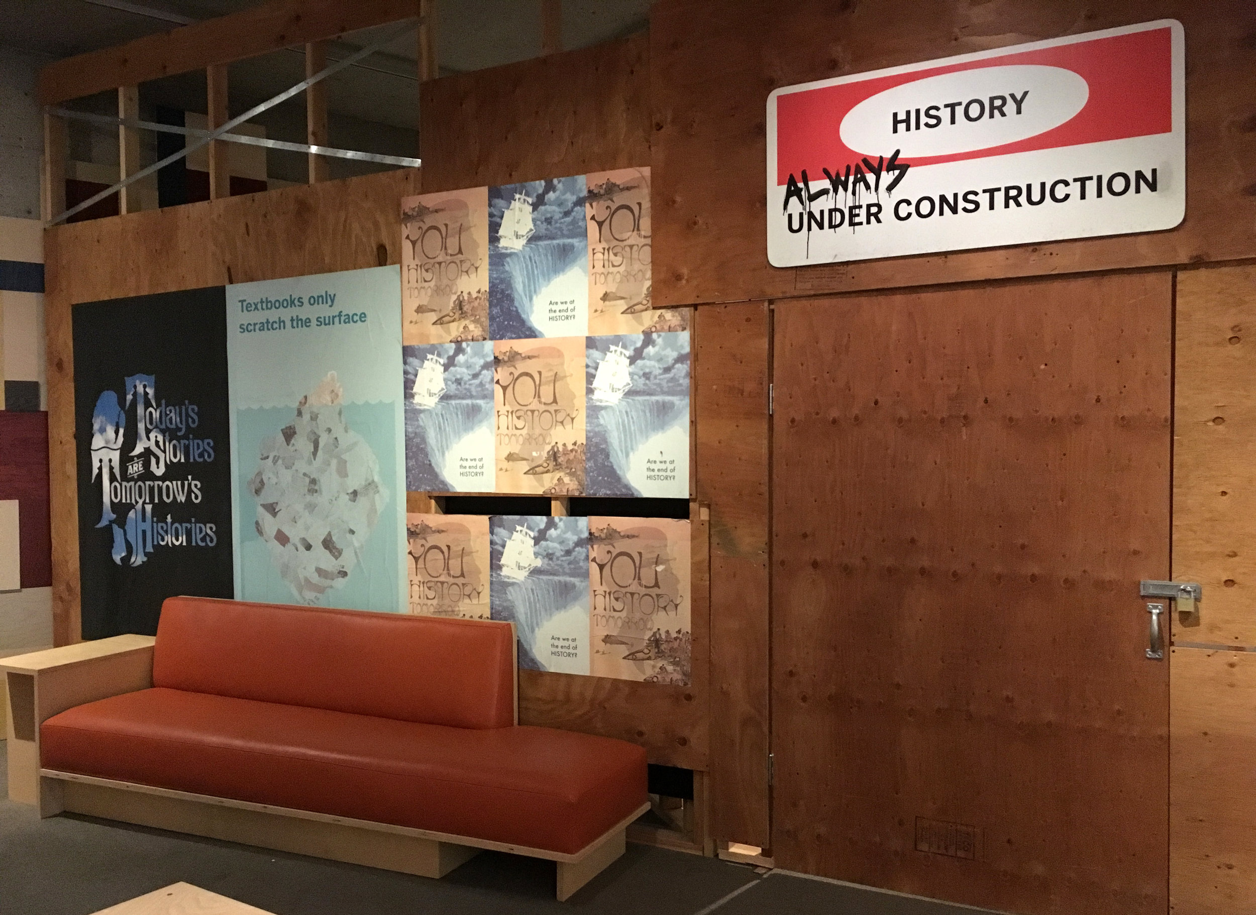
I always gravitate to the Art Gallery, with it's gentle continuity. But the museum is full of exhibition experiments to analyze and consider. Like visitor contributed stories of the 60's-early 70's curated as personal diaramas.

IMG_9641.JPG

And  baby pictures donated from local members

IMG_9672.JPG
IMG_9725.JPG

In the ocean area, a plastic activity, "Find 3 things in the jars that you have at home."

IMG_9724.JPG

With the museum stepping out of the authority role, art becomes for everybody nature gets politicized, history gets de-glamorized.

IMG_9660.JPG

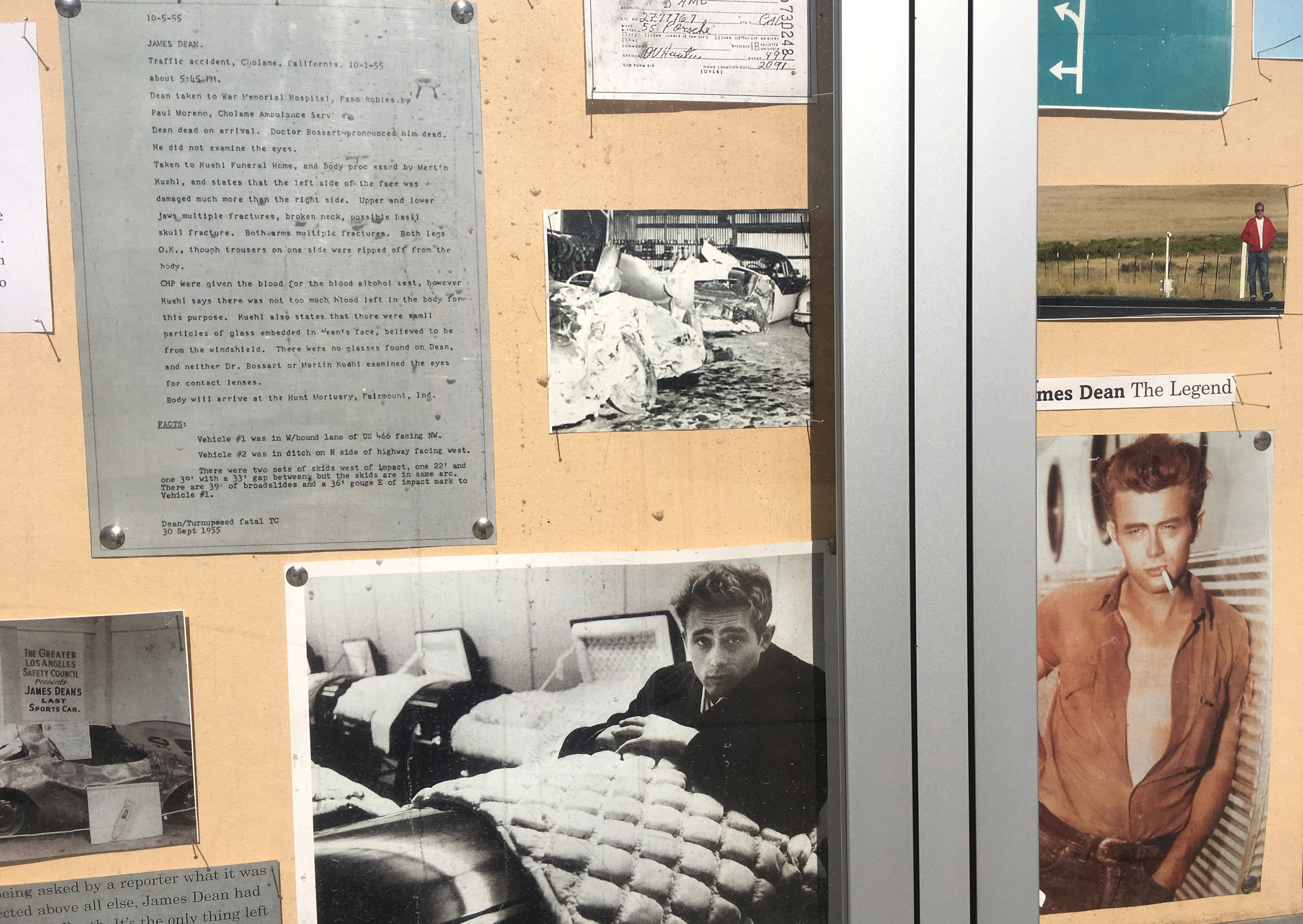
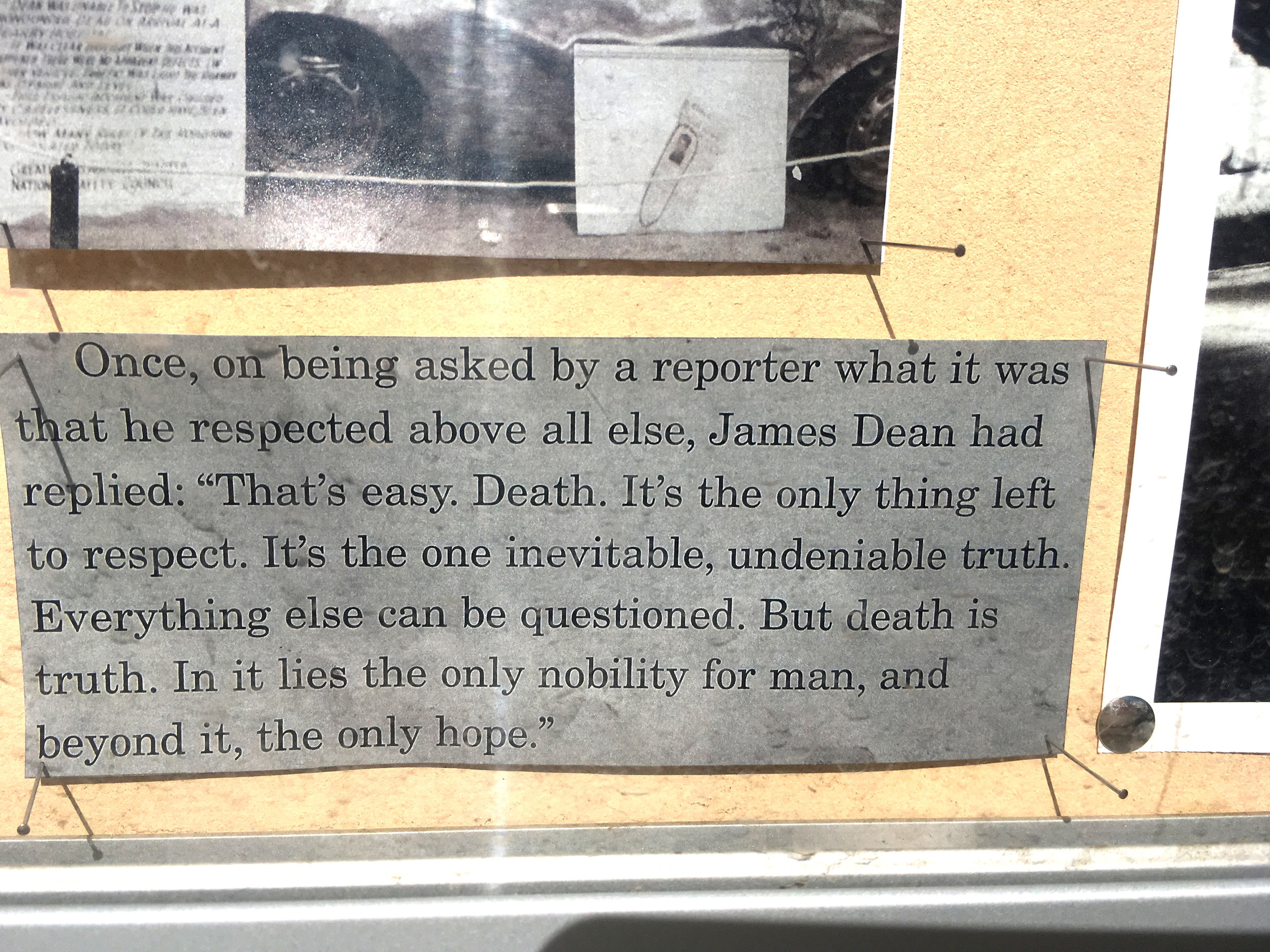
This is the "back closet area where someone(?) decides what's mysterious or weird.

IMG_9650.JPG

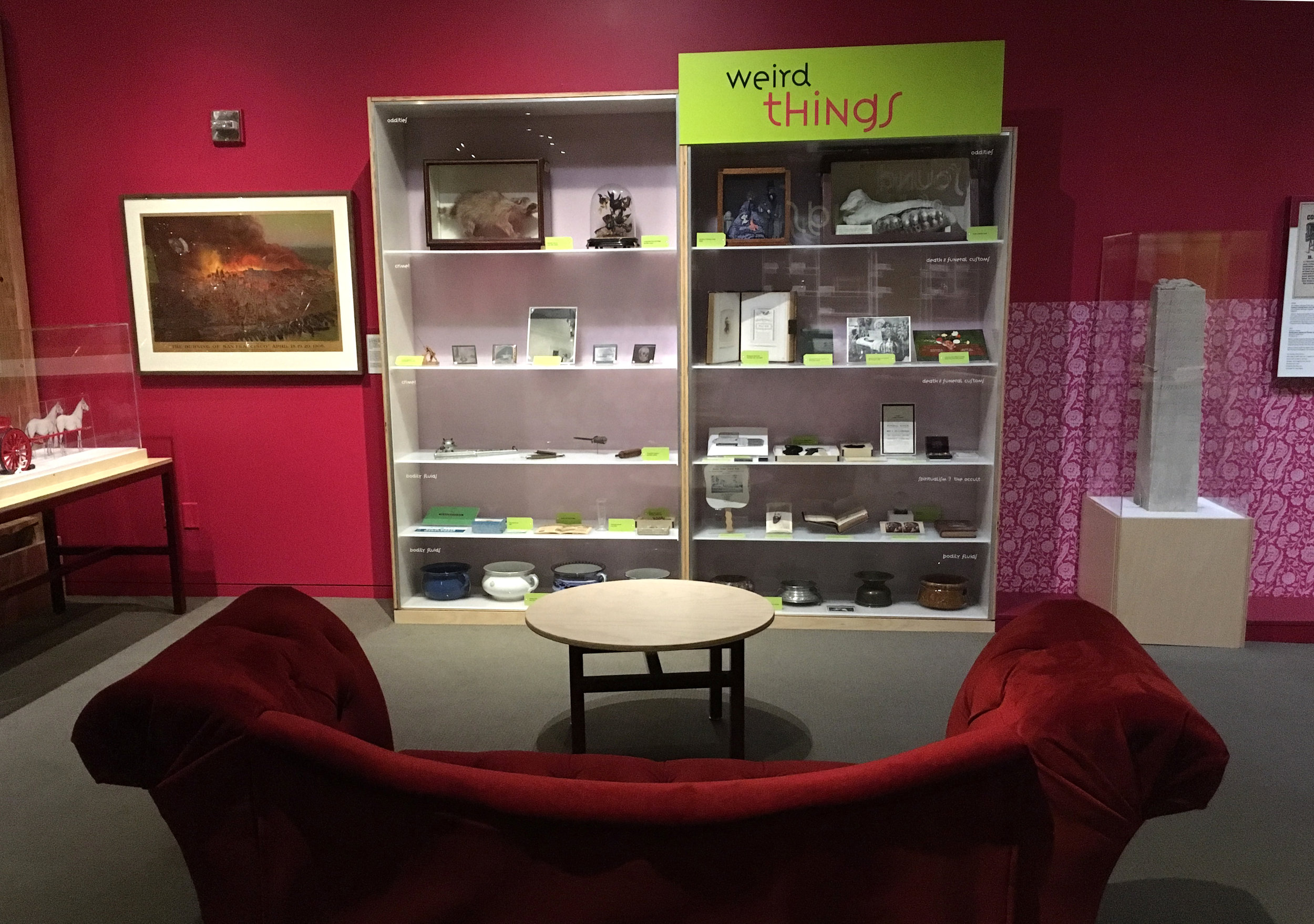
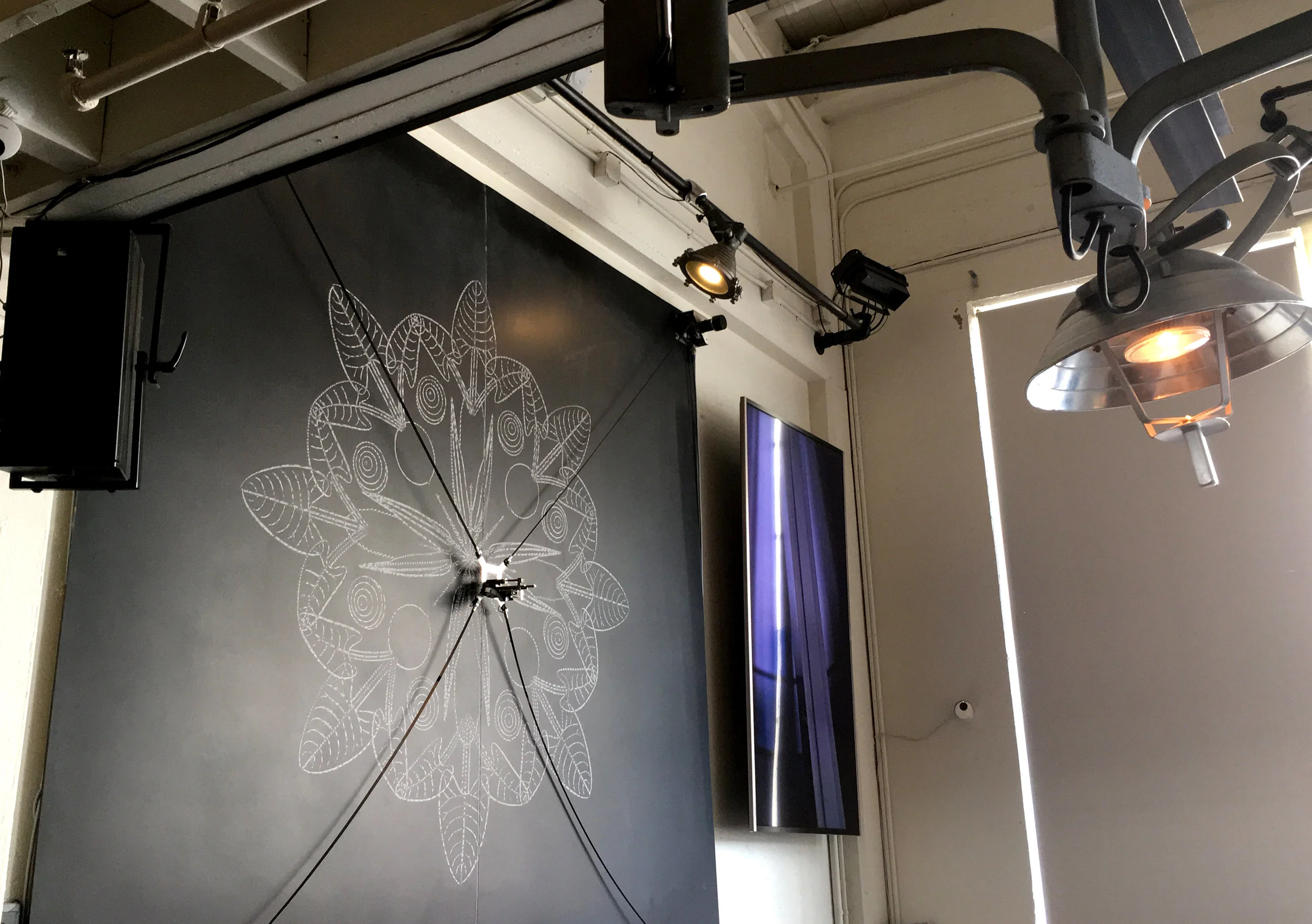
Just a few design details, Like this projection spill over,

IMG_9628.JPG

and "making" videos tucked in with the artifacts.

IMG_9621.JPG

The woman that (occasionally) passes by the front door

IMG_9626.JPG

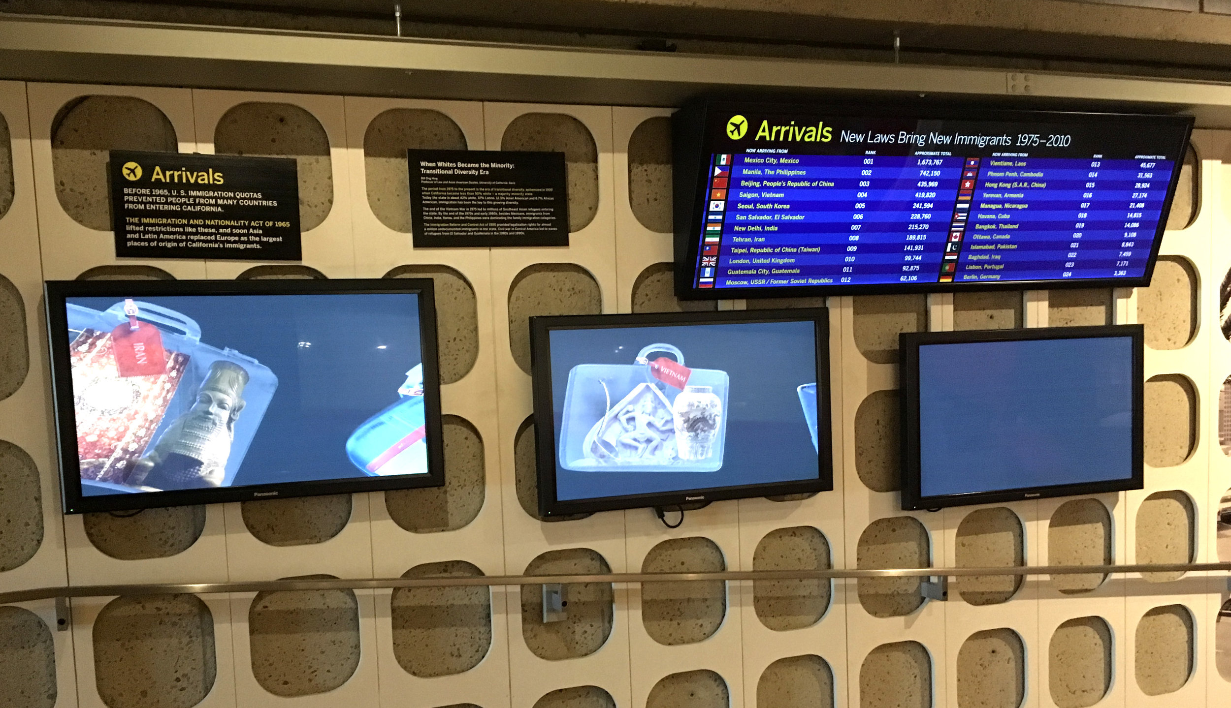
Immigrant information presented in the "vernacular" of an airport. 

IMG_9670.JPG

The kid's fort. Some kids never get to make their own at home.

IMG_9702.JPG
IMG_9683.JPG

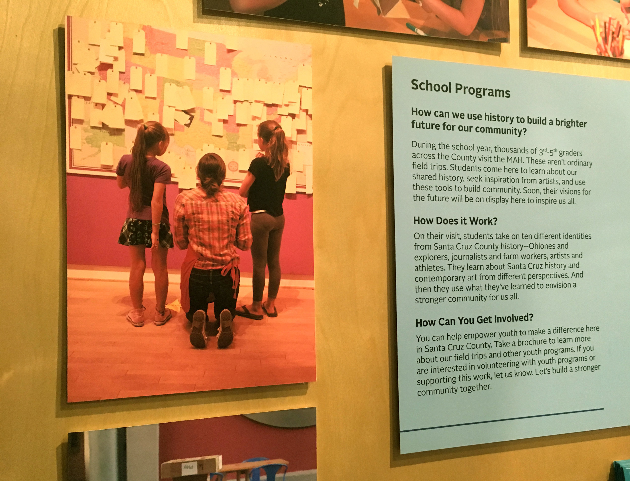
As museum trends roll out across the world, visitors seem to be quicker to adapt than the museums. Today visitors are sophisticated, more and more open minded about what's “appropriate” in a museum. They expect to customize their experience, to contribute something and see themselves reflected in meaningful ways.

IMG_9753.JPG

Trends and design treatments are quick to swirl and atrophy, but I think the new goals of community involvement are here to stay, driving innovation forward.

IMG_9769.JPG

BART (CA)

San Francisco. Don't get me started, because I don't know where to begin. I weep (and scream) inside every time I see visitors trying to use SF's BART ticket machines. As a local graphic designer I feel a deep and bitter shame. 

IMG_6811.JPG

This is how visitors are welcomed to our world famous city.

IMG_0212.JPG

Terrible wayfinding design is an extra level of aggravation, on top of other challenges with our (various) public transportation systems. Nothing about this is elegant, simple, consistent or intuitive. Worst of all, the constant additive tweaking is repetitive and ugly. The extremely amateurish fixes just add confusion to confusion.

IMG_6810.JPG

Here are some of the gruesome details!

IMG_0218.JPG
IMG_0217.JPG
IMG_0216.JPG

Here's an overview of the user's experience. So sad. I hate this situation with all my heart. 

IMG_0208.JPG

About a month later, maps disappeared from the platforms all together.

IMG_3256.JPG
IMG_3255.JPG

Exhibit Ahead (USA)

As a traditionally object medium, exhibits can embrace all media; word, image, moving image, sound, performance, installation, plants and animals, digital technologies, etc. But the most persistent definition of "exhibit" is that it is inherently physical; it has dimension, takes up space, and has (hopefully real) stuff. As a form of communication, it's a narrative you can walk around in. It's both a noun and a verb. To actually touch, or to be touched by something. To experience directly and to make meaning for yourself, alone or socially. It's an active (hopefully interactive) full body sensory exploration of content in a physical space.

IMG_7938.JPG

The elusive line between exhibits in museums and in the world at large is interesting. One one hand, a well designed museum exhibit is an experience of "embedded knowledge", where content is integrated in a meaningful way in every aspect of the space itself. Museums are the traditional keepers of sophisticated exhibit design research and best practices. On the other hand, from private living rooms to the streets, the world is one huge informal exhibit, unconsciously or intuitively or experimentally designed. Out there we can learn about communication and meaning making in all it's forms, as if "exhibit" can be defined as any time we say look!  there's an important story here.


Overlapping Graphics (CA)

CCA, San Francisco. When I attended an art exhibition reception at my alma mater, California College of Art, I noticed this poster treatment at the entry to the design department. Vertical and horizontal layouts were posted one over the other. The green tape is a nice touch.

IMG_0058.JPG
IMG_0057.JPG

I'm sorry I couldn't attend the opening reception to learn more about this event. The description included this statement, "The browser, in its mutability and its fraught relationship to form, will be used as a vehicle to interrogate and innovate layout techniques, typesetting, hierarchy, and visual form" 

The Interval (CA)

San Francisco. One official definition of a museum is "a non-profit, permanent institution in the service of society and its development, open to the public, which acquires, conserves, researches, communicates and exhibits the tangible and intangible heritage of humanity and its environment for the purposes of education, study and enjoyment". My favorite SF bar, the Interval, is also an important museum of the Long Now Foundation.

IMG_9878.JPG

Is it possible for a history museum to extent time awareness backwards and forward at the same time? As a counterpoint to today's accelerating culture, the Long Now wants to make long-term thinking and responsibility more common, in the framework of the next 10,000 years. Time is an intangible heritage of humanity, and this museum is trying harder than most to be as permanent as possible.  It's a history museum for the far distant future.

IMG_9860.JPG

But first the bar. Meant to "inspire thought through conversation", the Interval is a serious cocktail bar, with salon talks and historical international concoctions. The bottles hanging overhead are a gesture of donor recognition, a personal reserve of custom spirits for each donor to enjoy over time.

IMG_9812.JPG

The Long Now, created in 1996, is mostly known for the  10,000 year old clock, now being built at full scale inside a mountain in western Texas. When it's finished, visitors will be able to climb up the mountain and go inside to see the giant clock themselves. Under this table is an early version of the "chime generator." The clock's small scale prototype now lives at the London Science Museum.

IMG_9855.JPG

The Long Now is a think tank of luminaries, a rich incubator of time-responsible thinking and preservation projects. I remember coming here for lectures before the bar existed. Now "The wall" is a non-linear collage that hints at what goes on here. This is the tip of the iceberg, from preserving languages and the genetics of endangered species, to "long bets" and long term thinking seminars.

IMG_9825.JPG
IMG_9851.JPG

The Wall "key" like all the museum labels is dense and small.

IMG_9827.JPG

"What books would you want to restart civilization?" is the premise for the living library up above. It is crowd-curated, but I've never seen it open to the public.

IMG_9856.JPG
IMG_9846.JPG

The Rosetta Stone is a spiraling digital language archive. The museum takes a futuristic approach to preserving history, creating future artifacts and tools for future archeologists. These high tech projects have a old fashioned aesthetic.

IMG_9841.JPG

Brian Eno's ambient Painting and Jurge Lenhi.'s robotic chalk drawing machine continually evolve in real time, a criteria for Long Now art.

IMG_9816.JPG

The experience of being in the space is ideally the visitor's own "long now", a relaxed time to think about the continuity of our planet and civilization. Or to check phone messages.

IMG_9822.JPG

“Now” is never just a moment. The Long Now is the recognition that the precise moment you’re in grows out of the past and is a seed for the future. - Brian Eno (Founding board member)

IMG_9828.JPG

James Dean Rest Stop (LA)

LA, CA. Impromptu memorials appear wherever tragedies happen. They often include interpretation(s) of what happened, photos, stories and tributes from loved ones to the victim(s). They appear spontaneously, and remain as long as they are needed for the grieving process, or until they are replaced by a more official and permanent memorial. Crosses on the highway are a common marker of someone's death on the road, usually unknown except to family and friends. James Dean's death on the highway has gone one step more official, as a "rest stop" exhibition. 

IMG_8516.JPG
IMG_8522.JPG

Safety instructions on how to get to an actual roadside memorial nearby.

IMG_8509.JPG

"The perfect embodiment of an eternal struggle..."

IMG_8515.JPG

Morbid details are an essential part of the narrative.

IMG_8508.JPG
IMG_8521.JPG

The exhibition fills one of the standard highway display vitrines, but I wasn't able to find any credit or "curator's" statement. 

IMG_8507.JPG

On the opposite side, next to a typical local wildlife display, was this unintentional but deeply disturbing "exhibition" about missing children. Sometimes having no interpretation at all is the most powerful experience of all.

IMG_8523.JPG

The rest stop is just the beginning of a multi location experience. After passing the actual intersection and memorial where James Dean died, the Blackwell Corner General Store makes the final grand gesture of respect with an enormous hall of impromptu memorabilia, and 50's style diner. 

IMG_8525.JPG

Roadside attractions may be the most amateur form of narrative and exhibition, abut they are often intensely motivated, a place where local legends are created.

IMG_8529.JPG

Teaching Design Museum (Davis, CA)

UC Davis, CA. Many exhibition-related designers, like myself, slipped sideways into it from other areas of design or theater or art. It's often an organic but accidental career destination. It's rare to find a school that actually offers exhibition design. I was lucky to spend several refreshing hours chatting with Tim McNeil, Director of the Design Museum and Professor of Design for Exhibition Design and Environmental Graphic Design. The museum "explores how design shapes, improves and makes economically viable the objects, technology and environments we use, inhabit and experience every day."

IMG_8130.JPG

Located on campus inside the design department, the intention of the museum is to enhance the teaching and research activities of the design program. The words "Speed Mentoring Exhibit Mock Up" are heart warming to see.

IMG_8131.JPG

The museum is a founding adopter of the Green Museums Accord (California Association of Museums and the Green Museums Initiative) and the exhibition I saw, “It’s Bugged: Insects’ Role in Design” was a participant in the annual UC Davis Biodiversity Museum Day.

The entry is off a hallway through swinging classroom doors. The space is small. Just one room and a smaller room, with an office off the back.

IMG_8168.JPG

What's exciting to me is the quarterly turn over of exhibits in this little space, which keeps everyone on their toes. The time constraint causes resource and decision constraints as well, so the students have the opportunity to see authentic design in process and study the results.

IMG_8132.JPG

The insect exhibition explores how makers, designers, architects, and artists draw upon nature’s patterns, and how humans and insects collaborate as producers of raw materials. It combines elements from the Joann C. Stabb Design Collection and works from collaborating artists.

IMG_8170.JPG

With respect to honeybee architecture, the room's corners are cut to form a hexagonal shape, making the small space feel larger. The hanging fabric centered in the room, mirrors the shape.

IMG_8165.JPG

The fabric was designed for the exhibition

IMG_8183.JPG

The angled room corners form deep open vitrines,

IMG_8143.JPG

creating a feeling of infinite space behind the display, (where the corner would be).

IMG_8141.JPG
IMG_8138.JPG

Campus visitors must be well behaved, because these vitrines are open without plex.

IMG_8135.JPG

Each section text panel reflects the facing fabric pattern. Section titles play with Initial letters.

IMG_8181.JPG
IMG_8185.JPG
IMG_8189.JPG

Insect vitrines are tilted specimen drawers. Displays are informally arranged, making them feel more alive.

IMG_8140.JPG
IMG_8144.JPG

Beetle jewelry combined with specimens is just one of many small thoughtful details.

IMG_8192.JPG

I like the resourceful simplicity of install solutions.

IMG_8190.JPG

Hornet nest paper sculptures by Ann Savageau's are nicely integrated.

IMG_8194.JPG

And her wood sculptures etched into striking patterns by bark beetle larvae. 

IMG_8173.JPG
IMG_8148.JPG

From curation to design to install, the museum feels like a living changing example of important design considerations. Student visitors seem to be studying and learning from the design as much as the content.

IMG_8166.JPG

As a sideways designer, I had the added excitement of learning everything "on the job." But visiting UC Davis made me envious of the jump start these students receive, in good hands!

IMG_8153.JPG

Participatory Relevance (CA)

Santa Cruz Museum of Art and History. My return to the SF Bay Area brings "HOME" the importance of this area as a hub for progressive museum thinking. The Exploratorium is one example of this, where I met Nina Simon years ago. At that time I was reading her first book "The Participatory Museum", and now after reading "The Art of Relevance" I'm finally making a visit to her museum. Nina Simon is an advocate for meaningful new relationships between museums and communities, and her books are a must read for museum professionals. After a quick lunch together, she slipped back to her work and I explored the museum by myself.

"This is Your Museum." Moving beyond the initial "bonding" potential of museum experience, MAH's goal is to promote a stronger and more connected community, through "building bridges" and "feeling empowered". Going further, OFBYFOR ALL is MAH's global initiative to make civic and cultural organizations more inclusive. This is museum as community center, devoted to collaboration and activism with no pretense of neutrality. Here you can have a job title that includes the word "Catalyst" or "Spark".

IMG_7762.JPG

The sidewalk entry is spare. The main entry is around the corner, set back from the street in a cozy plaza with a food court. Based on the logo, a semi-cricle of red balls against the mirrored walls of the building creates a floating ring above the door. The 2 entries are unified by a mural that wraps the plaza with a patchwork quilt theme.

IMG_7958.JPG
IMG_7971.JPG
IMG_7926.JPG

The important first impression is a relaxed social activity (trains) in an unpretentious lobby. It's this scene that lures us in, not the sophisticated, seductive or novel aspects of the designed environment. Without knowing their design intent, it's clear that this informal persona is what makes MAH an authentic community center, a safe and welcome place for all. At the same time, unresolved design aspects indicate a level of design that is associated with amateur museums in general. This raises design questions about the difference between a lack of design ability or resources on one hand, and not wanting design to be an obstacle to authentic experience on the other hand. It's an issue close to my heart, having struggled with it for years. The Intentionality and appropriateness of design are a heightened concern. Since "no design" is not an option, what is the most sensitive design approach in this situation? I like to think that authenticity and empowerment can co-exist with sophisticated design. Smart functional elements, and flexible exhibition design elements is a useful strategy that could be applied here.

IMG_7923.JPG
IMG_7889.JPG
IMG_7745.JPG

A piano just inside the sidewalk entry is a bonus gesture of informality. The unspoken message doesn't need any interpretation.

IMG_7916.JPG

The Santa Cruz History room is small and packed, visible almost all at once. The writing style is simple and direct about social issues. Encouraging visitors to "make" history themselves is the prominent theme, introduced by this floor graphic at the entry.

IMG_7811.JPG
IMG_7826.JPG
IMG_7828.JPG
IMG_7824.JPG
IMG_7822.JPG

"How can you get involved?" 

IMG_7830.JPG

MAH co-creates exhibitions through its think tank committee (C3), a group of creative community activists. For example, the "Lost Childhoods" exhibition is a collaboration with the Foster Youth Museum and a group of local foster youth, artists, and youth advocates. As well as stories, personal belongings, photography, and art installations created by foster youth, the exhibition includes concrete ways to support child welfare today, acting as a "platform for dialogue and action." Homey sofas in the foyer, with kleenex, set the stage.

IMG_7879.JPG
IMG_7808.JPG

I wonder if the exhibition space itself was also co-designed with the community? Partitions would help to break up this space, define and give privacy to each story. In the context of changeable collaborative installations, a fleet of re-usable modular elements such as free-standing panels, stands and vitrines could be a useful strategy.

IMG_7803.JPG

Everywhere there are notebook opportunities to reflect and share personal experiences and thoughts. No nonsense here. They are filled with sincere and revealing reflections.

IMG_7776.JPG

The photography, stories and objects are intense and eye-opening.

IMG_7783.JPG
IMG_7779.JPG

At MAH, exploring the theme of activism is as prominent as the content itself. Below the big wall title is a set of small yellow take away cards.

IMG_7886.JPG

I'm so impressed by the extra thought and organization this required. Concrete, doable suggestions with real contact information (on the back) in a small takeaway format. Picking out a few cards is already a personal decision, a commitment to move from new awareness to considering action. The deeper message doesn't need to be put into words; Everyone has something to offer.

IMG_7794.JPG

A "community board" wall allows visitors to understand that the way an exhibition is created is as important as what it is about. This area raises the same questions about unresolved design and intentional informal design.

IMG_7784.JPG

"We built this with our community" is a statement of shared pride. There is no hesitation about offering community pamphlets and notices in the galleries. 

IMG_7788.JPG

The Chamber of Heart and Mystery is a whimsical arty space that serves as a "magical" portal to The Word Lab, a writing lab for local 4th through 12th grade public school students. Using writing as way of self discovery, projects lead to the publication of a book, poster, or magazine, or public reading. The aesthetic is a nod to the cabinet of curiosities. The door between the chamber and the workshop serves as a projection surface.

IMG_7892.JPG
IMG_7751.JPG
IMG_7905.JPG
IMG_7902.JPG
IMG_7754.JPG

A collaboration with a sound artist and Hospice Santa Cruz County, "Spoken/Unspoken" is a sound installation featuring intimate messages from Hospice patients in end of life care. It asks "At the end of your life, what will you wish you had said?" This exhibition invites you to listen to and contribute stories that are woven into an audio installation.

IMG_7836.JPG

A simple draped environment does not distract from listening to moving messages.

IMG_7854.JPG

This gives new meaning to the importance of "last words."

IMG_7859.JPG
IMG_7839.JPG

The recording room.

IMG_7850.JPG

Stationary and envelopes are provided. "Feeling inspired? Reach out. Take a moment to write to a friend or loved one. Don't wait, say it now."

IMG_7860.JPG

Near the exhibition is an exercise in values; rating what is most important to you, using a hole punch. The card then plays a melody in the music box. 

IMG_7871.JPG
IMG_7867.JPG
IMG_7866.JPG

Daily Geometry (India)

Mammalipuram, Pondicherry, Trichy, India. (February 2017) Every morning women draw kolam patterns on the sidewalk outside the door, drizzling rice flour on the wet pavement. Traditionally they are based on a central geometric grid of dots, through which the pattern loops, with a callagraphic quality. If the lines create closed shapes, it keeps out evil spirits. Otherwise the patterns are meant to be welcoming to all beings (including ants) and bring prosperity to the home or business. What makes them even more powerful is their temporal beauty, fleeting and endlessly original.

1.JPG
2.JPG
3.JPG
9.JPG
4.JPG
5.JPG
7.JPG
6.JPG
IMG_1074.JPG

Installation In Progress

When I come across installations in progress, at various museums, I get a little rush of contagious anticipation. I suspect that this is interesting only to those who work in the museum world, who play a role in the strange theatrical process "behind the scenes".

It's the visible tip of the iceberg of exhibition development

IMG_6222.JPG

Lunch with Lucia Eames (CA)

Northern California. Looking back in my photo archives, I'm finding things from the past to share (here & there) in my ongoing blog. In 2010 I was part of an Exploratorium group invited for lunch with Lucia Eames at her home in Marin. The lunch table and meeting area were thoughtfully set up with inspiring elements.

IMG_0394.JPG

More than a matter of stylish hosting, this is proof that a good design process begins and ends with the surrounding environment. We feed our process by creating a stimulating environment.

IMG_0397.JPG

Lucia, our elegant and gracious host. Meeting her is a cherished memory for me!

IMG_0424.JPG

The house is partly a private archive, containing various design prototypes, exhibition artifacts, photos and collections.

IMG_0415.JPG

But this home is lived in, so for me the vicarious thrill of the personal environment was most alluring.

IMG_0461.JPG

With the god-like status of the Eames, the experience is a bit like visiting a shrine. The homes of famous creatives are a form of voodoo, a brush with the legendary greatness.

IMG_0395.JPG

Descriptive accolades of their work are endless; lean & modern, playful & functional, sleek, sophisticated, and beautifully simple, intelligent, thorough, experimental, energetic, worldly....ahead of their time in every way.

IMG_0441.JPG

They are credited with an almost mythic integrity; and the ability to design every-which-way and on every level, seemlessly and simultaneously.

IMG_0459.JPG

It's easy to see how they epitomize the ideal creative work/life attitude.

IMG_0465.JPG

"In the end everything connects - people, ideas, objects. The quality of connections is the key to quality itself" Charles Eames

IMG_0449.JPG
IMG_0479.JPG
IMG_0455.JPG
IMG_0462.JPG
IMG_0442.JPG
IMG_0456.JPG
IMG_0447.JPG
IMG_0450.JPG
IMG_0500.JPG
IMG_0469.JPG

As exhibition designers the Eames were early conduits for the science/art crossover. Famous for information rich environments honoring physics to mathematics to early computer technology. As a designer working on interactives at the Exploratorium, I was thrilled to see this old example:

IMG_0396.JPG
IMG_0491.JPG

It's interesting to consider that their charming and complex graphics would be considered too dense for today's design approach, inaccessible in some ways.

IMG_0475.JPG
IMG_0425.JPG

I couldn't photograph it, but  i want to describe my favorite moment; looking into flat file drawers full of the tiny model people used in exhibition design models. They photographed a group of their friends, meticulously printed each of them at about 6 different scales in the darkroom, mounted them on cardboard and carefully cut around each figures. That's how they did things.

Discrimination and Resistance (Portland)

Portland, Oregon. My favorite core exhibit at the Jewish Museum and Center for Holocaust Education uses flip panels as a powerful way to present positive and negative social forces, back to back. Since no museum is neutral, color reinforces the positive bias.

IMG_7693.JPG

The panels look at Jewish history in Oregon through the lens of tools of discrimination (Scapegoat, Intimidate, Appropriate, Segregate, Exclude and Dehumanize) using black and red, on one side...

IMG_7672.JPG

.....and tools of resistance (Persist, Create, Celebrate, Protest, Organize, and Reform) using color, on the other side

IMG_7685.JPG
IMG_7682.JPG

"Spin" suggest twirling the panels casually, but the experience calls for a slower "Turn", a thoughtful consideration of contrasting forces, and the power of choice.

IMG_7684.JPG

The theme is reinforced using floor graphics circling a nearby display that amplifies the same dilemma with examples of issues beyond the jewish community.

IMG_7688.JPG
IMG_7687.JPG

Book Arts PNCA (Portland)

Portland, Oregon. What are the unique qualities of campus exhibition venues, situated in the context of a learning environment? Student energy seems like a real, or implied factor, because school is a place of youthful struggle and transformation. I went to a book arts lecture and related exhibition "Projects for the Page" at Pacific Northwest College of Art.

IMG_7645.JPG

This PNCA building is a renovated post office building.

IMG_7649.JPG
IMG_7660.JPG

A minimal tabletop presentation, with white gloves provided to touch the fragile books.

IMG_7655.JPG
IMG_7654.JPG
IMG_7653.JPG

PNCA wayfinding captures the studio mood using splattered paint within the typography

IMG_7658.JPG

When students are accepted to the program, they are invited to respond with art.

IMG_7659.JPG

Communication Design Poster

IMG_7661.JPG

Musee LeeUngo (Daejeon)

Daejeon, Korea. The most prominent sign at the entry of this art museum is the mysterious M1, which suggests a code on a city map?

IMG_7187.JPG

The official title is more understated, pedestrian level at the beginning of the entry pathway. 

IMG_7271.JPG

A slice of the landscape through the cement wall comes first.

IMG_7183.JPG
IMG_7273.JPG

And then a tree.

IMG_7291.JPG

Located around the side, these massive dimensional letters are practically hug-able.

IMG_7189.JPG

Elegant slatted wood treatment in the galleries.

IMG_7285.JPG
IMG_7283.JPG

I always enjoy this detail, the changeable shadow effect of graphics on window shades

IMG_7293.JPG

An english typographic treatment used for photos.

IMG_7295.JPG
IMG_7191.JPG

DMA (Daejeon)

Daejeon, Korea. I borrowed a bicycle and peddled around the gorgeous Botanical Park where 2 museums are located. At the Daejeon Art Museum, the group exhibition "Variance of Objects" was well worth the visit. I wonder how intentional it is, the way this venerable tree is placed at the entry, so that the corner of the building folds it's shadow, so beautifully. 

IMG_7177.JPG
IMG_7184.JPG

Translucent entry banners, which are right-reading from the street, are reversed to visitors as they enter on foot.

IMG_7234.JPG
IMG_7176.JPG

Icon in a permeable parking space

IMG_7230.JPG

The lower entry doesn't get a lot of traffic in the morning

IMG_7270.JPG

NSM (Daejeon)

Daejeon, Korea. (ISSM Conference) I was invited to speak at this conference held at the National Science Museum. When I got a short break from our wonderful Korean hosts, I took a self-guided tour, sprinting through the museum.

IMG_6994.JPG

Modern architecture side by side with traditional pavilions, which are probably used for visitor lunch time and museum events.

IMG_6998.JPG

The interior is a cavernous patchwork of exhibition areas, delineated by lower wall partitions, without much transition or pacing from area to area.

IMG_7012.JPG

This science museum aesthetic reminds me of a shopping center. Everything competes for the same level of attention, as if for shoppers, who may be driven more by distraction than attraction. There is a slightly dazed sense that we could be anywhere in the world. 

IMG_7027.JPG

Especially in this context, it's interesting to see how local cultural aesthetic permeates the more generic design approach. In a section about nuclear technology, models are treated as exquisite jewels, set into a wall geometry suggesting origami.

IMG_7120.JPG
IMG_7118.JPG

Visually elaborate icons are pervasive. I hoped they would help me read meaning, as a non Korean speaker, but for me it was hard work.

IMG_7034.JPG

The choice of colors used with old artifacts and elaborate colorful animations.

IMG_7109.JPG
IMG_7108.JPG

The entry to the alcove about kimchee is elegant, and welcoming, like a bow.

IMG_7116.JPG
IMG_7111.JPG

English appears only with some titles, but like everywhere in the world, it also appears here and there as a "global" design element.

IMG_7042.JPG

I confess as a westerner, my amazement that the ever popular outlined typography can be legible with alphabet systems such as this Korean Hangul.

IMG_7113.JPG

At a science museum like this, a variety of design is no surprise. When some sections, like these, are visually simpler, with clearer focus, I wonder if it is due in part to a sponsor's involvement (?)

IMG_7112.JPG
IMG_7117.JPG

Like this history of technology area,

IMG_7077.JPG

with white space, and an interaction between grey images and real shadows from the objects.

The lighting on this massive 4 sided, multi-tiered tower turned off and on in different vitrines, synchronized with related videos.

IMG_7030.JPG

As usual, the (Korean) history of science and technology is located in a quieter area, top floor. As often happens, the historical area of the science museum shifts suddenly to the history museum stereotype, more dignified and restful for visitors.

IMG_7084.JPG
IMG_7102.JPG

The objects were stunning.

IMG_7089.JPG

Science feels qualitatively different in a historical context. It meshes with culture, art, function, and belief systems, intrinsically. Even if the connections are not explained, they are still implied, effortlessly. Why is it more difficult to convey or to sense this relevance with current content?

IMG_7106.JPG

In this world of busy icons, a plain rectangular icon is mysterious.

IMG_7088.JPG

A gigantic ancient map of Korea is displayed on a curved vertical surface to make it easier to view as a whole.

IMG_7083.JPG
IMG_7092.JPG

I know it's a bizarre practice to sprint through a museum, looking at the design without diving into the actual experience and content! It's ironic too, because form follows _________(you name it). Perhaps it's dangerous, and maybe not "better than nothing". For me it raises my awareness about the most automatic, unconscious design associations we make.

IMG_7045.JPG

I returned to the conference feeling grateful for the invitation to Daejeon, and lucky to be part of the cultural exchange within the museum world.

IMG_7049.JPG

Logo Physics (CA)

San Francisco, CA. Does physics matter in logos? Maybe only to veterans of science museum work. Fed Ex Kinko's logo is a rearrangement of the original FedEx typographic colors. In the window of a printing service center, the three overlapping shapes seem to imply color primaries. Print primaries are magenta, cyan, and yellow, which would combine to make blackish in the center. But the logo uses light primaries—red, green and blue, which should combine to make white in the center, where it's dark blue. 

IMG_8498.JPG

Teotihuacan Vitrines (CA)

San Francisco. The artifacts are incredible, but I couldn't help admiring the vitrines as well, in "Teotihuacan, City of Water, City of Fire" at the De Young Museum. The pedestals are stepped at the bottom giving them extra weight and presence, like the architecture the artifacts would feel at home in.

IMG_6844.JPG
IMG_6847.JPG

Even where a base might not be neccessary, the pedestal adds something to the presentation.

IMG_6852.JPG

Freestanding vitrines have various stepped pedestals set inside a full sized plex box.

IMG_6840.JPG

So the plex seems to float, giving the artifacts breathing room.

IMG_6832.JPG