Terror Haza Muzeum (Budapest)
Budapest, Hungary. For the last 9 months on the road, I've visited many museums that focus on dark and difficult history. Mostly small museums, barely funded, not well known and hardly attended. In contrast, Terror Haza is a famous museum, highly designed, at great cost, with a constant line of visitors at the door.

There is already so much to read about this museum. In short, it was designed by movie set designer Attila Kovacs. So the installations are theatrical, and the visitor experience is cinematic. The design relies heavily on drama—of video, projection, architectural variety and lighting. An ominous musical theme permeates the space. The overhead cut title, which is meant to cast a moving shadow along the building, is oppressive even on a cloudy day. Consequently there are design issues such as overload. But the exhibition design is interesting and creative, with varied pacing from space to space.

There is controversy about the two threaded narrative that follows both the Cross Arrow and the Communists. At some points they (intentionally) cross-over, and the multiple stories can be confusing to the visitor. There is also controversy about how the role of Hungary is portrayed, or not.
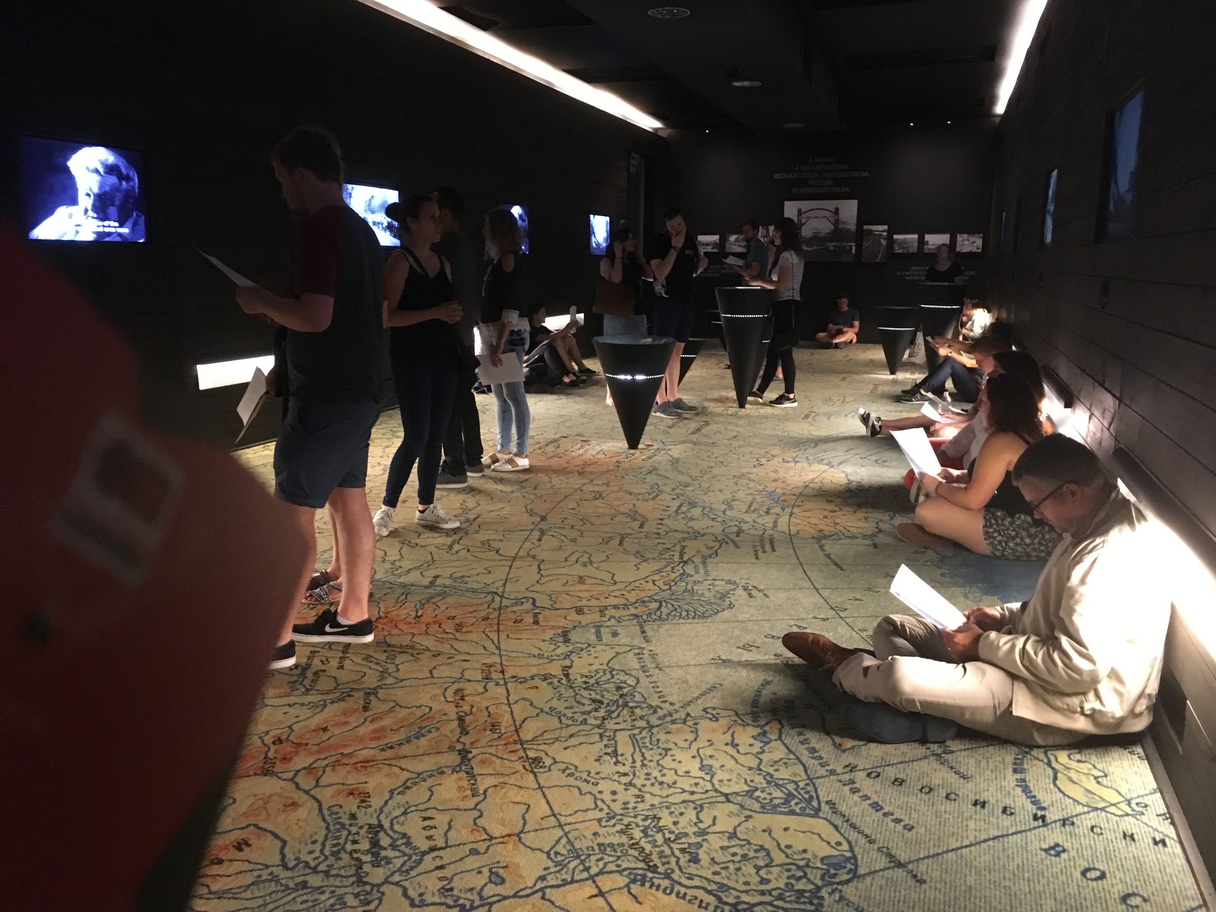
Surprisingly, seating is lacking, and visitors sit on the floor, needing time to digest it all. Interpretation is provided as a single sheet multi-lingual handout for each room, or an audio guide, which is difficult to maneuver, turning it off and on in such an immersive environment.

I marveled at aspects of the design here. Like anyone involved in museum design, I am basically "ruined" as a visitor, having a conflict of interest between studying the exhibition's design, and trying to innocently and holistically "grok" the experience as a visitor would. After visiting a string of humbler, poorly designed and poorly curated museums on similar themes, I appreciate the intelligence of Terror Haza. But I have come to love the humbler museums on this year-long journey. Their intent seems more transparent and I often feel a kind of grass-roots urgency about their emotion and mission. Sometimes I wonder if there's an inverse connection between the degree of design (which strives to clarify and communicate) and the degree of cloudiness (in the inner workings of the process and intention).