The Art of Style (Paris)

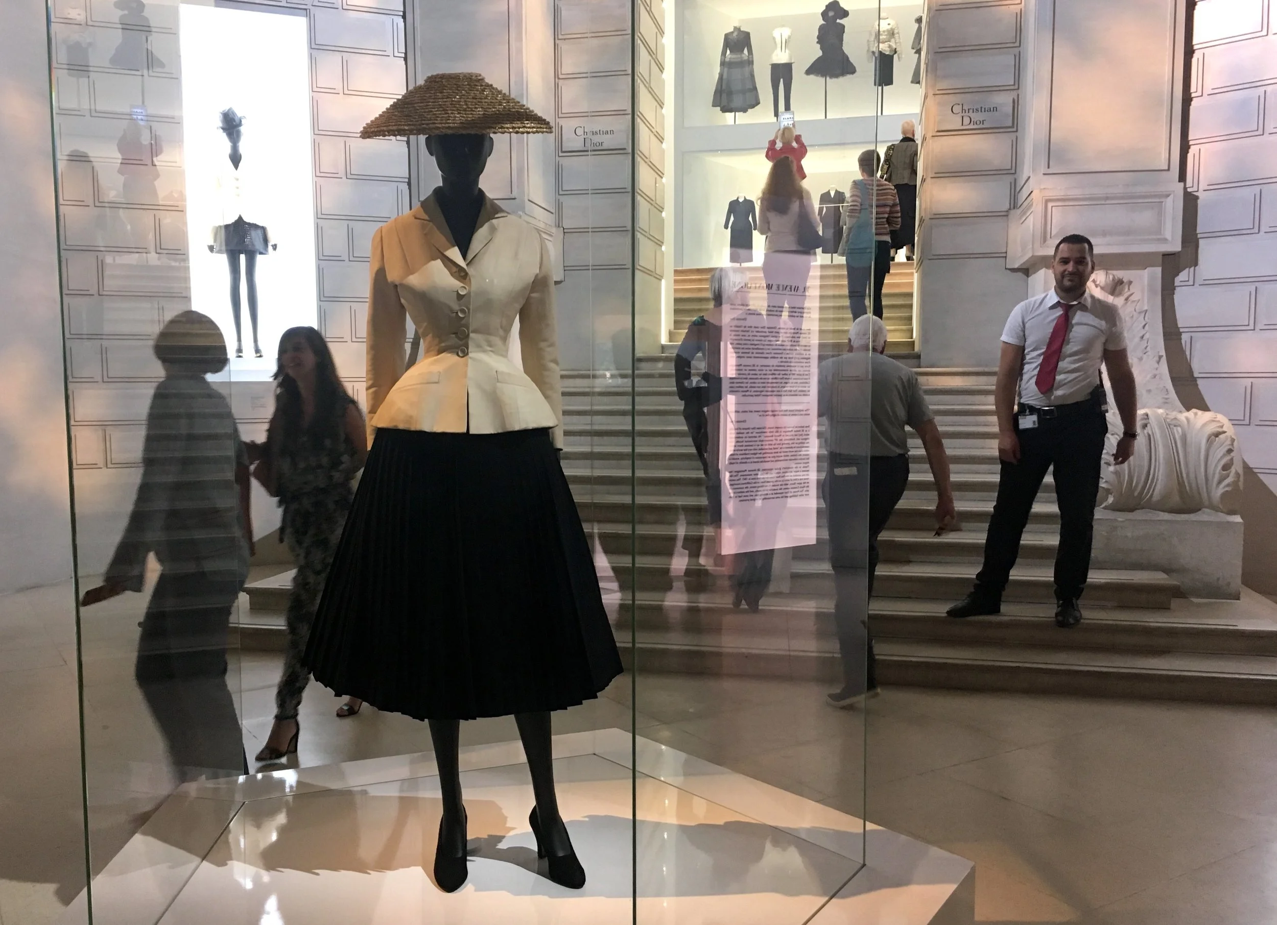
Paris, France. The entry line was down the block to get into the Christian Dior exhibition at the "other" Louvre, Musee des Arts Decoratifs. On my last visit to Paris I discovered how interesting fashion exhibitions can be, in a city where it's elevated to the highest art. It turns out that Dior was connected to other arts as well, and I had much to learn. 

IMG_4534.JPG

The exhibition is organized in 2 parts straddling the main entry, each side entry with a grand architectural theme. The initial effect was like a glamorous shopping mall.

IMG_4538.JPG
IMG_4665.JPG

But the smaller, actual entry, at the top of the stairs, was really interesting. After passing through a transparent "house" of Dior...

IMG_4558.JPG

The connection to art is immediately made, with a black & white photo mural of the art gallery Dior once owned, before he became a fashion designer.

IMG_4545.JPG
IMG_4546.JPG

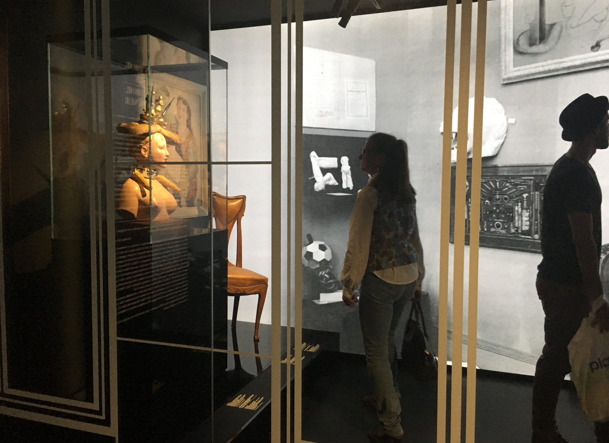
This sculpture becomes iconic with it's prominent placement.

IMG_4550.JPG
IMG_4560.JPG

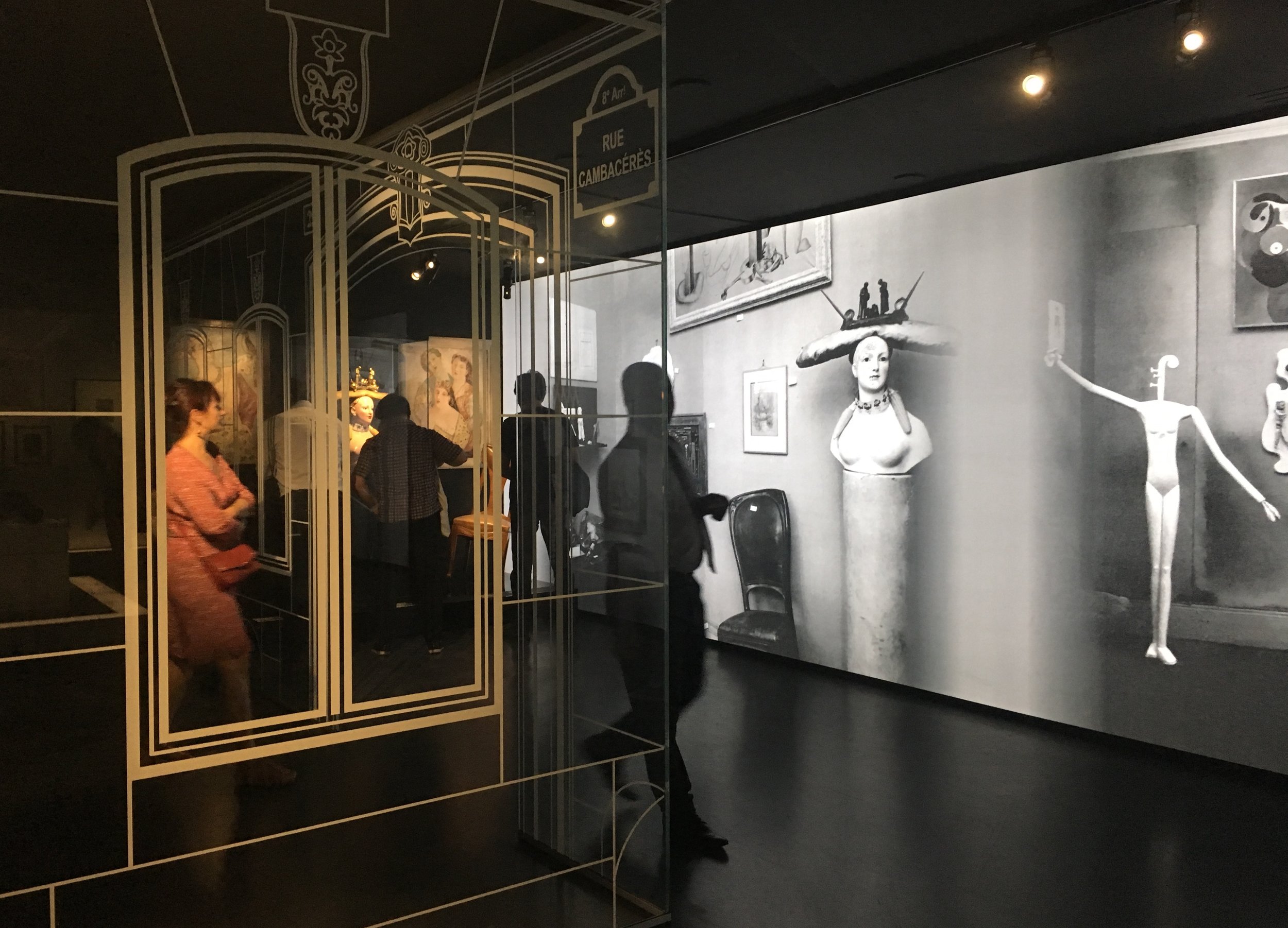
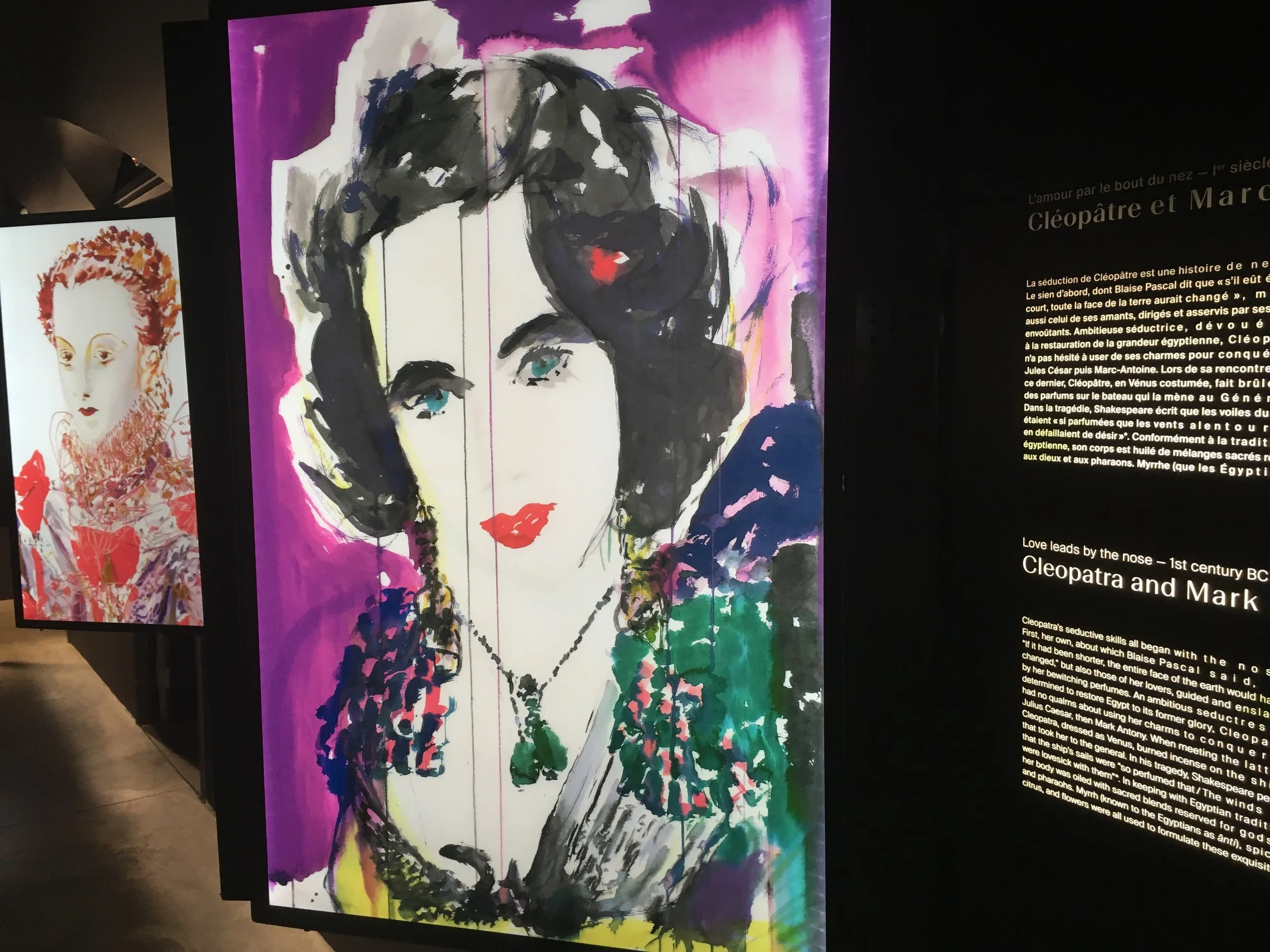
Dior was closely connected to the surrealists who showed in his gallery, and whose work was also on display here in the exhibition. A nourishing dose of art before digging into fashion.

IMG_4555.JPG

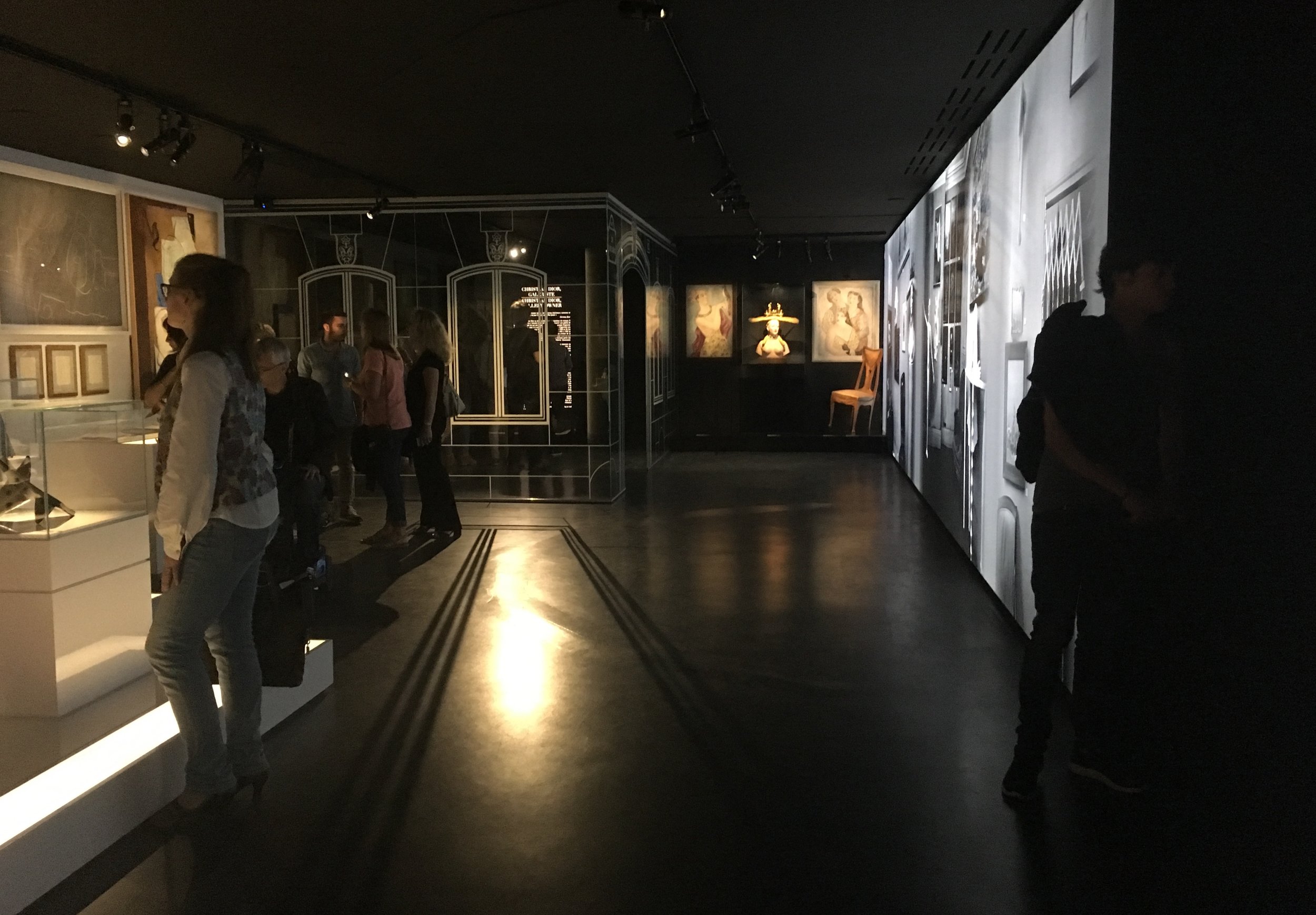
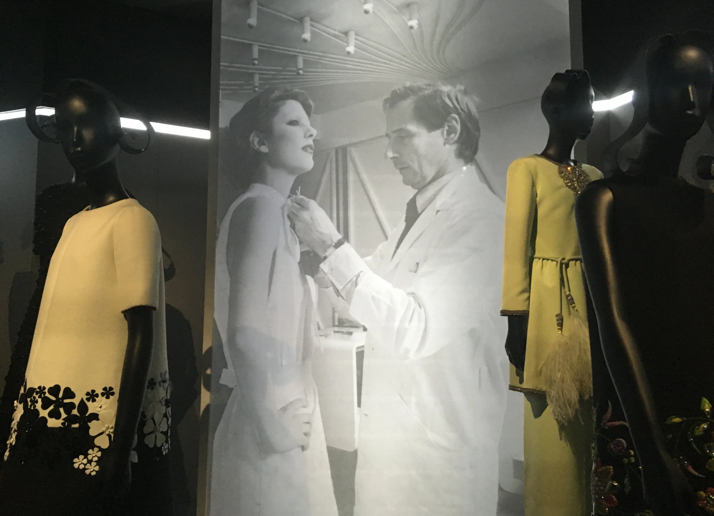
After Dior's life story is a gallery honoring another art, fashion photography. The photos were displayed traditionally on three walls. But on the fourth was a set of three big vitrines with the light fading in and out to reveal the actual dress in the space behind the enlarged photographs. An interesting play between image (woman) and object (dress).

IMG_4576.JPG
IMG_4566.JPG

What follows is a dense winding pathway of outfits and accessories, organized by color. I was amazed by the small, foot-high models of outfits, perfectly sewn in every detail! Visitors were moving very slowly and clearly relishing every detail.

IMG_4610.JPG
IMG_4594.JPG
IMG_4589.JPG

Like food, fashion has an intrinsic allure, so personal...

IMG_4588.JPG

The effect of this collaged path was deeply feminine, precious and cool.

IMG_4598.JPG

The stairway leading down passes a wall of magazines

IMG_4620.JPG

Historically inspired designs look out on the gardens

IMG_4630.JPG

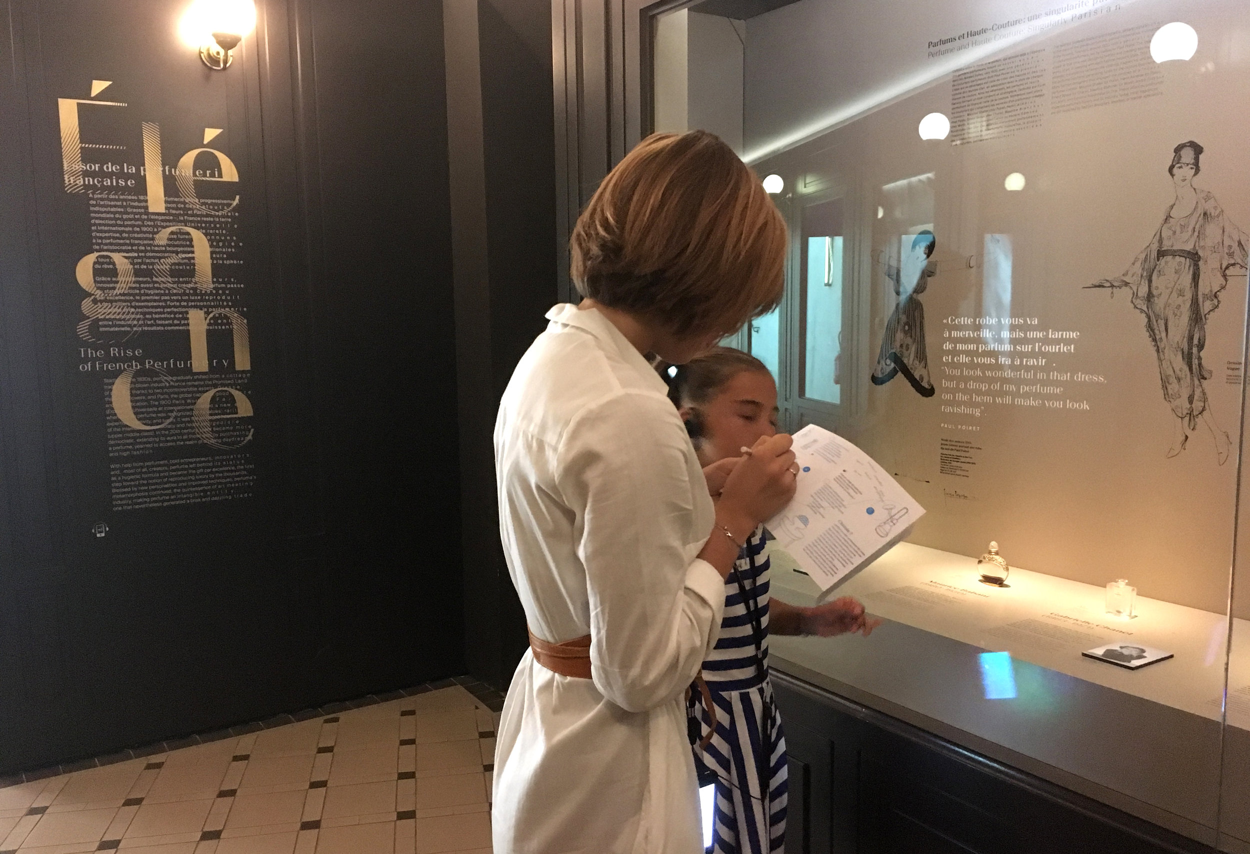
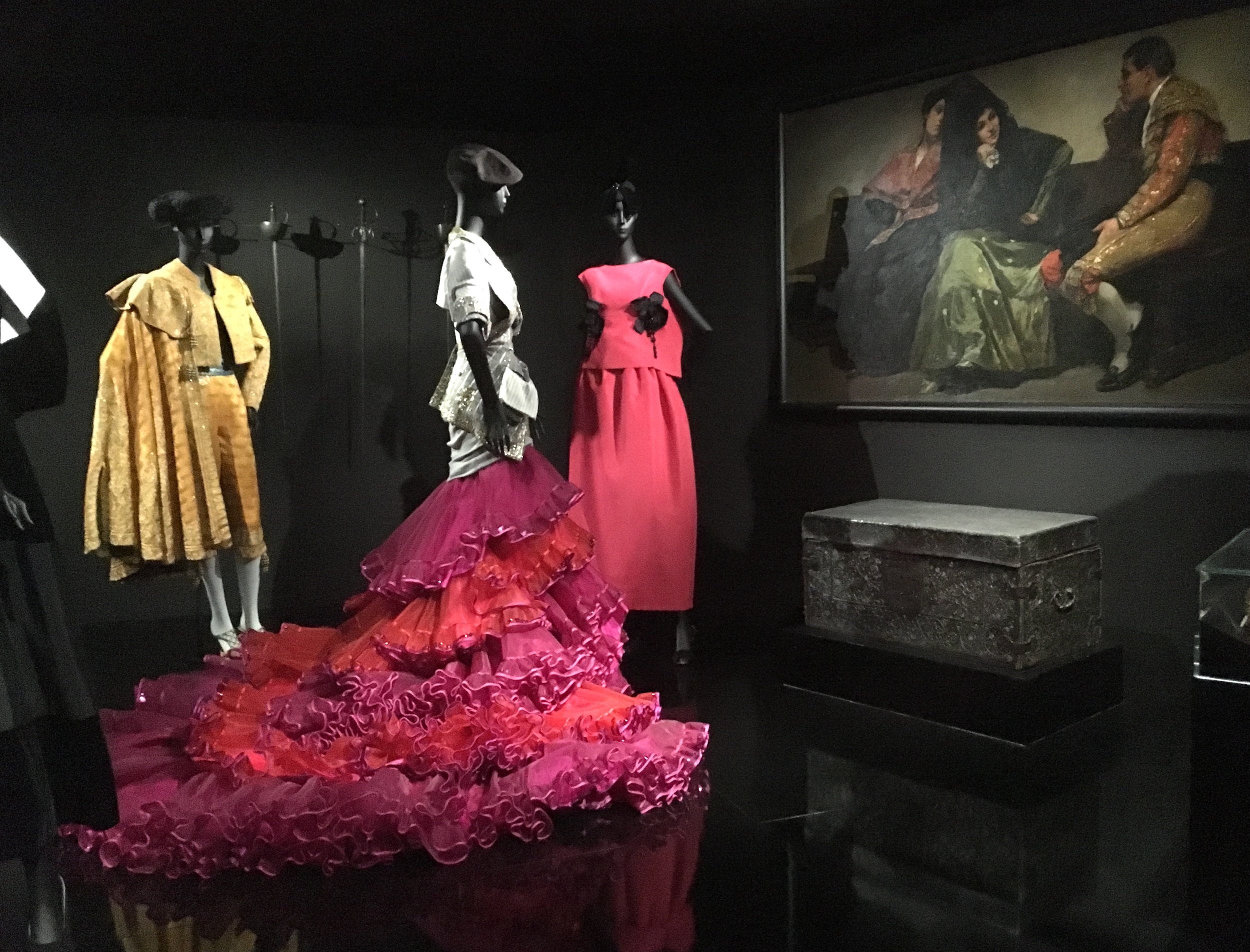
Culturally inspired designs are shown with related paintings

IMG_4646.JPG

And garden inspired designs displayed under a tree.

IMG_4654.JPG
IMG_4653.JPG

Passing over to the other side of the entry, it seemed hard to believe there could be more to see.

IMG_4666.JPG

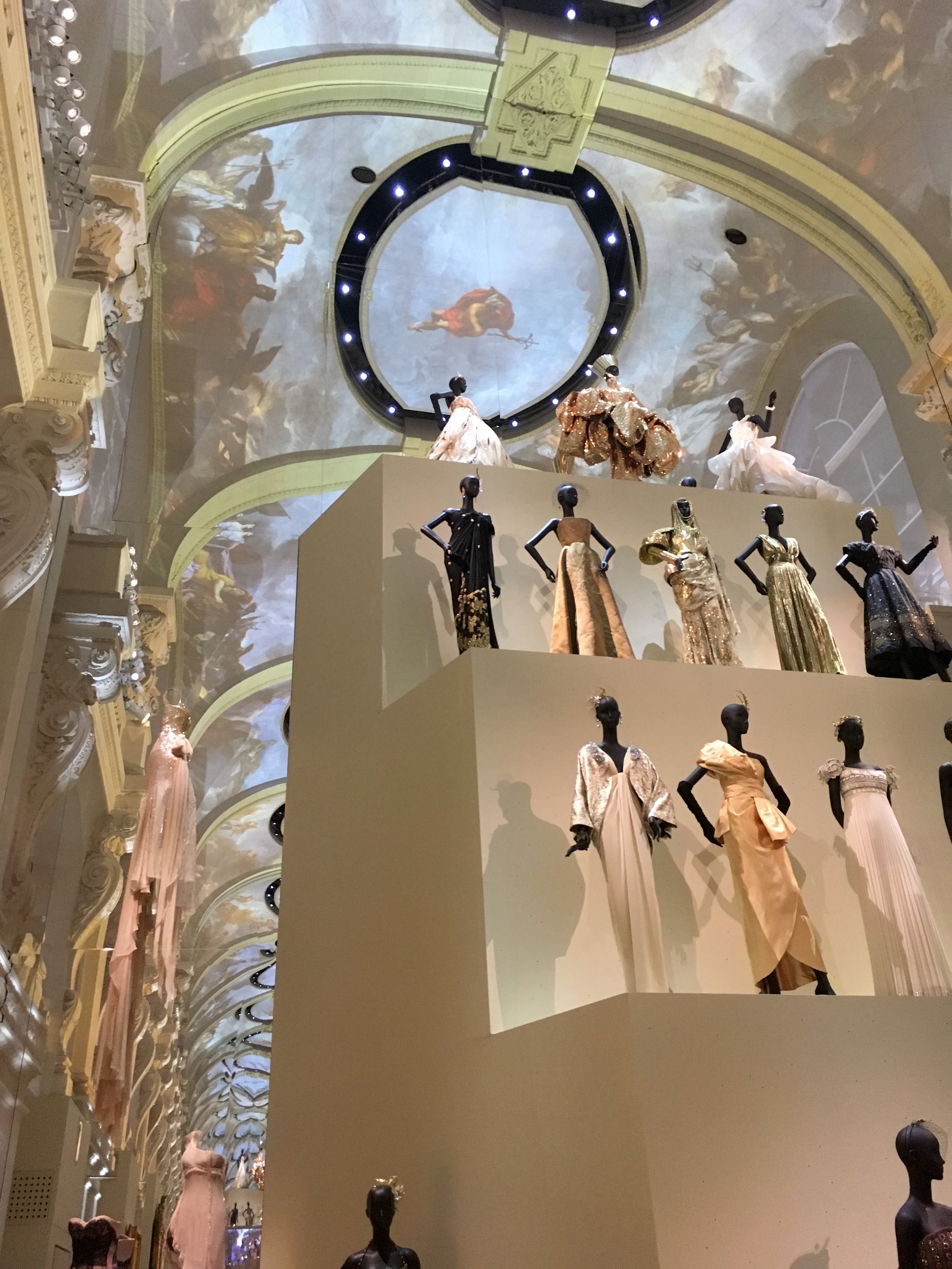
An extremely high mirror ceilinged room with five tiers of white designs, a literally towering effect!

IMG_4683.JPG

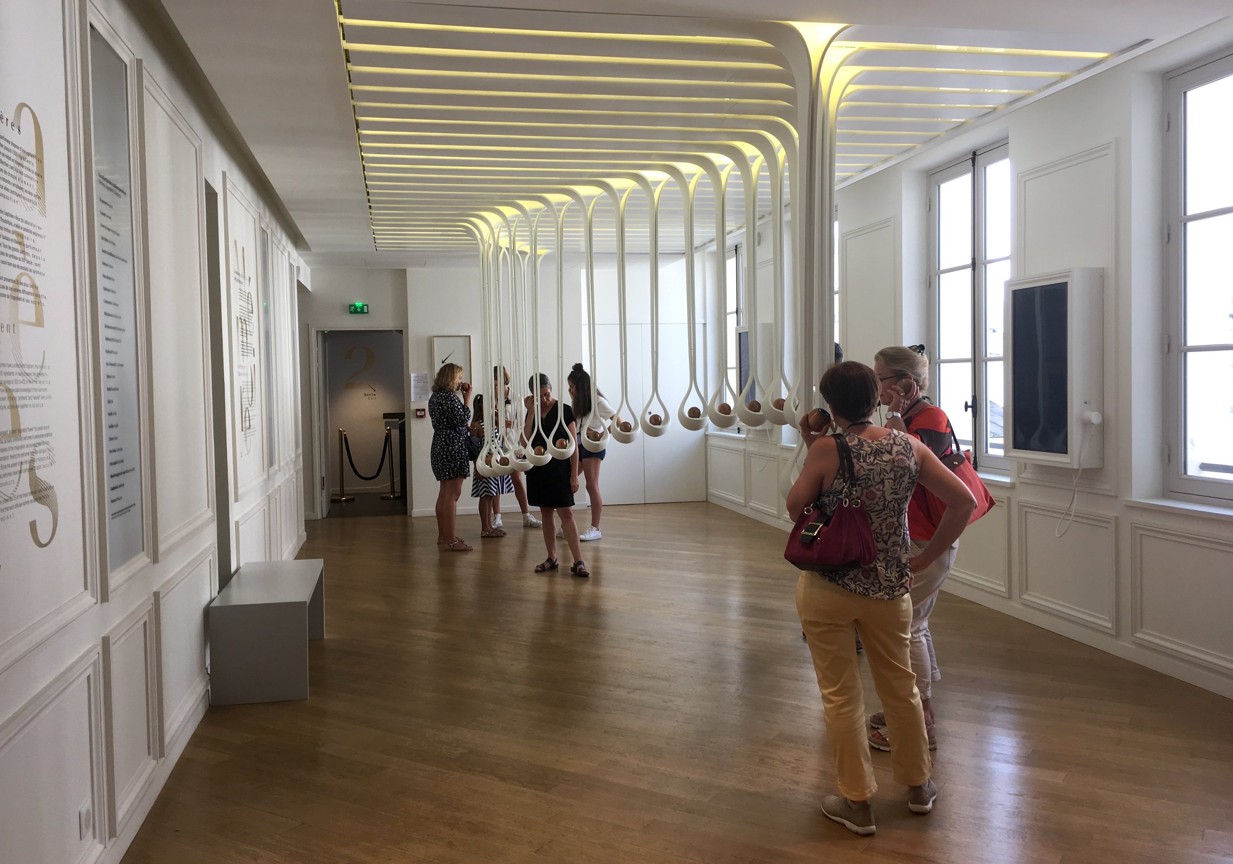
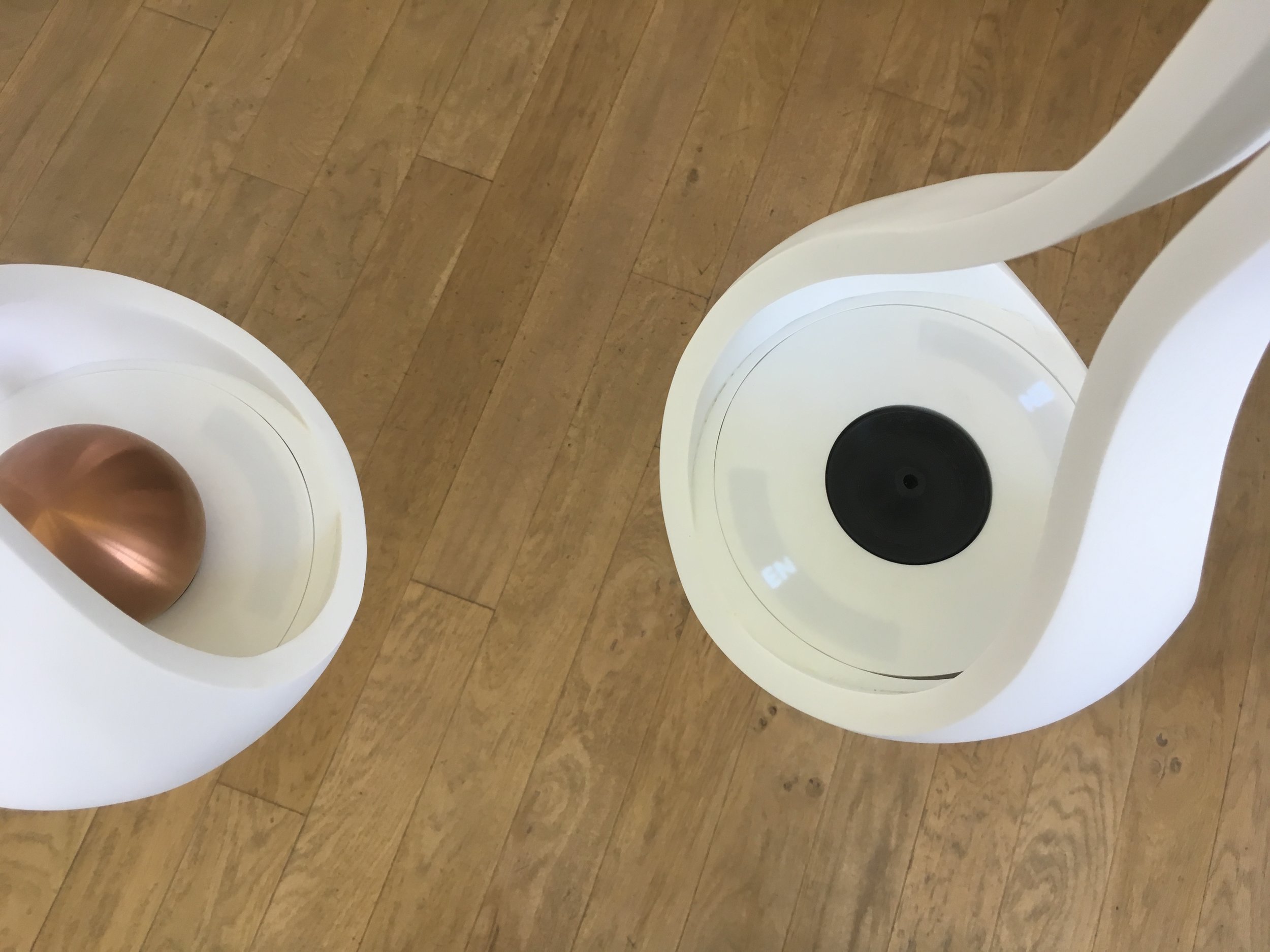
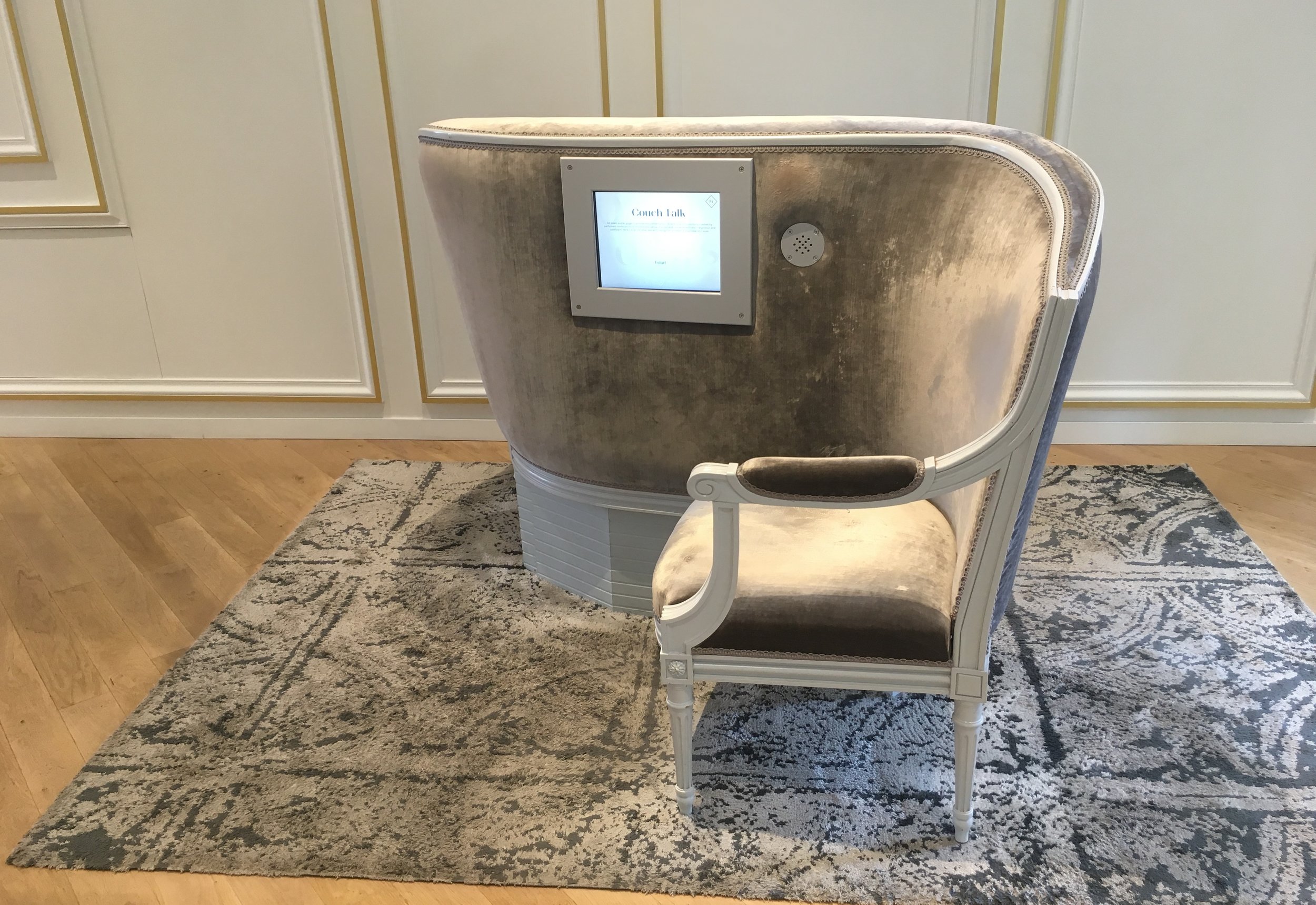
At the bottom a refreshing little mediated alcove about the craft of the seamtress.

Dior's fashion sketches

IMG_4672.JPG

Entering the most modern phase of Dior's work

IMG_4674.JPG

Only a few designs appeared in photos only.

IMG_4675.JPG

At this point, the prolific arc of his career starts to really sink in. In this room, lighting shifted along the box edges, like searchlights crossing the sky.

IMG_4687.JPG

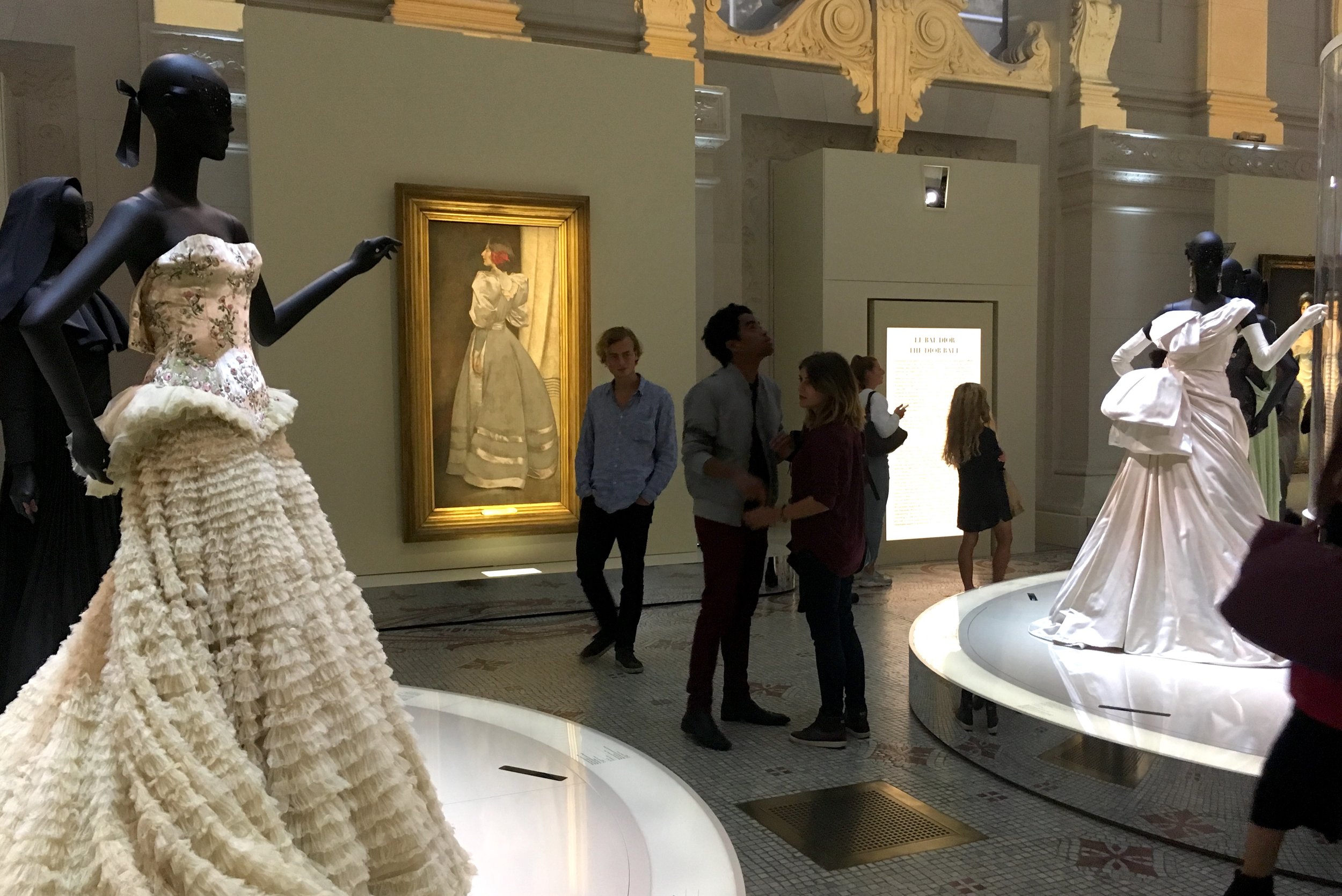
Just as I was expecting to see the exit, we entered the grand finale; a ballroom fantasy in the huge atrium space, mirrored at either end.

IMG_4692.JPG

Here the entire "ballroom" was covered in multi projections, walls and ceiling, cycling through day and night and from architectural details to Dior's sketches. Videos showed film clips of his designs worn by leading actresses.

IMG_4710.JPG
IMG_4718.JPG
IMG_4705.JPG
IMG_4702.JPG

This was the final spectacle that just seemed to stun everyone.

IMG_4701.JPG

As I was leaving I was trying to imagine how much money was spent on this exhibition. Haute couture is an elitist art. I think the visitors, who seemed pleased and tired, got their money's worth. A lavish celebration of beauty, in the form of style.

Advertising Kiosks (Paris)

Paris, France. Maybe it's been this way for a long time, but I only just noticed that Parisian columns are motorized, slowly rolling to change posters. Low tech is perfect for these old fashioned, quaint monuments. I think of them as uniquely french, but apparently they were designed by the Germans, in 1885, to avoid ads and messages pasted all over Berlin.

IMG_4120.JPG

Vertical rolling posters as a street sign

IMG_4118.JPG

Horizontal rolling posters on the side of kiosks. These endearing kiosks are being replaced by a new design by Matali Crasset, made of recycled glass & aluminum. Because the new ones look like sardine cans, Parisians are rightfully upset about the change. A case of function over culture.

IMG_4432.JPG

Makes me wonder if these curved tile metro frames will disappear as well

IMG_4996.JPG

Anti Litter (Paris)

Paris, France. This environmental campaign "calls out" specific individuals who have thrown trash outside the trash cans. "You can leave a more beautiful trace on the earth" is the warning. It's clever because it puts the focus on each of us as individuals, and our specific actions in real time.

IMG_4492.JPG

But it's shame based. I wonder if it would be more effective to honor individuals when they put it in the can? With the message that you did something to beautify the world?

IMG_4753.JPG

If it were honoring, not shaming, would it be more believable that these could be real people, not fictitious people?

IMG_4942.JPG

Le Grand Musee du Parfum (Paris)

Paris, France. What does it mean to be a connoisseur of olfaction? A good life skill for anyone in pursuit of refined sensibilities. It's no surprise that there several perfume museums in Paris. Certainly it's an arty twist on interactives about perception. "Making the invisible palpable, presenting this intangible heritage of perfume in the rooms of a museum, is the challenge accepted by Le Grand Musee du Parfum".

IMG_4422.JPG

The title typography is treated with graduated metallic fingerprints. It spreads and rotates when it's animated. As a background, It makes the body text illegible.

IMG_4353.JPG

The letter spacing of the body text is continually increasing from left to right, like fragrant molecules drifting into the air, and when animated it sometimes reverses, as if it's being gathered, or inhaled.

IMG_4246.JPG
IMG_4239.JPG
IMG_4166.JPG

Some lines of the body text are wafting out like odorants, but some are not. The tenth line, for example, is tightly justified and really stands out here. The reading experience is a slippery road. 

IMG_4156.JPG

The first gallery, about the role of perfume in famous love affairs, is really fun. Cleopatra is winking here, but from another angle, she is not. 

IMG_4130.JPG
IMG_4138.JPG

All of the angled side paintings are lenticular and change depending on angle.

IMG_4145.JPG
IMG_4149.JPG

Smell is a challenge, for sure. Or is it the smell dispensers that are tricky? There are many different types of dispensers here. Visitors come to the first smells, in the form of bowls in the ancient history section. The first impulse is to put your face in the bowl (unless you're too short), but that didn't seem to produce any scent.

IMG_4181.JPG

There is no apparent on button. The hand icon suggests getting the smell from the bowl with your hand in some way. But this didn't seem to help.

IMG_4172.JPG

The history is fascinating, with wonderful artifacts and stories about the use for scent, during the plague for instance.

IMG_4197.JPG

Here the speaker-like scent dispensers were easier to use, but I found the scents to be just too subtle to really detect.

IMG_4208.JPG
IMG_4200.JPG

Silhouette, puppet-like animations

IMG_4215.JPG

Perfume and fashion exhibitions are a common assignment for Parisian students.

IMG_4216.JPG

Fragrant Art History.

IMG_4217.JPG

The laboratory was not in use when I was there, except by staff.

IMG_4289.JPG

Upstairs visitors enter a more serious laboratory of basic scents used in the art of perfume, emphasizing "imagination, invention, and reflection in the intellectual process of creating a fragrance".

IMG_4259.JPG

Here the scent dispensers are orbs, which worked well for getting a good strong sniff.

IMG_4258.JPG

The orbs work for audio as well as smell. One of about 5 languages can be chosen by rotating the orb in it's holder, before removing it.

IMG_4272.JPG

This was clearly the core experience of the museum, where diligent visitors were spending serious lengths of time. Quietly sniffing and listening. Even going back to repeat some of the scents.

IMG_4251.JPG
IMG_4268.JPG

A tribute to famous contemporary "Noses" takes the form of dressing tables

IMG_4282.JPG

This looks pretty elegant for the "laboratory" area, where the olefactory perception process is explained. The theme of chemical compound shapes is reflected in the light fixture.

IMG_4336.JPG

A voting station on perception of scents based on gender. There seemed to be more women visitors here than men.

IMG_4396.JPG

Another, flower-like scent dispenser was pretty effective.

IMG_4340.JPG

It occurs to me that this display would be comical, seen out of context.

IMG_4354.JPG

Then there's a smell garden, with 11 smells to guess

IMG_4380.JPG

Here the smell dispensers were funnel-shaped flower heads, which didn't seem to work. Some were lit up, and some had subtle images inside to indicate the answers. 

IMG_4365.JPG

After the gallery of orbs, I think some visitors expected audio as well.

IMG_4357.JPG

A view of the real garden beyond the artificial one.

IMG_4391.JPG

This love seat uses the speaker-like dispenser again.

IMG_4374.JPG

Wall alcoves that dispense smell had stringed curtains, and colored light to give a visual clue to where the scent is.

IMG_4385.JPG

Finally we come to another test your senses area, this one with paper strip dispensers, like the ones used in perfume stores, which worked great.

IMG_4382.JPG

A simple comparison of 3 scents, with identifying pictures to line up

IMG_4388.JPG
IMG_4389.JPG

It seems like the tally sheets are often on a window sill.

IMG_4392.JPG

The museum store carries over the design of the galleries, including the drifting typography.

IMG_4419.JPG

Here there are even more types of dispensers; ribbon, cups...

IMG_4418.JPG

And free form glass blown shapes at the scented glove display

IMG_4415.JPG

This is the final perfume dispenser for purchased bottles

IMG_4400.JPG

Street Art (Lisboa)

Lisboa, Portugal. This portrait series is everywhere around town, "Have you seen this man/woman?"

IMG_2736.JPG
IMG_2730.JPG
IMG_2735.JPG
IMG_2729.JPG
IMG_3198.JPG
IMG_2852.JPG

A detail of the street art "carving" style in Lisboa

IMG_3539.JPG
IMG_3467.JPG
IMG_2726.JPG
IMG_2956.JPG
IMG_2977.JPG
IMG_3469.JPG
IMG_3514.JPG

A formal street exhibition in the Alfama pays homage to famous locals, in a beautiful way, using sensitive photographs on tile, with side labels

IMG_3549.JPG
IMG_3562.JPG
IMG_3567.JPG

To me, mystery window installations are street art. Envelopes?

IMG_3491.JPG

Globally Hip, Locally...

Jaded after many months on the road, my eyelids are tattooed with an endless movie of interior design (restaurants, cafes, bars & living spaces). We've arrived, at globally hip. From cheap & dirty to swank, it's just a matter of inspiration and resourcefulness, wherever you are in the world.

IMG_2999.JPG

And if the muse doesn't provide the creative vision, the internet will, swirling the globe like a second, pinterest atmosphere. We're breathing it in non stop.

IMG_9336.jpg

Even ways of being undesigned are intentional. Nobody is not a designer anymore.

IMG_7189.jpg

I love it. But maybe our global hip is terminal? Maybe we're losing the regional uniqueness of design, the specialness of a locality, where strange and wonderful things develop in their own geographic bubble. Travel used to be a discovery of truly odd local aesthetics and fashions, but now its more and more predictable, in an eclectic way. 

IMG_5471.JPG
IMG_7319.JPG

You could say that local design still exists in the form of "local themes", even if they're not organically grown. One of my favorites is the Soviet Bar in Cluj Napoca, Romania. 

IMG_5763.JPG
IMG_5886.JPG
IMG_5748.JPG
IMG_5768.JPG
IMG_5782.JPG
IMG_5760.JPG
IMG_5761.JPG
IMG_5891.JPG
IMG_5754.JPG

Then there's a wider approach to "themes" that seems to achieve global and local at the same time. Like "I'm Camper" cafe in Seoul, Korea.

IMG_5682 copy.JPG

Quinta da Regaleira (Sintra)

Sintra, Portugal. This estate museum is famous for it's symbolic gardens, with underground tunnels and spiral staircase wells based on Tarot rituals. But the house was more intriguing to me, and less crowded. Pedictably opulent, the rooms are delicately decorated in every medium. But it's just impossible not to look at the distracting black stanchions, so the subtlety is lost. The stations probably wouldn't exist if there were guards or docents. What's that little step inside the fireplace?

IMG_3926.JPG

These display cases compete with the room. They bring the focus down and center, away from the portraits along the ceiling.

IMG_3950.JPG
IMG_3943.JPG

The architecture itself is untouched, until this stand out wall and entry appears suddenly, along a narrow stairway corridor. The room is devoted to the Italian set designer and architect Luigi Manini.

IMG_3960.JPG

The facade is a watercolor design for opera curtains.

IMG_3939.JPG

The blown up watercolor is beautiful, but it seems ironic that this display about the designer interferes with his own design of the house it's in.

IMG_3937.JPG

MAAT (Lisboa)

Lisboa, Portugal. Who isn't drawn to old power plants? They make good energy museums, and even better contemporary art museums. Usually one or the other. But the Tejo Power Station is both. Art exhibitions share the space with the Museu de Electricidade, which is now part of the Museum of Art, Architecture and Technology.  A fresh drama of old brick and new whiteness along the Tagus river walk.

IMG_3209.JPG

The water tower makes a circular billboard venue

IMG_3213.JPG
IMG_3215.JPG

A handsome outdoor vitrine for art exhibitions

IMG_3218.JPG

With almost no signage, the building stands on it's own. A subtle ticket office and entry (seen through the window)

IMG_3221.JPG

As soon as they enter the electricity museum, visitors are enveloped in a composed musical piece, moody (and catchy) with a rhythmic clang of pipes in the mix. Graphically the museum combines huge red monolith signs with oversize diagrams. 

IMG_3223.JPG

Gobo lighting defines the wayfinding signage.

IMG_3228.JPG
IMG_3259.JPG
IMG_3247.JPG

The only interactive I found here was "accidental", and strange. One control console had a few mysteriously active buttons, one of which activates a dummy figure far above on a catwalk, to call out to his fellow workers.

IMG_3231.JPG

A contemporary photo exhibition is slipped into one of the corridors, too tight to view at any distance.

IMG_3245.JPG

Simple white Hanging panels catch the shadows of structure

IMG_3257.JPG

Interesting use of red photo here makes the alcove feel like a wrinkle in the wall.

IMG_3252.JPG

The walls in this interactive Electricity space are backlit. The wall mounted interactives have a retro styling.

IMG_3265.JPG

The plump curved shaping is very approachable.

IMG_3273.JPG

Did these anthromorphized meters come from another planet?

IMG_3267.JPG

Power plants are massive, mind boggling, walk-through living diagrams of themselves. Color coding, specific part lighting and placed labels help make it digestible. But the general awe of a building like this is satisfying in it's own right. Sometimes visitors are on a "mindless" stroll, a valid way to experience museums, after all.

IMG_3279.JPG
IMG_3277.JPG

This event space, is nicely located, visible from a catwalk, with packing crates as part of the furnishings.

IMG_3315.JPG

And this activity classroom is located behind the power plant console. A bit of charming old flooring, is left intact.

IMG_3317.JPG

Beautiful placement of old photographs among the machinery.

IMG_3294.JPG
IMG_3287.JPG
IMG_3291.JPG

Including some gorgeous and delicate small photos.

IMG_3289.JPG
IMG_3288.JPG

A dummy figure appears here by surprise, another cause of mixed feelings.

IMG_3292.JPG

This cathedral like space of the Turbine Hall, is a perfect art venue for Bai Ming's work from China.

IMG_3313.JPG
IMG_3310.JPG

They make it look easy, their transition to contemporary art spaces

IMG_3326.JPG
IMG_3330.JPG

These are actually very tall green display pedestals, rising from the floor below.

IMG_3337.JPG
IMG_3334.JPG

Stairs double as theater seating in a tight space.

IMG_3335.JPG

The MAAT lounge is also in a great location.

IMG_3351.JPG
IMG_3339.JPG

It's a pleasant walk next door to the gradual entry of the new building, designed by Amanda Levete. A gently sloping hill of tile.

IMG_3361.JPG
IMG_3356.JPG
IMG_3404.JPG

MAAT logo, in animation. I like the reverse overlap in the letterforms.

IMG_3391.JPG
IMG_3399.JPG

A triangular entry desk leads to a central gallery, shaped like an eye, wrapped by a walkway down to the side gallery entries.

IMG_3388.JPG

Mirrored doors off the gallery deflect attention and increase the space.

IMG_3377.JPG

To be honest, due to depressing world news, I didn't feel up to seeing an exhibition on Utopia/Dystopia. It turned out to be unremarkable, in terms of design. But a stroll on the roof is uplifting!

IMG_3408.JPG
IMG_3418.JPG

I could be anywhere (Lisboa)

Time Out Market occupies about half of the old Mercado da Rebeira.

IMG_2934.JPG

It's a crowded, popular food court with a central shared eating area surrounded by food stalls serving food on trays. 

IMG_2874.JPG

Everything is uniformly branded with Time Out's black & white identity. 

IMG_2864.JPG

It calls itself the best of Lisboa, because "everything in a time out market is chosen, tasted (and tested) by an independent panel of experts: Time Out's journalists and critics. It's a simple rule: if it's good it goes in the magazine. If it's great it goes on to the Market." The space design feels like a fine line between magazine and market.

IMG_2899.JPG

To me this raises troubling questions, especially about travelers and designed environments. Do they come here to enjoy good Portuguese food because it's been curated? Or do they come because it's a safe place to get predictable service, without the awkwardness of language barriers or quirky restaurant experiences?

IMG_2863.JPG
IMG_2876.JPG

Along the outer corridor: some upscale counter stalls.

IMG_2854.JPG

Upstairs: Time Out Restaurant, and office space.

IMG_2906.JPG

Along the inside corridor, between Time Out and the regular market: some stalls feel like hybrids.

IMG_2896.JPG

The regular market with it's few remaining side stalls was closed when I was there. The two environments seem separate from each other. Or protected from each other?

IMG_2861.JPG
IMG_2865.JPG

Am I in a travel magazine or a real world destination? Sometimes the tension between design and "authenticity" is palpable. "Realness" is often associated with aesthetic chaos, and uncomfortable surprises.  Designed environments like this reinforce an expectation for controlled ease. At worst, they can be a soulless buffer from the real world. A time out. From the real world. Wherever you are.

IMG_2895.JPG

Spiritual Interactives

As well as museums, I've visited many temples. Except for the most sacred chambers, the public is normally invited to visit, as they would any museum. This creates an interesting dynamic between museum and spiritual practice. There are usually opportunities to engage in a ritual, such as bell ringing, candle or incense lighting, wishes, offerings, divinations, and blessing rituals. With all due respect for all religions, I've been wondering... how they might be similar to museum interactives?

IMG_3136.JPG

At the Jeronimos Monastery, in Lisboa, Portugal, you can buy your candle and light it "virtually." The text says "Light a real candle remotely via the CANDLA APP" which can be downloaded by a QR code in the upper corner. I kept wondering if there really was a wax candle being lit in another room? Where the smoke won't damage the building? The prayer is multi lingual, in 5 languages. 

IMG_3131.JPG

Many temple activities require instruction or mediation to do it "correctly"  but there are always people winging it. In museum education, making is thinking. We make meaning by interacting. At the temple, you could say that making is setting the intention spiritually. 

IMG_7376.JPG
IMG_8329.JPG
IMG_4100.JPG
IMG_7600.JPG
IMG_7338.JPG
IMG_0989.jpg
IMG_1517.JPG
IMG_8328.JPG
IMG_3368.JPG
IMG_3333.JPG

Museu Nacional dos Coches (Lisboa)

Lisboa, Portugal. This is a brutal beast of a building, a massive raised cement garage that houses ornate and golden coaches, like Cinderella's but for real. From the outside, you'd never guess what it contains.

IMG_3643.JPG
IMG_3630.JPG

Could be the largest restroom icon in the world?

IMG_3641.JPG

The huge elevators are closed, and after walking up some drab side stairs the visitors enter immediately into a great hall of coaches. Unceremoniously.

IMG_3656.JPG

Some are more restored than others. The views between carriages and wheels adds a little interest along the wide corridor.

IMG_3667.JPG
IMG_3736.JPG

The coaches are bordered by a floor railing with text. Angled side displays.

IMG_3661.JPG

For many, this is a dream come true. 

IMG_3690.JPG
IMG_3665.JPG

Massive side walls allowed for huge projections with sound, which is much needed in the stark space. But the long silent, blank gaps between the video segments were disturbing, as if the whole experience was stopping and starting again.

IMG_3694.JPG

The effect was like standing on a quiet road, watching a dramatic coach with horses ride by, and then disappear again. But I don't think this was the intention.

IMG_3678.JPG
IMG_3698.JPG
IMG_3714.JPG

People actually rode around in these objects, pulled by animals!

IMG_3703.JPG
IMG_3672.JPG

When you leave the building, your own coach awaits.

IMG_3747.JPG

Or you can cross the street to the original coach museum, which looks like this. An ornate building with the more neglected coaches, and bad lighting.

IMG_3805.JPG

A temporary exhibition honors the history of fighting fire by horse drawn coaches.

IMG_3777.JPG

Every large banner image, has a small scale whole image set into it.

IMG_3779.JPG
IMG_3784.JPG
IMG_3787.JPG

MNAA (Lisboa)

Lisboa, Portugal. At the Museu Nacional de Arte Antiga store, I was tempted to buy one of these "sweet" little figurines. They're from one of Jheronymus (their spelling) Bosch's triptychs, "Temptations of Santo Antao."

IMG_3853.JPG

I love the use of typography in 15th century paintings. Could this be the earliest form of comic strip art? The message comes from the hands as a ribbon, rather than from the mouth as a bubble. Here the message is partially hidden as is curls out like smoke. 

IMG_3820.JPG

It's a wonderful expression of how words, not only written but spoken become a thing...

IMG_3821.JPG

something we carry with us.

IMG_3822.JPG

Chair covers! This is truly the "fancy" living room nobody is allowed to use, especially visitors.

IMG_3831.JPG

Historical placemat at the museum cafe.

IMG_3814.JPG

Street Art (Porto)

Porto, Portugal. The streets were papered with series of artists' work. Such as Helena Rocio's collage.

IMG_0876.JPG
IMG_1430.JPG
IMG_1548.JPG
IMG_1594.JPG

Porto is full of portraits, like these bearded ones by Arte Sem Dono.

IMG_1604.JPG
IMG_1605.JPG
IMG_1615.JPG

And Berri Blue:

IMG_1567.JPG
IMG_1575.JPG
IMG_1648.JPG

Figures by Excercito Ana

IMG_1644.JPG
IMG_1573.JPG
IMG_2101 1.JPG

or disembodied

IMG_0877 copy.JPG
IMG_0717.JPG
IMG_1528.JPG

In a bandshell

IMG_1632.JPG

Another series, devils.

IMG_0861.JPG
IMG_0728.JPG

Seagulls rule Porto!

IMG_1579.JPG
IMG_1059.JPG
IMG_1533.JPG

and my favorite (unique) Porto portrait.

IMG_0839.JPG

Porto Transit (Porto)

Porto, Portugal. Porto has every imaginable type of transport from funicular to little ferry boats. Here is the logo for the metro system.

IMG_1110.JPG
IMG_0657.JPG

The metro uses ColorADD, a color system designed by Portuguese graphic designer Miguel Neiva for colorblind users. Symbols are used for each color, combined in pairs to represent secondary or mixed colors, based on subtractive primaries. This system is used in Portuguese hospitals, schools, traffic lights, packaging, etc.

IMG_0969.JPG
IMG_0968.JPG

The transit card matches this design

IMG_1055.JPG

A modular fan fold poster system in the stations with a split image poster design.

IMG_1676.JPG

The Centro da Mobilidade, in Sao Bento station, is a ticket agency for all forms of transportation, with a three petaled logo.

IMG_1684.JPG

Photo cropping using the shape.

IMG_0942.JPG
IMG_1692.JPG

Semillas (Porto)

Porto, Portugal. What is charming? We can learn something from this venerable seed store, which is the real deal, not a modern store with an intentionally old fashioned design. The store is low key and unpretentious, in fact it wasn't even open when I found it.

IMG_0758.JPG

There is something about same sized packages, with simple (beautiful) images that form a grid, that feels honest.

IMG_0766.JPG

There's something about repeating the same items that feels humble. Less really is more.

IMG_0768.JPG

There is something about the simplicity of just one kind of thing, a plain functional place without a lot of accessories, or signage, that feels calming. This was the only sign, taped in the window.

IMG_0761.JPG