Museum of Typography (Crete)
Chania, Crete. The Greek word for "typography" means both typography and printing. The Museum of Typography provides a history of both. And more than that, a place to reflect on the history of communication arts across all cultures. Valuable background for young designers.

You can feel the enthusiasm here. I arrived on the first day of the AEPM conference (Association of European Printing Museums), hosted by the museum. I was kindly shown around and invited to join the opening event of the conference. In true Greek tradition, the museum has written original songs, including a poetic story of the creation of the museum, performed by a choir.

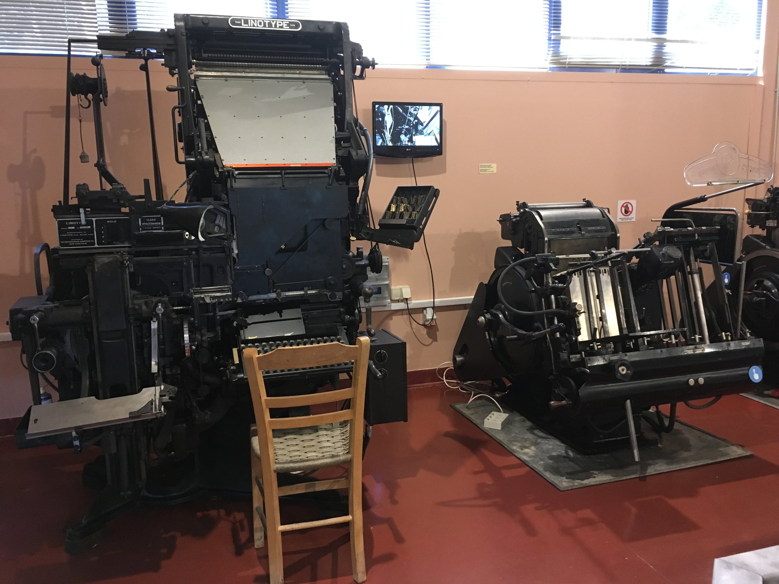
The collection covers virtually every printing/typography technology and process. Presses: Gutenburg, platen, iron, Heidelbergs, Frankenthal, cylinder, Kempkeworke. Typography: hand set, Linotype, Intertype, Monotype, Graphotype, Telex, Chelgraph, Viewsonic. Serigraphy, xerography, offset, engraving, lithography, foil, die, emboss, stamp, watermarking, book binding. And more. A historical feast for designers and shop craftsmen.


Here the floor is delineated with a lip, and seating is shaped along the edge.


Happily, some of the equipment is alive and in use, in various ways. Tours are interactive. Open trays of ink and other supplies are left in-process on the floor, and unattended. The museum tickets are printed on an old Heidelberg.


The overall exhibition design is boxy and heavily outlined, which gets overly busy when there are many elements. It is probably (well) inspired by the exacting registration of printing, and the orderly aspect of typography cabinets.

3 tier displays spiral around the columns (with potentially thigh-bruising corners).

Dark stained particle board, stained canvas, and sepiad collage help convey the patience of craft and grimy joy of a printshop.


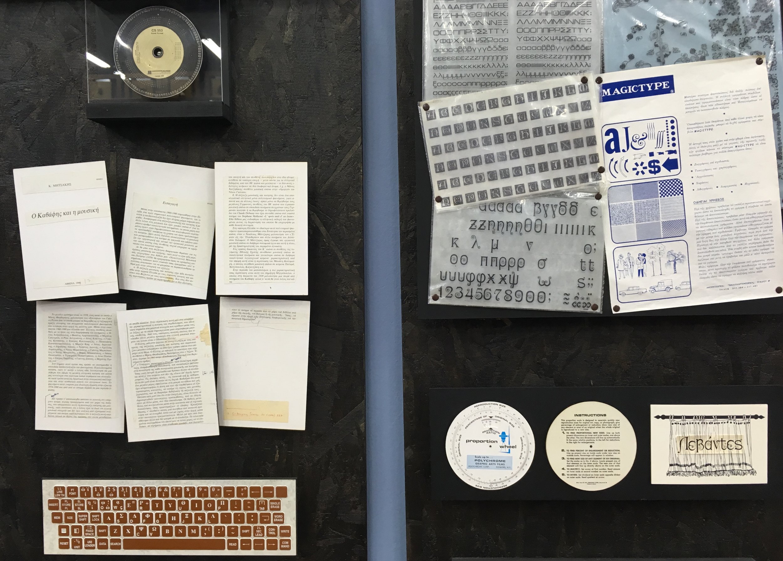
Alongside quirky old specialty machinery are reminders of the earliest computer technologies, and more recently lost arts such as four color processing, and watermark paper forms. Designers my age will find the offset paste-up display amusing.


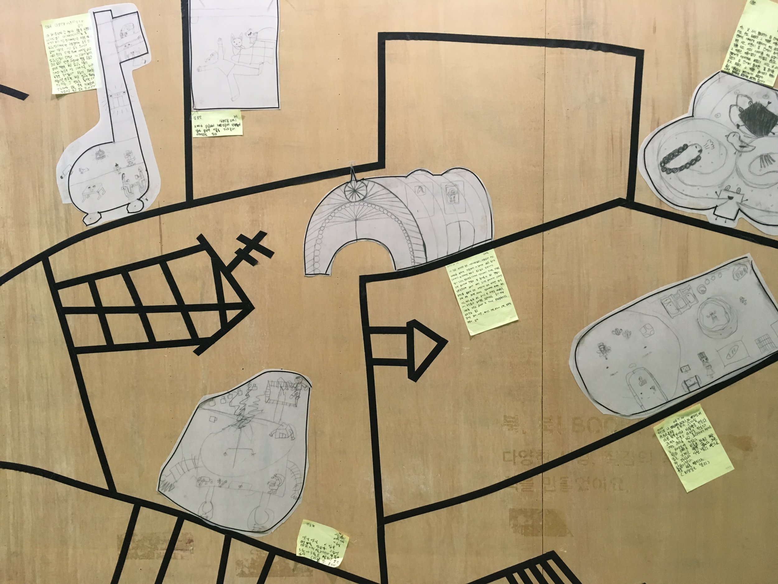
"History of Writing" by artist Antonis Papantonopoulos, is an ambitious interpretation of visual language and mediums, across time and cultures. From cave painting and the earliest languages to the most current technologies, each display has the same configuration and components.

Sign Language

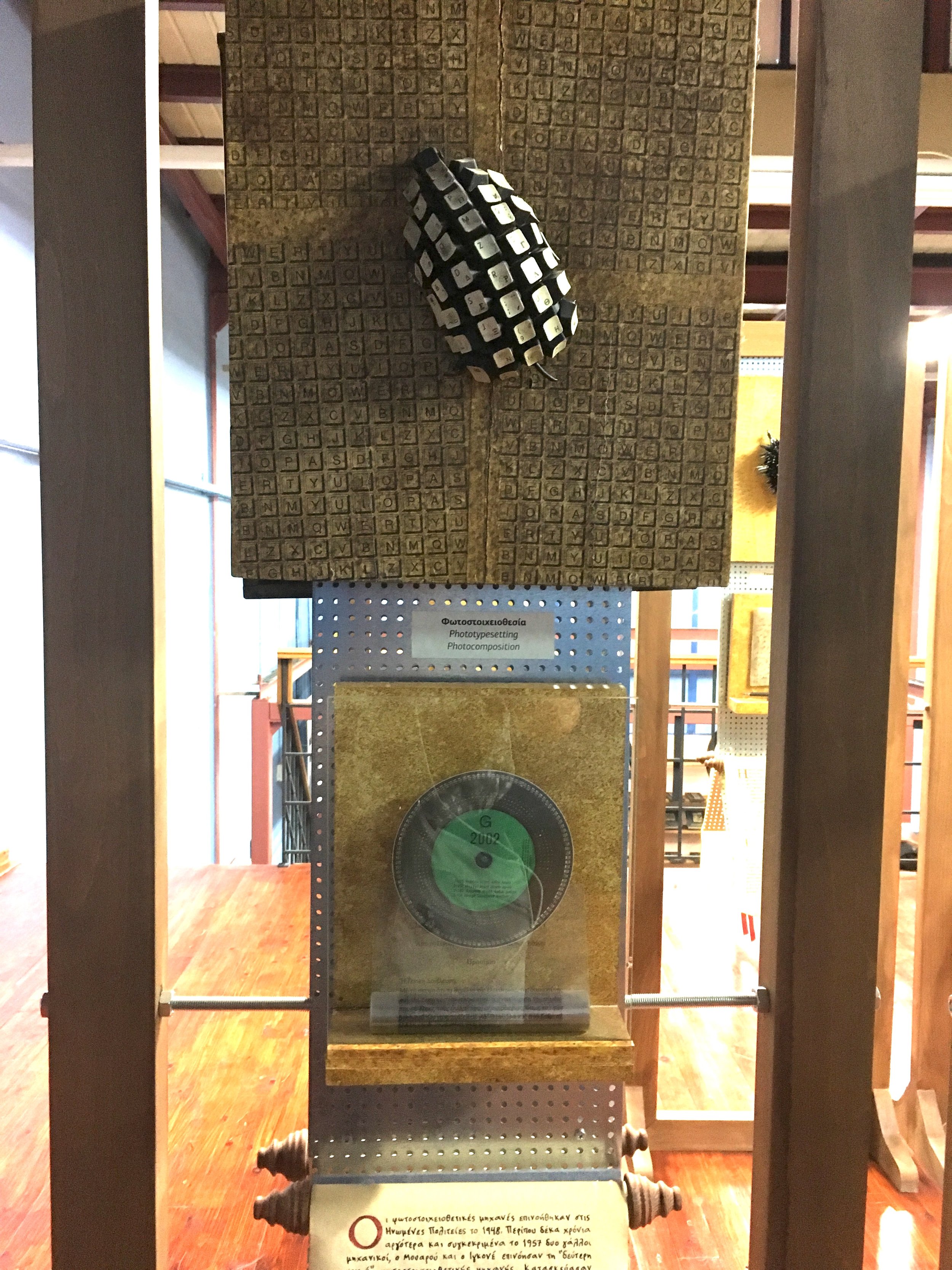
Photo Typesetting
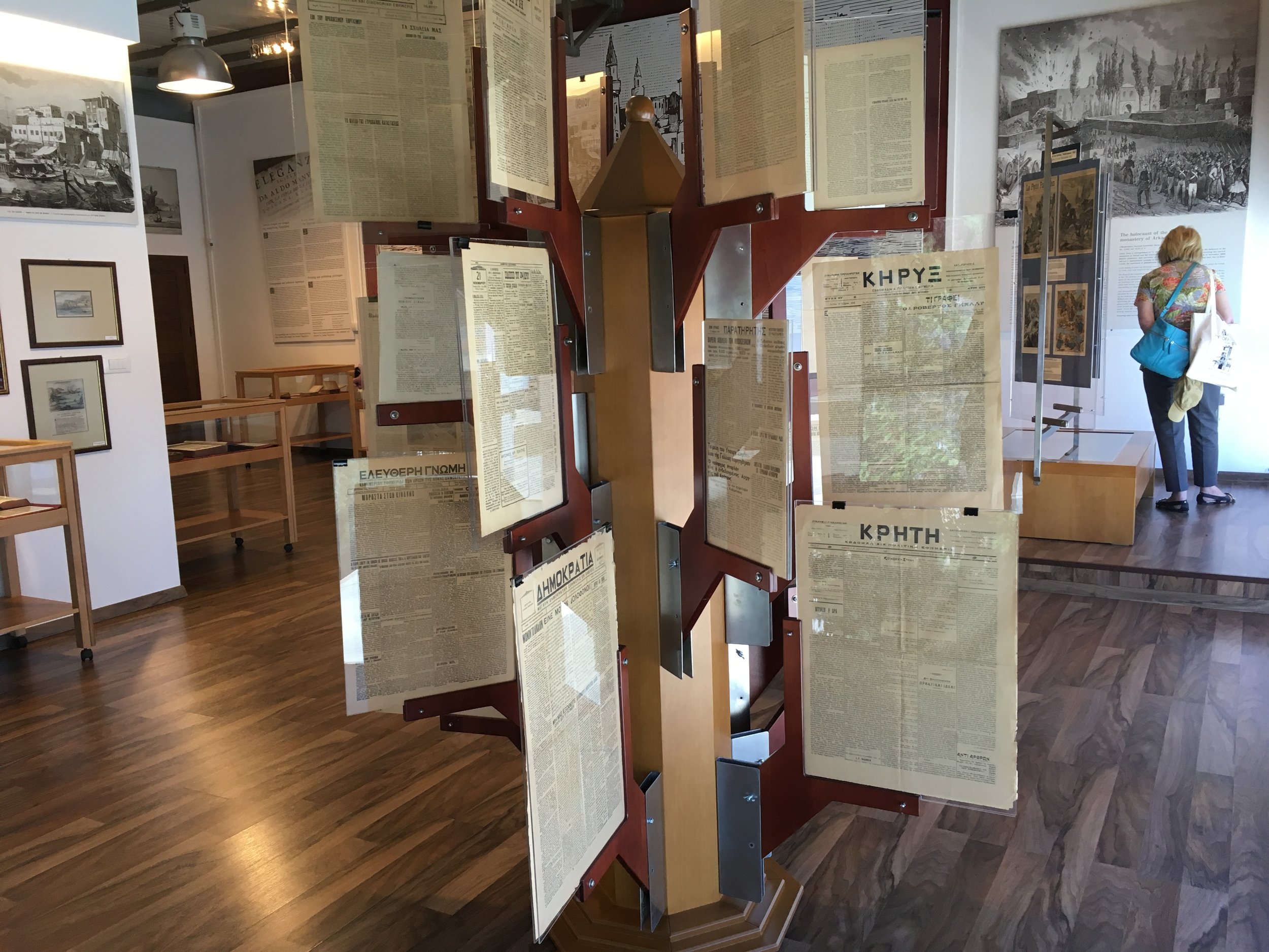
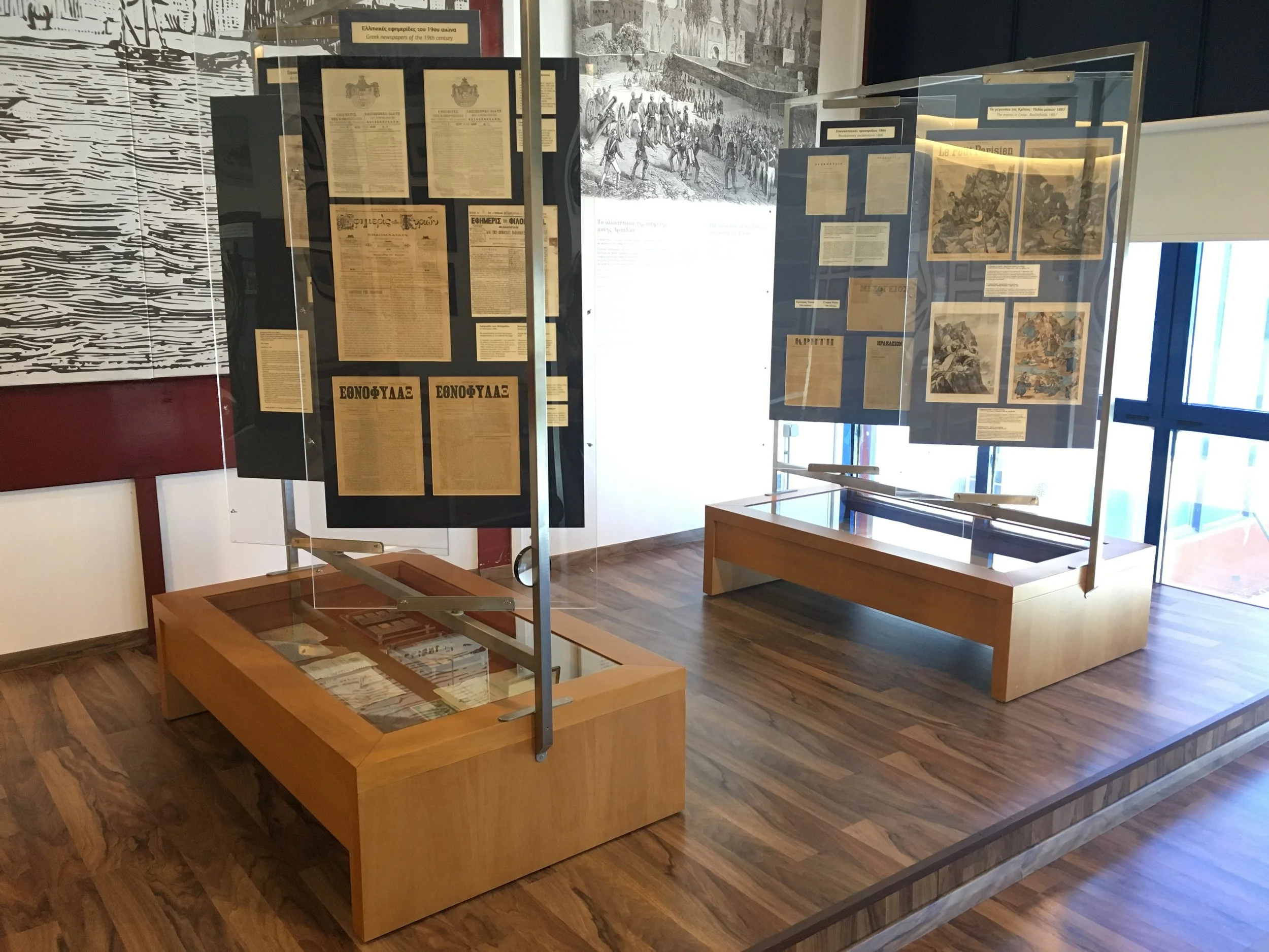
The last room presents a collection of beautiful local prints dating back to the 17th century. The newspaper display structure is an elaborate tree form. A pair of nearby displays have angled vertical panels to help reveal a lower vitrine.
The museum wrote this poem about typography, with a key below.

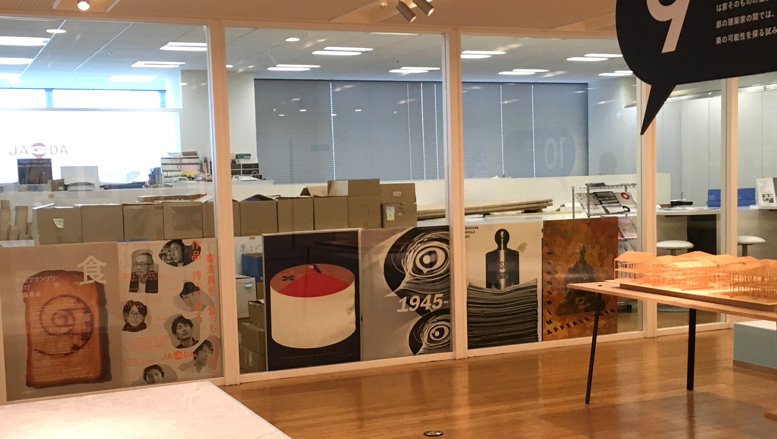
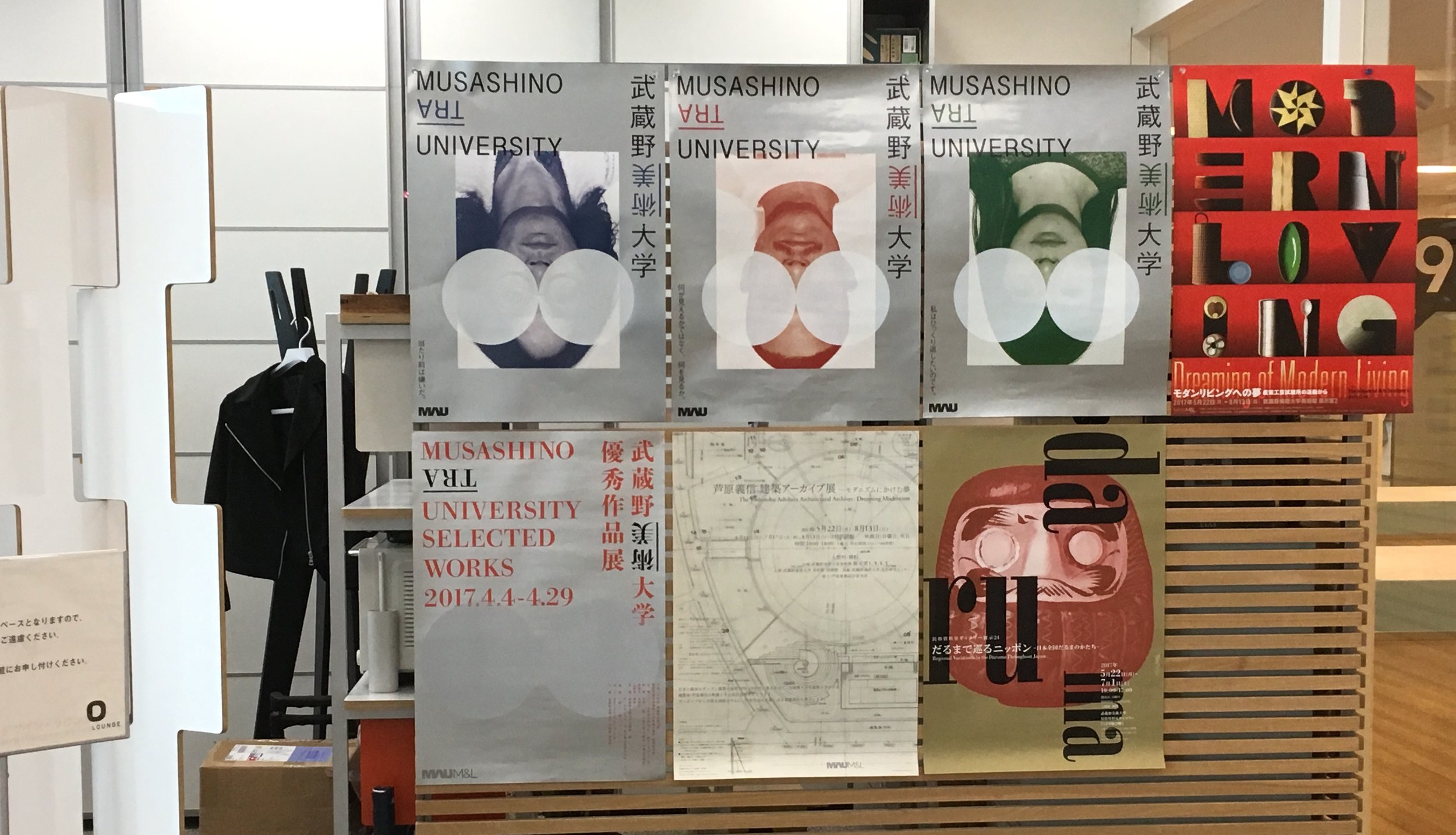
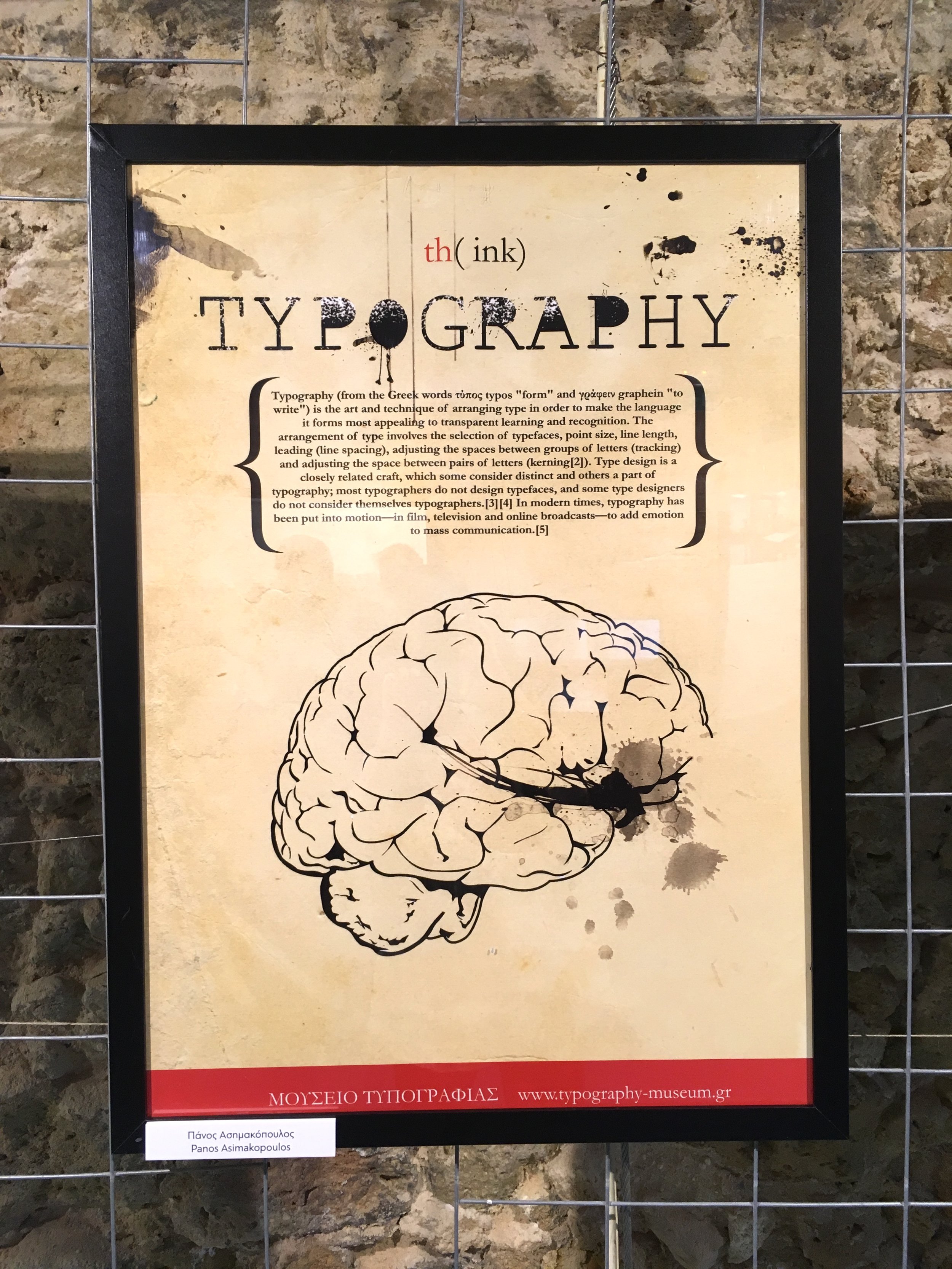
A few typography posters from museum competitions.

Museum of Typography postcards are had to resist.